Hugo uses Markdown as its content format. However, there are a lot of things that Markdown doesn’t support well. To overcome those limitations, Hugo created the concept of shortcodes.
The badge shortcode displays colorful markers in your text with optional icons.
ImportantVersion6.6.6Captain InfoNewAwesome
Usage
{{%badge%}}Important{{%/badge%}}{{%badgestyle="primary"title="Version"%}}6.6.6{{%/badge%}}{{%badgeicon="angle-double-up"style="red"%}}Captain{{%/badge%}}{{%badgestyle="info"%}}New{{%/badge%}}{{%badgecolor="fuchsia"icon="fa-fw fab fa-hackerrank"%}}Awesome{{%/badge%}}
{{partial"shortcodes/badge.html"(dict"page"."content""Important")}}{{partial"shortcodes/badge.html"(dict"page"."content""6.6.6""style""primary""title""Version")}}{{partial"shortcodes/badge.html"(dict"page"."content""Captain""icon""angle-double-up""style""red")}}{{partial"shortcodes/badge.html"(dict"page"."content""New""style""info")}}{{partial"shortcodes/badge.html"(dict"page"."color""fuchsia""content""Awesome""icon""fa-fw fab fa-hackerrank")}}
Parameters
Name
Default
Notes
style
default
The style scheme used for the badge.
- by severity: caution, important, info, note, tip, warning - by brand color: primary, secondary, accent - by color: blue, cyan, green, grey, magenta, orange, red - by special color: default, transparent, code, link, action, inline
Lorem ipsum dolor sit amet, graecis denique ei vel, at duo primis mandamus. Awesome Et legere ocurreret pri, animal tacimates complectitur ad cum. Cu eum inermis inimicus efficiendi. Labore officiis his ex, soluta officiis concludaturque ei qui, vide sensibus vim ad.
Button
The button shortcode displays a clickable button with adjustable color, title and icon.
Either the destination URL for the button or JavaScript code to be executed on click. If this parameter is not set, the button will do nothing but is still displayed as clickable.
- if starting with javascript: all following text will be executed in your browser - every other string will be interpreted as URL, you can use link effects as well.
type
see notes
The button type if href is JavaScript. Otherwise the parameter is not used. If the parameter is not given it defaults to button.
borderless
false
When true, no border will be shown around the button.
hint
<empty>
Tooltip for the button.
style
transparent
The style scheme used for the button.
- by severity: caution, important, info, note, tip, warning - by brand color: primary, secondary, accent - by color: blue, cyan, green, grey, magenta, orange, red - by special color: default, transparent, code, link, action, inline
{{partial"shortcodes/button.html"(dict"page"."content""Shout it out""href""javascript:alert('Hello world!');this.blur();""icon""bullhorn""style""primary")}}
Button within a form Element
To use native HTML elements in your Markdown, add this in your hugo.toml
{{partial"shortcodes/card.html"(dict"page"."content""Awesome AI accelerated code\n\n```c\nprintf(\"Hello World!\");\n```""href""https://example.com""title""High performance code")}}
If you want to show a set of cards grouped together you can wrap your cards into the cards shortcode.
Parameters
Name
Default
Notes
href
<empty>
Either the destination URL for the card or JavaScript code to be executed on click. If this parameter is set, the card will hover on mouse over.
- if starting with javascript: all following text will be executed in your browser - every other string will be interpreted as URL, you can use link effects as well.
image
<empty>
URL to an image to be displayed at the start of the card.
title
<empty>
Arbitrary title for the card.
template
default
The template to be used to display the card.
- default: The standard layout - debug: A debug layout helping you in development
If you have advanced requirements to display your cards, you can place a card layout partial into layouts/partials/card that will be used for each single card.
For example, if you want to see debug output displaying the parameter the partial receives, you could set template=debug which will cause the partial layouts/partials/debug.html to be called. The debug card template is shipped with the theme.
A card template will be called with all the above parameter. href and image are transformed into a form ready to be consumed.
{{partial"shortcodes/card.html"(dict"page"."content""Image, title and a text""href""https://example.com""image""/images/magic.gif""title""Everything")}}
Because the text contains source code with the copy-to-clipboard button, you are not allowed to use the href parameter or your layout may get messed up.
{{partial"shortcodes/card.html"(dict"page"."content""reallylongwordthatdoesnotwraparoundandbehaveslikeaprick\n\n```c\nprintf(\"Hello Code!\");\n```\n\n---\n\nAnd a bullet list\n\n- blue\n- red\n- yellow\n- marshmallow\n- cardboard box\n- sandals\n- kumi ichi\n- random stuff\n- just made up\n- i guess i reached the end\n- really?\n- you can stop now")}}
{"color":"","content":"","href":"","hrefattributes":{},"icon":"","image":null,"imageattributes":{},"page":{"PageWithoutContent":{"Date":"0001-01-01T00:00:00Z","Lastmod":"0001-01-01T00:00:00Z","PublishDate":"0001-01-01T00:00:00Z","ExpiryDate":"0001-01-01T00:00:00Z","Aliases":[],"BundleType":"branch","Description":"Show content in a card","Draft":false,"IsHome":false,"Keywords":null,"Kind":"section","Layout":"","LinkTitle":"Card","IsNode":true,"IsPage":false,"Path":"/shortcodes/card","Slug":"","Lang":"en","IsSection":true,"Section":"shortcodes","Sitemap":{"ChangeFreq":"","Priority":-1,"Filename":"sitemap.xml","Disable":false},"Type":"shortcodes","Weight":0},"TableOfContentsProvider":{"Date":"0001-01-01T00:00:00Z","Lastmod":"0001-01-01T00:00:00Z","PublishDate":"0001-01-01T00:00:00Z","ExpiryDate":"0001-01-01T00:00:00Z","Aliases":[],"BundleType":"branch","Description":"Show content in a card","Draft":false,"IsHome":false,"Keywords":null,"Kind":"section","Layout":"","LinkTitle":"Card","IsNode":true,"IsPage":false,"Path":"/shortcodes/card","Slug":"","Lang":"en","IsSection":true,"Section":"shortcodes","Sitemap":{"ChangeFreq":"","Priority":-1,"Filename":"sitemap.xml","Disable":false},"Type":"shortcodes","Weight":0},"MarkupProvider":0,"ContentProvider":0},"params":{"blub":"bla"},"style":"filled","template":"debug","title":""}
  </div>
</div>
Cards
The cards shortcode displays your content in a grouped set of cards.
{{partial"shortcodes/cards.html"(dict"page"."content"(slice(dict"content""The AI native programming language.\n\n```python\nprint(\"Hello World!\")\n```""href""https://example.com""title""Python Example")(dict"content""For guys who like to tinker around.\n\n```bash\necho \"Hello World!\"\n```""title""Terminal Example")(dict"content""For the connoisseur of programming.\n\n```c\nprintf(\"Hello World!\");\n```""title""C Example")))}}
If you just want a single card you can instead call the card shortcode standalone.
Also follow the above link to see the parameter for each nested card.
Parameters
Name
Default
Notes
template
default
The template to be used to display all cards in the set. Can be overridden for each card.
- default: The standard layout - debug: A debug layout helping you in development
{{partial"shortcodes/cards.html"(dict"page"."content"(slice(dict"content""The AI native programming language.""title""Python")(dict"content""For guys who like to tinker around.""title""Terminal")(dict"content""For the connoisseur of programming.""title""C")(dict"content""For the guys that can cope with syntax.""title""C++")(dict"content""For guys that need two destructors.""title""C#")))}}
{{partial"shortcodes/cards.html"(dict"page"."content"(slice(dict"content""The AI native programming language.""title""Python")(dict"content""For guys who like to tinker around.""template""default""title""Terminal")(dict"content""For the connoisseur of programming.""title""C")(dict"content""For the guys that can cope with syntax.""title""C++")(dict"content""For guys that need two destructors.""title""C#"))"template""debug")}}
Python
All Parameter
{"color":"","content":"The AI native programming language.","href":"","hrefattributes":{},"icon":"","image":null,"imageattributes":{},"page":{"PageWithoutContent":{"Date":"0001-01-01T00:00:00Z","Lastmod":"0001-01-01T00:00:00Z","PublishDate":"0001-01-01T00:00:00Z","ExpiryDate":"0001-01-01T00:00:00Z","Aliases":[],"BundleType":"branch","Description":"Show content in a set of cards","Draft":false,"IsHome":false,"Keywords":null,"Kind":"section","Layout":"","LinkTitle":"Cards","IsNode":true,"IsPage":false,"Path":"/shortcodes/cards","Slug":"","Lang":"en","IsSection":true,"Section":"shortcodes","Sitemap":{"ChangeFreq":"","Priority":-1,"Filename":"sitemap.xml","Disable":false},"Type":"shortcodes","Weight":0},"TableOfContentsProvider":{"Date":"0001-01-01T00:00:00Z","Lastmod":"0001-01-01T00:00:00Z","PublishDate":"0001-01-01T00:00:00Z","ExpiryDate":"0001-01-01T00:00:00Z","Aliases":[],"BundleType":"branch","Description":"Show content in a set of cards","Draft":false,"IsHome":false,"Keywords":null,"Kind":"section","Layout":"","LinkTitle":"Cards","IsNode":true,"IsPage":false,"Path":"/shortcodes/cards","Slug":"","Lang":"en","IsSection":true,"Section":"shortcodes","Sitemap":{"ChangeFreq":"","Priority":-1,"Filename":"sitemap.xml","Disable":false},"Type":"shortcodes","Weight":0},"MarkupProvider":0,"ContentProvider":0},"params":null,"style":"filled","template":"debug","title":"Python"}
  </div>
</div>
Terminal
For guys who like to tinker around.
C
All Parameter
{"color":"","content":"For the connoisseur of programming.","href":"","hrefattributes":{},"icon":"","image":null,"imageattributes":{},"page":{"PageWithoutContent":{"Date":"0001-01-01T00:00:00Z","Lastmod":"0001-01-01T00:00:00Z","PublishDate":"0001-01-01T00:00:00Z","ExpiryDate":"0001-01-01T00:00:00Z","Aliases":[],"BundleType":"branch","Description":"Show content in a set of cards","Draft":false,"IsHome":false,"Keywords":null,"Kind":"section","Layout":"","LinkTitle":"Cards","IsNode":true,"IsPage":false,"Path":"/shortcodes/cards","Slug":"","Lang":"en","IsSection":true,"Section":"shortcodes","Sitemap":{"ChangeFreq":"","Priority":-1,"Filename":"sitemap.xml","Disable":false},"Type":"shortcodes","Weight":0},"TableOfContentsProvider":{"Date":"0001-01-01T00:00:00Z","Lastmod":"0001-01-01T00:00:00Z","PublishDate":"0001-01-01T00:00:00Z","ExpiryDate":"0001-01-01T00:00:00Z","Aliases":[],"BundleType":"branch","Description":"Show content in a set of cards","Draft":false,"IsHome":false,"Keywords":null,"Kind":"section","Layout":"","LinkTitle":"Cards","IsNode":true,"IsPage":false,"Path":"/shortcodes/cards","Slug":"","Lang":"en","IsSection":true,"Section":"shortcodes","Sitemap":{"ChangeFreq":"","Priority":-1,"Filename":"sitemap.xml","Disable":false},"Type":"shortcodes","Weight":0},"MarkupProvider":0,"ContentProvider":0},"params":null,"style":"filled","template":"debug","title":"C"}
  </div>
</div>
C++
All Parameter
{"color":"","content":"For the guys that can cope with syntax.","href":"","hrefattributes":{},"icon":"","image":null,"imageattributes":{},"page":{"PageWithoutContent":{"Date":"0001-01-01T00:00:00Z","Lastmod":"0001-01-01T00:00:00Z","PublishDate":"0001-01-01T00:00:00Z","ExpiryDate":"0001-01-01T00:00:00Z","Aliases":[],"BundleType":"branch","Description":"Show content in a set of cards","Draft":false,"IsHome":false,"Keywords":null,"Kind":"section","Layout":"","LinkTitle":"Cards","IsNode":true,"IsPage":false,"Path":"/shortcodes/cards","Slug":"","Lang":"en","IsSection":true,"Section":"shortcodes","Sitemap":{"ChangeFreq":"","Priority":-1,"Filename":"sitemap.xml","Disable":false},"Type":"shortcodes","Weight":0},"TableOfContentsProvider":{"Date":"0001-01-01T00:00:00Z","Lastmod":"0001-01-01T00:00:00Z","PublishDate":"0001-01-01T00:00:00Z","ExpiryDate":"0001-01-01T00:00:00Z","Aliases":[],"BundleType":"branch","Description":"Show content in a set of cards","Draft":false,"IsHome":false,"Keywords":null,"Kind":"section","Layout":"","LinkTitle":"Cards","IsNode":true,"IsPage":false,"Path":"/shortcodes/cards","Slug":"","Lang":"en","IsSection":true,"Section":"shortcodes","Sitemap":{"ChangeFreq":"","Priority":-1,"Filename":"sitemap.xml","Disable":false},"Type":"shortcodes","Weight":0},"MarkupProvider":0,"ContentProvider":0},"params":null,"style":"filled","template":"debug","title":"C++"}
  </div>
</div>
C#
All Parameter
{"color":"","content":"For guys that need two destructors.","href":"","hrefattributes":{},"icon":"","image":null,"imageattributes":{},"page":{"PageWithoutContent":{"Date":"0001-01-01T00:00:00Z","Lastmod":"0001-01-01T00:00:00Z","PublishDate":"0001-01-01T00:00:00Z","ExpiryDate":"0001-01-01T00:00:00Z","Aliases":[],"BundleType":"branch","Description":"Show content in a set of cards","Draft":false,"IsHome":false,"Keywords":null,"Kind":"section","Layout":"","LinkTitle":"Cards","IsNode":true,"IsPage":false,"Path":"/shortcodes/cards","Slug":"","Lang":"en","IsSection":true,"Section":"shortcodes","Sitemap":{"ChangeFreq":"","Priority":-1,"Filename":"sitemap.xml","Disable":false},"Type":"shortcodes","Weight":0},"TableOfContentsProvider":{"Date":"0001-01-01T00:00:00Z","Lastmod":"0001-01-01T00:00:00Z","PublishDate":"0001-01-01T00:00:00Z","ExpiryDate":"0001-01-01T00:00:00Z","Aliases":[],"BundleType":"branch","Description":"Show content in a set of cards","Draft":false,"IsHome":false,"Keywords":null,"Kind":"section","Layout":"","LinkTitle":"Cards","IsNode":true,"IsPage":false,"Path":"/shortcodes/cards","Slug":"","Lang":"en","IsSection":true,"Section":"shortcodes","Sitemap":{"ChangeFreq":"","Priority":-1,"Filename":"sitemap.xml","Disable":false},"Type":"shortcodes","Weight":0},"MarkupProvider":0,"ContentProvider":0},"params":null,"style":"filled","template":"debug","title":"C#"}
  </div>
</div>
Children
The children shortcode lists child pages in various layouts.
- tree: a nested, unordered list - list: a non-nested list with titles resembling a heading style depending on the depth - flat: a non-nested list with titles in standard text style - group: much like tree, but grouped by title, see example for details - card: a card for each top-level children
breadcrumb
false
When true shows the breadcrumb under each page in the list.
When true shows a short text under each page in the list. When no description or summary exists for the page, the first 70 words of the content is taken - read more info about summaries on gohugo.io.
For type=tree|list|flat the depth of descendants to display. For example, if the value is 2, the shortcode will display two levels of child pages. To get all descendants, set this value to a high number eg. 999.
headingdepth
2
For type=group|list the starting depth of the heading.
showhidden
false
When true, child pages hidden from the menu will be displayed as well.
sort
auto
For type=tree|list|flat|card the sort criteria of the displayed list. type=group is always sorted by title.
- auto defaults to ordersectionsby of the page’s Front Matter or to ordersectionsby of the configuration Option or to default - weight - title - modifieddate - expirydate - publishdate - date - length - default adhering to Hugo’s default sort criteria.
Configuration
To use this shortcode you need to enable block attributes in your hugo.toml.
The children shortcode displays each children using the card shortcode for display. If you have advanced requirements to display the children, you can place a card layout partial into layouts/partials/card.
For example, if you want to see debug output displaying the parameter the partial receives, you could set cardtemplate=debug which will cause the partial layouts/partials/debug.html to be called. The debug card template is shipped with the theme.
A card template will be called with the following parameter by the children shortcode:
page: the page, the children shortcode was contained in
content: the summary
href: ready to use link to the children page
image: ready to use link to the featured image
title: title of the children page
params.page: the children page
params.depth: the shortcodes depth parameter value
params.description: the shortcodes description parameter value
params.showhidden: the shortcodes showhidden parameter value
Because none of the children pages of this example define their own feature images, the theme (and Hugo) falls back to the media image of your site.
Note
Note if you want to use the card layout and have goldmark.renderer.unsafe=false (which is the default if you don’t set it), you have to use {{< children >}} instead of {{% children %}} as with the other examples.
Markdown callout syntax is available in other Markdown parsers like Obsidian and therefore is the recommended syntax for generating portable Markdown.
The notice shortcode is also capable of displaying expandable/collapsible sections of text but with additional parameters for color and additional icons.
The theme supports Hugo’s built-in details shortcode by mapping the parameter to the theme’s expand shortcode.
Parameters
Name
Position
Default
Notes
title
1
"Details"
Arbitrary text to appear next to the expand/collapse icon.
expanded
2
false
How the content is displayed.
- true: the content is initially shown - false: the content is initially hidden
<content>
<empty>
Arbitrary text to be displayed on expand.
Examples
All Defaults
>[!default]>Yes,youdidit!
{{%expand%}}Yes,youdidit!{{%/expand%}}
{{%expand%}}Yes,youdidit!{{%/expand%}}
{{partial"shortcodes/expand.html"(dict"page"."content""Yes, you did it!")}}
{{partial"shortcodes/expand.html"(dict"page"."content""No need to press you!""expanded""true""title""Expand me...")}}
Expand me…
No need to press you!
Arbitrary Text
>[!default]Showmealmost**endless**possibilities>Youcanaddstandardmarkdownsyntax:>>-multipleparagraphs>-bulletpointlists>-_emphasized_,**bold**andeven**_boldemphasized_**text>-[links](https://example.com)>-etc.>>```plaintext
> ...and even source code
> ```>>>thepossibilitiesareendless(almost-includingothershortcodesmayormaynotwork)>>That'ssometextwithafootnote[^1]>>[^1]:Andthat'sthefootnote.>>That'ssomemoretextwithafootnote.[^someid]>>[^someid]:>Anythingofinterestgoeshere.>>Bluelightglowsblue.
{{%expandtitle="Show me almost **endless** possibilities"%}}Youcanaddstandardmarkdownsyntax:-multipleparagraphs-bulletpointlists-_emphasized_,**bold**andeven**_boldemphasized_**text-[links](https://example.com)-etc.```plaintext
...and even source code
```>thepossibilitiesareendless(almost-includingothershortcodesmayormaynotwork)That'ssometextwithafootnote[^1][^1]:Andthat'sthefootnote.That'ssomemoretextwithafootnote.[^someid][^someid]:Anythingofinterestgoeshere.Bluelightglowsblue.{{%/expand%}}
{{%expand"Show me almost **endless** possibilities"%}}Youcanaddstandardmarkdownsyntax:-multipleparagraphs-bulletpointlists-_emphasized_,**bold**andeven**_boldemphasized_**text-[links](https://example.com)-etc.```plaintext
...and even source code
```>thepossibilitiesareendless(almost-includingothershortcodesmayormaynotwork)That'ssometextwithafootnote[^1][^1]:Andthat'sthefootnote.That'ssomemoretextwithafootnote.[^someid][^someid]:Anythingofinterestgoeshere.Bluelightglowsblue.{{%/expand%}}
{{partial"shortcodes/expand.html"(dict"page"."content""You can add standard markdown syntax:\n\n- multiple paragraphs\n- bullet point lists\n- _emphasized_, **bold** and even **_bold emphasized_** text\n- [links](https://example.com)\n- etc.\n\n```plaintext\n...and even source code\n```\n\n> the possibilities are endless (almost - including other shortcodes may or may not work)\n\nThat's some text with a footnote[^1]\n\n[^1]: And that's the footnote.\n\nThat's some more text with a footnote.[^someid]\n\n[^someid]:\n Anything of interest goes here.\n\n Blue light glows blue.""title""Show me almost **endless** possibilities")}}
This shortcode is fully compatible with Hugo’s highlight shortcode but offers some extensions.
It is called interchangeably in the same way as Hugo’s own shortcode by providing positional parameters or simply by using Markdown codefences.
You are free to also call this shortcode from your own partials. In this case it resembles Hugo’s highlight function syntax if you call it using compatibility syntax.
Markdown codefence syntax is widely available in other Markdown parsers like GitHub and therefore is the recommended syntax for generating portable Markdown.
The tab shortcode is also capable of displaying code but with limited options.
Parameters
Name
Position
Default
Notes
type
1
<empty>
The language of the code to highlight. Choose from one of the supported languages. Case-insensitive.
title
<empty>
Extension. Arbitrary title for code. This displays the code like a single tab if hl_inline=false (which is Hugo’s default).
wrap
see notes
Extension. When true the content may wrap on long lines otherwise it will be scrollable.
The default value can be set in your hugo.toml and overwritten via front matter. See below.
options
2
<empty>
An optional, comma-separated list of zero or more Hugo supported options as well as extension parameter from this table.
You can configure the color style used for code blocks in your color variants stylesheet file using the --CODE-theme variable. This requires further configuration as described in the above link.
Examples
Line Numbers with Starting Offset
As mentioned above, line numbers in a table layout will shift if code is wrapping, so better use inline. To make things easier for you, set lineNumbersInTable = false in your hugo.toml and add lineNos = true when calling the shortcode instead of the specific values table or inline.
```py {lineNoStart="666" lineNos="true"}
# the hardest part is to start writing code; here's a kickstart; just copy and paste this; it's free; the next lines will cost you serious credits
print("Hello")
print(" ")
print("World")
print("!")
```
{{partial"shortcodes/highlight.html"(dict"page"."content""# the hardest part is to start writing code; here's a kickstart; just copy and paste this; it's free; the next lines will cost you serious credits\nprint(\"Hello\")\nprint(\" \")\nprint(\"World\")\nprint(\"!\")""lineNoStart""666""lineNos""true""type""py")}}
{{partial"shortcodes/highlight.html"(dict"page"."content""# the hardest part is to start writing code; here's a kickstart; just copy and paste this; it's free; the next lines will cost you serious credits\nprint(\"Hello\")\nprint(\" \")\nprint(\"World\")\nprint(\"!\")""type""py""options""lineNoStart=666,lineNos=true")}}
666# the hardest part is to start writing code; here's a kickstart; just copy and paste this; it's free; the next lines will cost you serious credits667print("Hello")668print(" ")669print("World")670print("!")
With Title
```py {title="python"}
# a bit shorter
print("Hello World!")
```
{{partial"shortcodes/highlight.html"(dict"page"."content""# a bit shorter\nprint(\"Hello World!\")""title""python""type""py")}}
{{partial"shortcodes/highlight.html"(dict"page"."content""# a bit shorter\nprint(\"Hello World!\")""type""py""options""title=python")}}
# a bit shorterprint("Hello World!")
With Wrap
```py {hl_lines="2" wrap="true"}
# Quicksort Python One-liner
lambda L: [] if L==[] else qsort([x for x in L[1:] if x< L[0]]) + L[0:1] + qsort([x for x in L[1:] if x>=L[0]])
# Some more stuff
```
{{partial"shortcodes/highlight.html"(dict"page"."content""# Quicksort Python One-liner\nlambda L: [] if L==[] else qsort([x for x in L[1:] if x< L[0]]) + L[0:1] + qsort([x for x in L[1:] if x>=L[0]])\n# Some more stuff""hl_lines""2""type""py""wrap""true")}}
{{partial"shortcodes/highlight.html"(dict"page"."content""# Quicksort Python One-liner\nlambda L: [] if L==[] else qsort([x for x in L[1:] if x< L[0]]) + L[0:1] + qsort([x for x in L[1:] if x>=L[0]])\n# Some more stuff""type""py""options""hl_lines=2,wrap=true")}}
# Quicksort Python One-linerlambdaL:[]ifL==[]elseqsort([xforxinL[1:]ifx<L[0]])+L[0:1]+qsort([xforxinL[1:]ifx>=L[0]])# Some more stuff
Without Wrap
```py {hl_lines="2" wrap="false"}
# Quicksort Python One-liner
lambda L: [] if L==[] else qsort([x for x in L[1:] if x< L[0]]) + L[0:1] + qsort([x for x in L[1:] if x>=L[0]])
# Some more stuff
```
{{partial"shortcodes/highlight.html"(dict"page"."content""# Quicksort Python One-liner\nlambda L: [] if L==[] else qsort([x for x in L[1:] if x< L[0]]) + L[0:1] + qsort([x for x in L[1:] if x>=L[0]])\n# Some more stuff""hl_lines""2""type""py""wrap""false")}}
{{partial"shortcodes/highlight.html"(dict"page"."content""# Quicksort Python One-liner\nlambda L: [] if L==[] else qsort([x for x in L[1:] if x< L[0]]) + L[0:1] + qsort([x for x in L[1:] if x>=L[0]])\n# Some more stuff""type""py""options""hl_lines=2,wrap=false")}}
# Quicksort Python One-linerlambdaL:[]ifL==[]elseqsort([xforxinL[1:]ifx<L[0]])+L[0:1]+qsort([xforxinL[1:]ifx>=L[0]])# Some more stuff
Icon
The icon shortcode displays icons using the Font Awesome library.
The CSS color value to be used. If not set, the chosen color depends on the style. Any given value will overwrite the default.
- for severity styles: a nice matching color for the severity - for all other styles: the corresponding color
Finding an icon
Browse through the available icons in the Font Awesome Gallery. Notice that the free filter is enabled, as only the free icons are available by default.
Once on the Font Awesome page for a specific icon, for example the page for the heart, copy the icon name and paste into the Markdown content.
Customizing Icons
Font Awesome provides many ways to modify the icon
Change color (by default the icon will inherit the parent color)
While the shortcode simplifies using standard icons, the icon customization and other advanced features of the Font Awesome library require you to use HTML directly. Paste the <i> HTML into markup, and Font Awesome will load the relevant icon.
Built with <iclass="fas fa-heart"></i> by Relearn and Hugo
Built with by Relearn and Hugo
To use these native HTML elements in your Markdown, add this in your hugo.toml:
When true and the included file contains headings, the first heading will be hidden. This comes in handy, eg. if you include otherwise standalone Markdown files.
Settings
Enabling Link Warnings
OptionFront Matter You can use include.errorlevel to control what should happen if a local link cannot be resolved to a resource.
If not set or empty, any unresolved link is written as given into the resulting output. If set to warning the same happens and an additional warning is printed in the built console. If set to error an error message is printed and the build is aborted.
Please note that this cannot resolve files inside of your static directory. The file must be a resource of the page or the site.
the possibilities are endless (almost - including other shortcodes may or may not work) (almost - including other shortcodes may or may not work)
Et Cetera (English: /ɛtˈsɛtərə/), abbreviated to etc., etc, et cet., is a Latin expression that is used in English to mean “and other similar things”, or “and so forth” ↩︎
Math
The math shortcode renders complex math and chemical formulae using the MathJax library.
You can also use pure Markdown for writing simple math expressions.
Passthrough syntax is only available by further configuration and has limited features as it does not provide any of the below parameters besides content. Nevertheless, it is widely available in other Markdown parsers like GitHub and therefore is the recommended syntax for generating portable Markdown.
Parameters
Name
Default
Notes
align
center
The vertical alignment.
Allowed values are left, center or right.
<content>
<empty>
Your formulae.
Settings
Providing Initialization Options for the MathJax Library
OptionFront Matter The MathJax library is configured with default settings for initialization.
You can overwrite the settings by providing a JSON object in mathJaxInitialize. See MathJax’s documentation for all allowed settings.
Keep in mind that initialization settings of your pages front matter overwrite all settings of your configuration options.
Loading an External Version of the MathJax Library
OptionFront Matter The theme uses the shipped MathJax library by default.
In case you want do use a different version of the MathJax library but don’t want to override the shipped version, you can set customMathJaxURL to the URL of the external MathJax library.
OptionFront Matter The MathJax library will be loaded if the page contains a math shortcode, Markdown codefence or the partial is called from your templates.
You can force loading the MathJax library if you are using Passthrough syntax by setting math=true. If a shortcode, Markdown codefence or partial was called, the option has no effect. This must be set in case you are using the Passthrough configuration to render math.
Instead of math=true you can also use the alias math.force=true.
[params]math=true
params:math:true
{"params":{"math":true}}
Passthrough Configuration
You can use your math without enclosing it in a shortcode or Markdown codefence by using a Passthrough configuration
In this case you have to force load the MathJax library either in your hugo.toml or in your page’s front matter as the theme doesn’t know if math is used.
See the example on how a Passthrough configurations makes using math really easy.
Examples
Block Math
In Passthrough default configuration, block math is generated if you use two consecutive $$ as a delimiter around your formulae.
Anyways your formulae still needs to be enclosed by $ or $$ with any of the other available syntax as well.
{{partial"shortcodes/mermaid.html"(dict"page"."align""center""content""graph LR;\n If --> Then\n Then --> Else""zoom""true")}}
Parameters
Name
Default
Notes
align
center
The vertical alignment.
Allowed values are left, center or right.
zoom
see notes
Whether the graph is pan- and zoomable.
If not set the value is determined by the mermaidZoom setting of your configurations options or the pages front matter or false if not set at all.
- false: no pan or zoom - true: pan and zoom active
<content>
<empty>
Your Mermaid graph.
Settings
Configuring Pan and Zoom
OptionFront Matter The generated graphs can be panned by dragging them and zoomed by using the mousewheel. On mobile devices you can use finger gestures.
By default this is disabled. Set mermaidZoom=true to enable it.
Individual settings of a graphs zoom parameter have precedence over the page’s front matter and configuration options in that order.
[params]mermaidZoom=true
params:mermaidZoom:true
{"params":{"mermaidZoom":true}}
Providing Initialization Options for the Mermaid Library
OptionFront Matter The Mermaid library is configured with default settings for initialization.
You can overwrite the settings by providing a JSON object in mermaidInitialize. See Mermaid’s documentation for all allowed settings.
Note
Using the theme setting in the initialization options is unsupported. To set the theme globally edit the --MERMAID-theme variable of your color variant.
Keep in mind that initialization settings of your pages front matter overwrite all settings of your configuration options.
In addition, you can merge settings for each individual graph through diagram directives on top of the settings of your page’s front matter or configuration options.
Loading an External Version of the Mermaid Library
OptionFront Matter The theme uses the shipped Mermaid library by default.
In case you want do use a different version of the Mermaid library but don’t want to override the shipped version, you can set customMermaidURL to the URL of the external Mermaid library.
OptionFront Matter The Mermaid library will be loaded if the page contains an mermaid shortcode, Markdown codefence or the partial is called from your templates.
You can force loading the Mermaid library if no shortcode, Markdown codefence or partial was called by setting mermaid.force=true. If a shortcode, Markdown codefence or partial was called, this option has no effect. This comes handy in case you are using scripting to render a graph.
[params][params.mermaid]force=true
params:mermaid:force:true
{"params":{"mermaid":{"force":true}}}
Setting a Specific Mermaid Theme
While you can configure the Mermaid theme to render your graph by using one of the initialization options, the recommended way is to set the default value using the --MERMAID-theme variable in your color variant stylesheet. This allows your graphs to look pretty when the user switches the color variant.
Examples
Flowchart with YAML-Title
```mermaid
---
title: Example Diagram
---
graph LR;
A[Hard edge] -->|Link text| B(Round edge)
B --> C{<strong>Decision</strong>}
C -->|One| D[Result one]
C -->|Two| E[Result two]
```
{{partial"shortcodes/mermaid.html"(dict"page"."content""---\ntitle: Example Diagram\n---\ngraph LR;\n A[Hard edge] -->|Link text| B(Round edge)\n B --> C{<strong>Decision</strong>}\n C -->|One| D[Result one]\n C -->|Two| E[Result two]")}}
---
title: Example Diagram
---
graph LR;
A[Hard edge] -->|Link text| B(Round edge)
B --> C{<strong>Decision</strong>}
C -->|One| D[Result one]
C -->|Two| E[Result two]
Sequence Diagram with Configuration Directive
```mermaid
%%{init:{"fontFamily":"monospace", "sequence":{"showSequenceNumbers":true}}}%%
sequenceDiagram
Alice->>John: Hello John, how are you?
loop Healthcheck
John->>John: Fight against hypochondria
end
Note right of John: Rational thoughts!
John-->>Alice: Great!
John->>Bob: How about you?
Bob-->>John: Jolly good!
```
{{partial"shortcodes/mermaid.html"(dict"page"."content""%%{init:{\"fontFamily\":\"monospace\", \"sequence\":{\"showSequenceNumbers\":true}}}%%\nsequenceDiagram\n Alice->>John: Hello John, how are you?\n loop Healthcheck\n John->>John: Fight against hypochondria\n end\n Note right of John: Rational thoughts!\n John-->>Alice: Great!\n John->>Bob: How about you?\n Bob-->>John: Jolly good!")}}
%%{init:{"fontFamily":"monospace", "sequence":{"showSequenceNumbers":true}}}%%
sequenceDiagram
Alice->>John: Hello John, how are you?
loop Healthcheck
John->>John: Fight against hypochondria
end
Note right of John: Rational thoughts!
John-->>Alice: Great!
John->>Bob: How about you?
Bob-->>John: Jolly good!
Class Diagram
```mermaid
classDiagram
Animal <|-- Duck
Animal <|-- Fish
Animal <|-- Zebra
Animal : +int age
Animal : +String gender
Animal: +isMammal()
Animal: +mate()
class Duck{
+String beakColor
+swim()
+quack()
}
class Fish{
-int sizeInFeet
-canEat()
}
class Zebra{
+bool is_wild
+run()
}
```
classDiagram
Animal <|-- Duck
Animal <|-- Fish
Animal <|-- Zebra
Animal : +int age
Animal : +String gender
Animal: +isMammal()
Animal: +mate()
class Duck{
+String beakColor
+swim()
+quack()
}
class Fish{
-int sizeInFeet
-canEat()
}
class Zebra{
+bool is_wild
+run()
}
State Diagram with Right Alignment
```mermaid {align="right"}
stateDiagram-v2
open: Open Door
closed: Closed Door
locked: Locked Door
open --> closed: Close
closed --> locked: Lock
locked --> closed: Unlock
closed --> open: Open
```
stateDiagram-v2
open: Open Door
closed: Closed Door
locked: Locked Door
open --> closed: Close
closed --> locked: Lock
locked --> closed: Unlock
closed --> open: Open
Entity Relationship Model with Non-Default Mermaid Theme
```mermaid
%%{init:{"theme":"forest"}}%%
erDiagram
CUSTOMER }|..|{ DELIVERY-ADDRESS : has
CUSTOMER ||--o{ ORDER : places
CUSTOMER ||--o{ INVOICE : "liable for"
DELIVERY-ADDRESS ||--o{ ORDER : receives
INVOICE ||--|{ ORDER : covers
ORDER ||--|{ ORDER-ITEM : includes
PRODUCT-CATEGORY ||--|{ PRODUCT : contains
PRODUCT ||--o{ ORDER-ITEM : "ordered in"
```
%%{init:{"theme":"forest"}}%%
erDiagram
CUSTOMER }|..|{ DELIVERY-ADDRESS : has
CUSTOMER ||--o{ ORDER : places
CUSTOMER ||--o{ INVOICE : "liable for"
DELIVERY-ADDRESS ||--o{ ORDER : receives
INVOICE ||--|{ ORDER : covers
ORDER ||--|{ ORDER-ITEM : includes
PRODUCT-CATEGORY ||--|{ PRODUCT : contains
PRODUCT ||--o{ ORDER-ITEM : "ordered in"
User Journey
```mermaid
journey
title My working day
section Go to work
Make tea: 5: Me
Go upstairs: 3: Me
Do work: 1: Me, Cat
section Go home
Go downstairs: 5: Me
Sit down: 3: Me
```
{{partial"shortcodes/mermaid.html"(dict"page"."content""journey\n title My working day\n section Go to work\n Make tea: 5: Me\n Go upstairs: 3: Me\n Do work: 1: Me, Cat\n section Go home\n Go downstairs: 5: Me\n Sit down: 3: Me")}}
journey
title My working day
section Go to work
Make tea: 5: Me
Go upstairs: 3: Me
Do work: 1: Me, Cat
section Go home
Go downstairs: 5: Me
Sit down: 3: Me
GANTT Chart
```mermaid
gantt
dateFormat YYYY-MM-DD
title Adding GANTT diagram functionality to Mermaid
section A section
Completed task :done, des1, 2014-01-06,2014-01-08
Active task :active, des2, 2014-01-09, 3d
Future task : des3, after des2, 5d
Future task2 : des4, after des3, 5d
section Critical tasks
Completed task in the critical line :crit, done, 2014-01-06,24h
Implement parser and jison :crit, done, after des1, 2d
Create tests for parser :crit, active, 3d
Future task in critical line :crit, 5d
Create tests for renderer :2d
Add to Mermaid :1d
```
{{partial"shortcodes/mermaid.html"(dict"page"."content""gantt\n dateFormat YYYY-MM-DD\n title Adding GANTT diagram functionality to Mermaid\n section A section\n Completed task :done, des1, 2014-01-06,2014-01-08\n Active task :active, des2, 2014-01-09, 3d\n Future task : des3, after des2, 5d\n Future task2 : des4, after des3, 5d\n section Critical tasks\n Completed task in the critical line :crit, done, 2014-01-06,24h\n Implement parser and jison :crit, done, after des1, 2d\n Create tests for parser :crit, active, 3d\n Future task in critical line :crit, 5d\n Create tests for renderer :2d\n Add to Mermaid :1d")}}
gantt
dateFormat YYYY-MM-DD
title Adding GANTT diagram functionality to Mermaid
section A section
Completed task :done, des1, 2014-01-06,2014-01-08
Active task :active, des2, 2014-01-09, 3d
Future task : des3, after des2, 5d
Future task2 : des4, after des3, 5d
section Critical tasks
Completed task in the critical line :crit, done, 2014-01-06,24h
Implement parser and jison :crit, done, after des1, 2d
Create tests for parser :crit, active, 3d
Future task in critical line :crit, 5d
Create tests for renderer :2d
Add to Mermaid :1d
Pie Chart without Zoom
```mermaid {zoom="false"}
pie title Pets adopted by volunteers
"Dogs" : 386
"Cats" : 85
"Rats" : 15
```
```mermaid
C4Context
title System Context diagram for Internet Banking System
Enterprise_Boundary(b0, "BankBoundary0") {
Person(customerA, "Banking Customer A", "A customer of the bank, with personal bank accounts.")
Person(customerB, "Banking Customer B")
Person_Ext(customerC, "Banking Customer C", "desc")
Person(customerD, "Banking Customer D", "A customer of the bank, <br/> with personal bank accounts.")
System(SystemAA, "Internet Banking System", "Allows customers to view information about their bank accounts, and make payments.")
Enterprise_Boundary(b1, "BankBoundary") {
SystemDb_Ext(SystemE, "Mainframe Banking System", "Stores all of the core banking information about customers, accounts, transactions, etc.")
System_Boundary(b2, "BankBoundary2") {
System(SystemA, "Banking System A")
System(SystemB, "Banking System B", "A system of the bank, with personal bank accounts. next line.")
}
System_Ext(SystemC, "E-mail system", "The internal Microsoft Exchange e-mail system.")
SystemDb(SystemD, "Banking System D Database", "A system of the bank, with personal bank accounts.")
Boundary(b3, "BankBoundary3", "boundary") {
SystemQueue(SystemF, "Banking System F Queue", "A system of the bank.")
SystemQueue_Ext(SystemG, "Banking System G Queue", "A system of the bank, with personal bank accounts.")
}
}
}
BiRel(customerA, SystemAA, "Uses")
BiRel(SystemAA, SystemE, "Uses")
Rel(SystemAA, SystemC, "Sends e-mails", "SMTP")
Rel(SystemC, customerA, "Sends e-mails to")
UpdateElementStyle(customerA, $fontColor="red", $bgColor="grey", $borderColor="red")
UpdateRelStyle(customerA, SystemAA, $textColor="blue", $lineColor="blue", $offsetX="5")
UpdateRelStyle(SystemAA, SystemE, $textColor="blue", $lineColor="blue", $offsetY="-10")
UpdateRelStyle(SystemAA, SystemC, $textColor="blue", $lineColor="blue", $offsetY="-40", $offsetX="-50")
UpdateRelStyle(SystemC, customerA, $textColor="red", $lineColor="red", $offsetX="-50", $offsetY="20")
UpdateLayoutConfig($c4ShapeInRow="3", $c4BoundaryInRow="1")
```
{{<mermaid>}}C4ContexttitleSystemContextdiagramforInternetBankingSystemEnterprise_Boundary(b0,"BankBoundary0"){Person(customerA,"Banking Customer A","A customer of the bank, with personal bank accounts.")Person(customerB,"Banking Customer B")Person_Ext(customerC,"Banking Customer C","desc")Person(customerD,"Banking Customer D","A customer of the bank, <br/> with personal bank accounts.")System(SystemAA,"Internet Banking System","Allows customers to view information about their bank accounts, and make payments.")Enterprise_Boundary(b1,"BankBoundary"){SystemDb_Ext(SystemE,"Mainframe Banking System","Stores all of the core banking information about customers, accounts, transactions, etc.")System_Boundary(b2,"BankBoundary2"){System(SystemA,"Banking System A")System(SystemB,"Banking System B","A system of the bank, with personal bank accounts. next line.")}System_Ext(SystemC,"E-mail system","The internal Microsoft Exchange e-mail system.")SystemDb(SystemD,"Banking System D Database","A system of the bank, with personal bank accounts.")Boundary(b3,"BankBoundary3","boundary"){SystemQueue(SystemF,"Banking System F Queue","A system of the bank.")SystemQueue_Ext(SystemG,"Banking System G Queue","A system of the bank, with personal bank accounts.")}}}BiRel(customerA,SystemAA,"Uses")BiRel(SystemAA,SystemE,"Uses")Rel(SystemAA,SystemC,"Sends e-mails","SMTP")Rel(SystemC,customerA,"Sends e-mails to")UpdateElementStyle(customerA,$fontColor="red",$bgColor="grey",$borderColor="red")UpdateRelStyle(customerA,SystemAA,$textColor="blue",$lineColor="blue",$offsetX="5")UpdateRelStyle(SystemAA,SystemE,$textColor="blue",$lineColor="blue",$offsetY="-10")UpdateRelStyle(SystemAA,SystemC,$textColor="blue",$lineColor="blue",$offsetY="-40",$offsetX="-50")UpdateRelStyle(SystemC,customerA,$textColor="red",$lineColor="red",$offsetX="-50",$offsetY="20")UpdateLayoutConfig($c4ShapeInRow="3",$c4BoundaryInRow="1"){{</mermaid>}}
{{partial"shortcodes/mermaid.html"(dict"page"."content""C4Context\n title System Context diagram for Internet Banking System\n Enterprise_Boundary(b0, \"BankBoundary0\") {\n Person(customerA, \"Banking Customer A\", \"A customer of the bank, with personal bank accounts.\")\n Person(customerB, \"Banking Customer B\")\n Person_Ext(customerC, \"Banking Customer C\", \"desc\")\n Person(customerD, \"Banking Customer D\", \"A customer of the bank, <br/> with personal bank accounts.\")\n\n System(SystemAA, \"Internet Banking System\", \"Allows customers to view information about their bank accounts, and make payments.\")\n\n Enterprise_Boundary(b1, \"BankBoundary\") {\n SystemDb_Ext(SystemE, \"Mainframe Banking System\", \"Stores all of the core banking information about customers, accounts, transactions, etc.\")\n\n System_Boundary(b2, \"BankBoundary2\") {\n System(SystemA, \"Banking System A\")\n System(SystemB, \"Banking System B\", \"A system of the bank, with personal bank accounts. next line.\")\n }\n\n System_Ext(SystemC, \"E-mail system\", \"The internal Microsoft Exchange e-mail system.\")\n SystemDb(SystemD, \"Banking System D Database\", \"A system of the bank, with personal bank accounts.\")\n\n Boundary(b3, \"BankBoundary3\", \"boundary\") {\n SystemQueue(SystemF, \"Banking System F Queue\", \"A system of the bank.\")\n SystemQueue_Ext(SystemG, \"Banking System G Queue\", \"A system of the bank, with personal bank accounts.\")\n }\n }\n }\n\n BiRel(customerA, SystemAA, \"Uses\")\n BiRel(SystemAA, SystemE, \"Uses\")\n Rel(SystemAA, SystemC, \"Sends e-mails\", \"SMTP\")\n Rel(SystemC, customerA, \"Sends e-mails to\")\n\n UpdateElementStyle(customerA, $fontColor=\"red\", $bgColor=\"grey\", $borderColor=\"red\")\n UpdateRelStyle(customerA, SystemAA, $textColor=\"blue\", $lineColor=\"blue\", $offsetX=\"5\")\n UpdateRelStyle(SystemAA, SystemE, $textColor=\"blue\", $lineColor=\"blue\", $offsetY=\"-10\")\n UpdateRelStyle(SystemAA, SystemC, $textColor=\"blue\", $lineColor=\"blue\", $offsetY=\"-40\", $offsetX=\"-50\")\n UpdateRelStyle(SystemC, customerA, $textColor=\"red\", $lineColor=\"red\", $offsetX=\"-50\", $offsetY=\"20\")\n\n UpdateLayoutConfig($c4ShapeInRow=\"3\", $c4BoundaryInRow=\"1\")")}}
C4Context
title System Context diagram for Internet Banking System
Enterprise_Boundary(b0, "BankBoundary0") {
Person(customerA, "Banking Customer A", "A customer of the bank, with personal bank accounts.")
Person(customerB, "Banking Customer B")
Person_Ext(customerC, "Banking Customer C", "desc")
Person(customerD, "Banking Customer D", "A customer of the bank, <br/> with personal bank accounts.")
System(SystemAA, "Internet Banking System", "Allows customers to view information about their bank accounts, and make payments.")
Enterprise_Boundary(b1, "BankBoundary") {
SystemDb_Ext(SystemE, "Mainframe Banking System", "Stores all of the core banking information about customers, accounts, transactions, etc.")
System_Boundary(b2, "BankBoundary2") {
System(SystemA, "Banking System A")
System(SystemB, "Banking System B", "A system of the bank, with personal bank accounts. next line.")
}
System_Ext(SystemC, "E-mail system", "The internal Microsoft Exchange e-mail system.")
SystemDb(SystemD, "Banking System D Database", "A system of the bank, with personal bank accounts.")
Boundary(b3, "BankBoundary3", "boundary") {
SystemQueue(SystemF, "Banking System F Queue", "A system of the bank.")
SystemQueue_Ext(SystemG, "Banking System G Queue", "A system of the bank, with personal bank accounts.")
}
}
}
BiRel(customerA, SystemAA, "Uses")
BiRel(SystemAA, SystemE, "Uses")
Rel(SystemAA, SystemC, "Sends e-mails", "SMTP")
Rel(SystemC, customerA, "Sends e-mails to")
UpdateElementStyle(customerA, $fontColor="red", $bgColor="grey", $borderColor="red")
UpdateRelStyle(customerA, SystemAA, $textColor="blue", $lineColor="blue", $offsetX="5")
UpdateRelStyle(SystemAA, SystemE, $textColor="blue", $lineColor="blue", $offsetY="-10")
UpdateRelStyle(SystemAA, SystemC, $textColor="blue", $lineColor="blue", $offsetY="-40", $offsetX="-50")
UpdateRelStyle(SystemC, customerA, $textColor="red", $lineColor="red", $offsetX="-50", $offsetY="20")
UpdateLayoutConfig($c4ShapeInRow="3", $c4BoundaryInRow="1")
Mindmaps
```mermaid
mindmap
root((mindmap))
Origins
Long history
::icon(fa fa-book)
Popularisation
British popular psychology author Tony Buzan
Research
On effectiveness<br/>and features
On Automatic creation
Uses
Creative techniques
Strategic planning
Argument mapping
Tools
Pen and paper
Mermaid
```
{{partial"shortcodes/mermaid.html"(dict"page"."content""mindmap\n root((mindmap))\n Origins\n Long history\n ::icon(fa fa-book)\n Popularisation\n British popular psychology author Tony Buzan\n Research\n On effectiveness<br/>and features\n On Automatic creation\n Uses\n Creative techniques\n Strategic planning\n Argument mapping\n Tools\n Pen and paper\n Mermaid")}}
mindmap
root((mindmap))
Origins
Long history
::icon(fa fa-book)
Popularisation
British popular psychology author Tony Buzan
Research
On effectiveness<br/>and features
On Automatic creation
Uses
Creative techniques
Strategic planning
Argument mapping
Tools
Pen and paper
Mermaid
Timeline
```mermaid
timeline
title History of Social Media Platform
2002 : LinkedIn
2004 : Facebook
: Google
2005 : Youtube
2006 : Twitter
```
{{partial"shortcodes/mermaid.html"(dict"page"."content""timeline\n title History of Social Media Platform\n 2002 : LinkedIn\n 2004 : Facebook\n : Google\n 2005 : Youtube\n 2006 : Twitter")}}
timeline
title History of Social Media Platform
2002 : LinkedIn
2004 : Facebook
: Google
2005 : Youtube
2006 : Twitter
ZenUML
ZenUML is currently not available with the Mermaid version shipped with the theme due to further required dependencies. Use sequence diagrams instead.
```mermaid
xychart-beta
title "Sales Revenue"
x-axis [jan, feb, mar, apr, may, jun, jul, aug, sep, oct, nov, dec]
y-axis "Revenue (in $)" 4000 --> 11000
bar [5000, 6000, 7500, 8200, 9500, 10500, 11000, 10200, 9200, 8500, 7000, 6000]
line [5000, 6000, 7500, 8200, 9500, 10500, 11000, 10200, 9200, 8500, 7000, 6000]
```
{{<mermaid>}}xychart-betatitle"Sales Revenue"x-axis[jan,feb,mar,apr,may,jun,jul,aug,sep,oct,nov,dec]y-axis"Revenue (in $)"4000-->11000bar[5000,6000,7500,8200,9500,10500,11000,10200,9200,8500,7000,6000]line[5000,6000,7500,8200,9500,10500,11000,10200,9200,8500,7000,6000]{{</mermaid>}}
{{partial"shortcodes/mermaid.html"(dict"page"."content""xychart-beta\n title \"Sales Revenue\"\n x-axis [jan, feb, mar, apr, may, jun, jul, aug, sep, oct, nov, dec]\n y-axis \"Revenue (in $)\" 4000 --> 11000\n bar [5000, 6000, 7500, 8200, 9500, 10500, 11000, 10200, 9200, 8500, 7000, 6000]\n line [5000, 6000, 7500, 8200, 9500, 10500, 11000, 10200, 9200, 8500, 7000, 6000]")}}
xychart-beta
title "Sales Revenue"
x-axis [jan, feb, mar, apr, may, jun, jul, aug, sep, oct, nov, dec]
y-axis "Revenue (in $)" 4000 --> 11000
bar [5000, 6000, 7500, 8200, 9500, 10500, 11000, 10200, 9200, 8500, 7000, 6000]
line [5000, 6000, 7500, 8200, 9500, 10500, 11000, 10200, 9200, 8500, 7000, 6000]
Block Diagram
```mermaid
block-beta
columns 1
db(("DB"))
blockArrowId6<[" "]>(down)
block:ID
A
B["A wide one in the middle"]
C
end
space
D
ID --> D
C --> D
style B fill:#969,stroke:#333,stroke-width:4px
```
{{<mermaid>}}block-betacolumns1db(("DB"))blockArrowId6<[" "]>(down)block:IDAB["A wide one in the middle"]CendspaceDID-->DC-->DstyleBfill:#969,stroke:#333,stroke-width:4px{{</mermaid>}}
{{partial"shortcodes/mermaid.html"(dict"page"."content""block-beta\n columns 1\n db((\"DB\"))\n blockArrowId6<[\" \"]>(down)\n block:ID\n A\n B[\"A wide one in the middle\"]\n C\n end\n space\n D\n ID --> D\n C --> D\n style B fill:#969,stroke:#333,stroke-width:4px")}}
block-beta
columns 1
db(("DB"))
blockArrowId6<[" "]>(down)
block:ID
A
B["A wide one in the middle"]
C
end
space
D
ID --> D
C --> D
style B fill:#969,stroke:#333,stroke-width:4px
```mermaid
---
config:
kanban:
ticketBaseUrl: 'https://mermaidchart.atlassian.net/browse/#TICKET#'
---
kanban
Todo
[Create Documentation]
docs[Create Blog about the new diagram]
[In progress]
id6[Create renderer so that it works in all cases. We also add som extra text here for testing purposes. And some more just for the extra flare.]
id9[Ready for deploy]
id8[Design grammar]@{ assigned: 'knsv' }
id10[Ready for test]
id4[Create parsing tests]@{ ticket: MC-2038, assigned: 'K.Sveidqvist', priority: 'High' }
id66[last item]@{ priority: 'Very Low', assigned: 'knsv' }
id11[Done]
id5[define getData]
id2[Title of diagram is more than 100 chars when user duplicates diagram with 100 char]@{ ticket: MC-2036, priority: 'Very High'}
id3[Update DB function]@{ ticket: MC-2037, assigned: knsv, priority: 'High' }
id12[Can't reproduce]
id3[Weird flickering in Firefox]
```
{{partial"shortcodes/mermaid.html"(dict"page"."content""---\nconfig:\n kanban:\n ticketBaseUrl: 'https://mermaidchart.atlassian.net/browse/#TICKET#'\n---\nkanban\n Todo\n [Create Documentation]\n docs[Create Blog about the new diagram]\n [In progress]\n id6[Create renderer so that it works in all cases. We also add som extra text here for testing purposes. And some more just for the extra flare.]\n id9[Ready for deploy]\n id8[Design grammar]@{ assigned: 'knsv' }\n id10[Ready for test]\n id4[Create parsing tests]@{ ticket: MC-2038, assigned: 'K.Sveidqvist', priority: 'High' }\n id66[last item]@{ priority: 'Very Low', assigned: 'knsv' }\n id11[Done]\n id5[define getData]\n id2[Title of diagram is more than 100 chars when user duplicates diagram with 100 char]@{ ticket: MC-2036, priority: 'Very High'}\n id3[Update DB function]@{ ticket: MC-2037, assigned: knsv, priority: 'High' }\n\n id12[Can't reproduce]\n id3[Weird flickering in Firefox]")}}
---
config:
kanban:
ticketBaseUrl: 'https://mermaidchart.atlassian.net/browse/#TICKET#'
---
kanban
Todo
[Create Documentation]
docs[Create Blog about the new diagram]
[In progress]
id6[Create renderer so that it works in all cases. We also add som extra text here for testing purposes. And some more just for the extra flare.]
id9[Ready for deploy]
id8[Design grammar]@{ assigned: 'knsv' }
id10[Ready for test]
id4[Create parsing tests]@{ ticket: MC-2038, assigned: 'K.Sveidqvist', priority: 'High' }
id66[last item]@{ priority: 'Very Low', assigned: 'knsv' }
id11[Done]
id5[define getData]
id2[Title of diagram is more than 100 chars when user duplicates diagram with 100 char]@{ ticket: MC-2036, priority: 'Very High'}
id3[Update DB function]@{ ticket: MC-2037, assigned: knsv, priority: 'High' }
id12[Can't reproduce]
id3[Weird flickering in Firefox]
Architecture
```mermaid
architecture-beta
group api(cloud)[API]
service db(database)[Database] in api
service disk1(disk)[Storage] in api
service disk2(disk)[Storage] in api
service server(server)[Server] in api
db:L -- R:server
disk1:T -- B:server
disk2:T -- B:db
```
{{partial"shortcodes/mermaid.html"(dict"page"."content""architecture-beta\n group api(cloud)[API]\n\n service db(database)[Database] in api\n service disk1(disk)[Storage] in api\n service disk2(disk)[Storage] in api\n service server(server)[Server] in api\n\n db:L -- R:server\n disk1:T -- B:server\n disk2:T -- B:db")}}
architecture-beta
group api(cloud)[API]
service db(database)[Database] in api
service disk1(disk)[Storage] in api
service disk2(disk)[Storage] in api
service server(server)[Server] in api
db:L -- R:server
disk1:T -- B:server
disk2:T -- B:db
{{%noticeicon="skull-crossbones"style="primary"title="There may be pirates"%}}Itisallabouttheboxes.{{%/notice%}}
{{%notice"primary""There may be pirates""skull-crossbones"%}}Itisallabouttheboxes.{{%/notice%}}
{{partial"shortcodes/notice.html"(dict"page"."content""It is all about the boxes.""icon""skull-crossbones""style""primary""title""There may be pirates")}}
If you want to display a transparent expandable box without any border, you can also use the expand shortcode.
Parameters
Name
Position
Default
Notes
groupid
<empty>
Arbitrary name of the group the box belongs to.
Expandable boxes with the same groupid synchronize their open state.
style
1
default
The style scheme used for the box.
- by severity: caution, important, info, note, tip, warning - by brand color: primary, secondary, accent - by color: blue, cyan, green, grey, magenta, orange, red - by special color: default, transparent, code, link, action, inline
The CSS color value to be used. If not set, the chosen color depends on the style. Any given value will overwrite the default.
- for severity styles: a nice matching color for the severity - for all other styles: the corresponding color
title
2
see notes
Arbitrary text for the box title. Depending on the style there may be a default title. Any given value will overwrite the default.
- for severity styles: the matching title for the severity - for all other styles: <empty>
If you want no title for a severity style, you have to set this parameter to " " (a non empty string filled with spaces)
icon
3
see notes
Font Awesome icon name set to the left of the title. Depending on the style there may be a default icon. Any given value will overwrite the default.
- for severity styles: a nice matching icon for the severity - for all other styles: <empty>
If you want no icon for a severity style, you have to set this parameter to " " (a non empty string filled with spaces)
expanded
<empty>
Whether to draw an expander and how the content is displayed.
- <empty>: no expander is drawn and the content is permanently shown - true: the expander is drawn and the content is initially shown - false: the expander is drawn and the content is initially hidden
<content>
<empty>
Arbitrary text to be displayed in box.
Settings
Defining own Styles
Option Besides the predefined style values from above, you are able to define your own.
This must match the style parameter used in a shortcode.
style
<empty>
If you define this optional parameter, this is where default values for title, icon and color are taken from if style exists beforehand. You can reference predefined styles as also your own styles.
title
<empty>
The default title used. If you have set style and don’t want any title at all, you have to set this parameter to " “. See the parameter i18n if you use multiple languages in your site.
i18n
<empty>
If no title is given but i18n is set, the title will be taken from the translation files by that key.
icon
<empty>
The default icon used. If you have set style and don’t want any icon at all, you have to set this parameter to " “.
color
<empty>
The default color used. If you have set style and don’t want any color at all, you have to set this parameter to " “.
{{partial"shortcodes/notice.html"(dict"page"."content""Advises about risks or negative outcomes of certain actions.""style""caution")}}{{partial"shortcodes/notice.html"(dict"page"."content""Key information users need to know to achieve their goal.""style""important")}}{{partial"shortcodes/notice.html"(dict"page"."content""Information that users <ins>_might_</ins> find interesting.""style""info")}}{{partial"shortcodes/notice.html"(dict"page"."content""Useful information that users should know, even when skimming content.""style""note")}}{{partial"shortcodes/notice.html"(dict"page"."content""Helpful advice for doing things better or more easily.""style""tip")}}{{partial"shortcodes/notice.html"(dict"page"."content""Urgent info that needs immediate user attention to avoid problems.""style""warning")}}
Caution
Advises about risks or negative outcomes of certain actions.
Important
Key information users need to know to achieve their goal.
Info
Information that users might find interesting.
Note
Useful information that users should know, even when skimming content.
Tip
Helpful advice for doing things better or more easily.
Warning
Urgent info that needs immediate user attention to avoid problems.
{{partial"shortcodes/notice.html"(dict"page"."content""Just some default color.""icon""skull-crossbones""style""default""title""Default")}}{{partial"shortcodes/notice.html"(dict"page"."content""No visible borders.""icon""skull-crossbones""style""transparent""title""Transparent")}}{{partial"shortcodes/notice.html"(dict"page"."content""Colored like a code fence.""icon""skull-crossbones""style""code""title""Code")}}{{partial"shortcodes/notice.html"(dict"page"."content""Style of topbar buttons""icon""skull-crossbones""style""link""title""Link")}}{{partial"shortcodes/notice.html"(dict"page"."content""Style of action buttons like Mermaid zoom or block code copy-to-clipboard""icon""skull-crossbones""style""action""title""Action")}}{{partial"shortcodes/notice.html"(dict"page"."content""Style of inline buttons like inline code copy-to-clipboard""icon""skull-crossbones""style""inline""title""Inline")}}
Default
Just some default color.
Transparent
No visible borders.
Code
Colored like a code fence.
Link
Style of topbar buttons
Action
Style of action buttons like Mermaid zoom or block code copy-to-clipboard
Inline
Style of inline buttons like inline code copy-to-clipboard
Various Features
With User-Defined Color, Font Awesome Brand Icon and Markdown in Title and Content
>[!default]**Hugo**is_awesome_>{{%include"shortcodes/include/INCLUDE_ME.md"%}}{color="fuchsia"icon="fa-fw fab fa-hackerrank"}
{{%noticecolor="fuchsia"icon="fa-fw fab fa-hackerrank"title="**Hugo** is _awesome_"%}}{{%include"shortcodes/include/INCLUDE_ME.md"%}}{{%/notice%}}
{{partial"shortcodes/notice.html"(dict"page"."color""fuchsia""content""{{% include \"shortcodes/include/INCLUDE_ME.md\" %}}""icon""fa-fw fab fa-hackerrank""title""**Hugo** is _awesome_")}}
the possibilities are endless (almost - including other shortcodes may or may not work) (almost - including other shortcodes may or may not work)
Et Cetera (English: /ɛtˈsɛtərə/), abbreviated to etc., etc, et cet., is a Latin expression that is used in English to mean “and other similar things”, or “and so forth” ↩︎
Expandable Content Area with groupid
If you give multiple expandable boxes the same groupid, at most one will be open at any given time. If you open one of the boxes, all other boxes of the same group will close.
{{partial"shortcodes/notice.html"(dict"page"."content""No need to press you!""expanded""true""groupid""notice-toggle""style""green""title""Expand me...")}}{{partial"shortcodes/notice.html"(dict"page"."content""Thank you!""expanded""false""groupid""notice-toggle""style""red""title""Expand me...")}}
Expand me…
No need to press you!
Expand me…
Thank you!
No Content or No Title
>[!accent]Justabar>[!accent]>Justabox
{{%noticestyle="accent"title="Just a bar"%}}{{%/notice%}}{{%noticestyle="accent"%}}Justabox{{%/notice%}}
{{%notice"accent""Just a bar"%}}{{%/notice%}}{{%notice"accent"%}}Justabox{{%/notice%}}
{{partial"shortcodes/notice.html"(dict"page"."style""accent""title""Just a bar")}}{{partial"shortcodes/notice.html"(dict"page"."content""Just a box""style""accent")}}
{{%noticestyle="caution"title="Callouts can have custom titles"%}}Likethisone.{{%/notice%}}{{%noticestyle="caution"title="Title-only callout"%}}{{%/notice%}}{{%noticeexpanded="false"style="note"title="Are callouts foldable?"%}}Yes!Inafoldablecallout,thecontentsarehiddenwhenthecalloutiscollapsed{{%/notice%}}{{%noticeexpanded="true"style="note"title="Are callouts foldable?"%}}Yes!Inafoldablecallout,thecontentsarehiddenwhenthecalloutiscollapsed{{%/notice%}}{{%noticestyle="info"title="Can callouts be nested?"%}}>[!important]Yes!,theycan.>>[!tip]Youcanevenusemultiplelayersofnesting.{{%/notice%}}
{{%notice"caution""Callouts can have custom titles"%}}Likethisone.{{%/notice%}}{{%notice"caution""Title-only callout"%}}{{%/notice%}}{{%notice"note""Are callouts foldable?"%}}Yes!Inafoldablecallout,thecontentsarehiddenwhenthecalloutiscollapsed{{%/notice%}}{{%notice"note""Are callouts foldable?"%}}Yes!Inafoldablecallout,thecontentsarehiddenwhenthecalloutiscollapsed{{%/notice%}}{{%notice"info""Can callouts be nested?"%}}>[!important]Yes!,theycan.>>[!tip]Youcanevenusemultiplelayersofnesting.{{%/notice%}}
{{partial"shortcodes/notice.html"(dict"page"."content""Like this one.""style""caution""title""Callouts can have custom titles")}}{{partial"shortcodes/notice.html"(dict"page"."style""caution""title""Title-only callout")}}{{partial"shortcodes/notice.html"(dict"page"."content""Yes! In a foldable callout, the contents are hidden when the callout is collapsed""expanded""false""style""note""title""Are callouts foldable?")}}{{partial"shortcodes/notice.html"(dict"page"."content""Yes! In a foldable callout, the contents are hidden when the callout is collapsed""expanded""true""style""note""title""Are callouts foldable?")}}{{partial"shortcodes/notice.html"(dict"page"."content""> [!important] Yes!, they can.\n> > [!tip] You can even use multiple layers of nesting.""style""info""title""Can callouts be nested?")}}
Callouts can have custom titles
Like this one.
Title-only callout
Are callouts foldable?
Yes! In a foldable callout, the contents are hidden when the callout is collapsed
Are callouts foldable?
Yes! In a foldable callout, the contents are hidden when the callout is collapsed
If you want to print out (or generate a PDF) from your OpenAPI documentation, don’t initiate printing directly from the page because the elements are optimized for interactive usage in a browser.
Instead, open the print preview in your browser and initiate printing from that page. This page is optimized for reading and expands most of the available sections.
Parameters
Name
Default
Notes
src
<empty>
The path to the to the OpenAPI specification resource or URL to be used. Resource paths adhere to Hugo’s logical path.
Settings
Enabling Link Warnings
OptionFront Matter You can use openapi.errorlevel to control what should happen if a local OpenAPI specification link cannot be resolved to a resource.
If not set or empty, any unresolved link is written as given into the resulting output. If set to warning the same happens and an additional warning is printed in the built console. If set to error an error message is printed and the build is aborted.
Please note that this cannot resolve files inside of your static directory. The file must be a resource of the page or the site.
Loading an External Version of the Swagger UI Library
OptionFront Matter The theme uses the shipped Swagger UI library by default.
In case you want do use a different version of the Swagger UI library but don’t want to override the shipped version, you can set customOpenapiURL to the URL of the external Swagger UI library.
OptionFront Matter The Swagger UI library will be loaded if the page contains an openapi shortcode or codefence.
You can force loading the Swagger UI library if no shortcode or codefence was used by setting openapi.force=true. If a shortcode or codefence was found, the option has no effect. This comes handy in case you are using scripting to render a spec.
[params][params.openapi]force=true
params:openapi:force:true
{"params":{"openapi":{"force":true}}}
Setting a Specific Swagger UI Theme
The recommended way to configure your Swagger UI theme is to set the default value using the --OPENAPI-theme and OPENAPI-CODE-theme variable in your color variant stylesheet. This allows your specs to look pretty when the user switches the color variant.
The theme uses Swaggers theming support. For --OPENAPI-theme the only allowed values are light or dark. For --OPENAPI-CODE-themethe allowed values are agate, arta, monokai, nord, obsidian, tomorrow-night, idea.
Multilanguage features are not supported directly by the shortcode but rely on Hugo’s handling for resource translations applied when the theme iterates over all available resources.
Parameters
Name
Default
Notes
style
transparent
The style scheme used for the box.
- by severity: caution, important, info, note, tip, warning - by brand color: primary, secondary, accent - by color: blue, cyan, green, grey, magenta, orange, red - by special color: default, transparent, code, link, action, inline
The CSS color value to be used. If not set, the chosen color depends on the style. Any given value will overwrite the default.
- for severity styles: a nice matching color for the severity - for all other styles: the corresponding color
title
see notes
Arbitrary text for the box title. Depending on the style there may be a default title. Any given value will overwrite the default.
- for severity styles: the matching title for the severity - for all other styles: Resources
If you want no title for a severity style, you have to set this parameter to " " (a non empty string filled with spaces)
icon
see notes
Font Awesome icon name set to the left of the title. Depending on the style there may be a default icon. Any given value will overwrite the default.
- for severity styles: a nice matching icon for the severity - for all other styles: paperclip
If you want no icon, you have to set this parameter to " " (a non empty string filled with spaces)
expanded
<empty>
Whether to draw an expander and how the resource list is displayed.
- <empty>: no expander is drawn and the resource list is permanently shown - true: the expander is drawn and the resource list is initially shown - false: the expander is drawn and the resource list is initially hidden
sort
asc
Sorting the output in ascending or descending order.
For further examples for style, color, title and icon, see the notice shortcode documentation. The parameters are working the same way for both shortcodes, besides having different defaults.
SiteParam
The siteparam shortcode prints values of site-wide params contained in your hugo.toml.
Usage
To print params from a page’s front matter and falling back to the site options, use Hugo’s built-in param shortcode.
{{partial"shortcodes/tab.html"(dict"page"."content""```c\nprintf(\"Hello World!\");\n```""title""c")}}{{partial"shortcodes/tab.html"(dict"page"."color""blue""content""Just some **text**.""title""Ramblings")}}
If you want multiple tabs grouped together you can wrap your tabs into the tabs shortcode.
If you want further options when using a single code tab, you can also use the highlight shortcode.
Parameters
Name
Default
Notes
style
see notes
The style scheme used for the tab. If you don’t set a style and you display a single code block inside of the tab, its default styling will adapt to that of a code block. Otherwise default is used.
- by severity: caution, important, info, note, tip, warning - by brand color: primary, secondary, accent - by color: blue, cyan, green, grey, magenta, orange, red - by special color: default, transparent, code, link, action, inline
{{partial"shortcodes/tab.html"(dict"page"."content""A tab cannot only contain code but arbitrary text. In this case text **and** code will get a margin.\n```python\nprintf(\"Hello World!\");\n```""title""_**Mixed**_")}}
A tab cannot only contain code but arbitrary text. In this case text and code will get a margin.
printf("Hello World!");
Understanding style and color Behavior
The style parameter affects how the color parameter is applied.
{{<tabs>}}{{%tabstyle="blue"title="just colored style"%}}The`style`parameterissettoacolorstyle.Thiswillsetthebackgroundtoalighterversionofthechosenstylecolorasconfiguredinyourthemevariant.{{%/tab%}}{{%tabcolor="blue"title="just color"%}}Onlythe`color`parameterisset.ThiswillsetthebackgroundtoalighterversionofthechosenCSScolorvalue.{{%/tab%}}{{%tabcolor="blue"style="default"title="default style and color"%}}The`style`parameteraffectshowthe`color`parameterisapplied.The`default`stylewillsetthebackgroundtoyour`--MAIN-BG-color`asconfiguredforyourthemevariantresemblingthedefaultstylebutwithdifferentcolor.{{%/tab%}}{{%tabstyle="info"title="just severity style"%}}The`style`parameterissettoaseveritystyle.Thiswillsetthebackgroundtoalighterversionofthechosenstylecolorasconfiguredinyourthemevariantandalsoaffectsthechosenicon.{{%/tab%}}{{%tabcolor="blue"style="info"title="severity style and color"%}}The`style`parameteraffectshowthe`color`parameterisapplied.ThiswillsetthebackgroundtoalighterversionofthechosenCSScolorvalueandalsoaffectsthechosenicon.{{%/tab%}}{{</tabs>}}
{{partial"shortcodes/tabs.html"(dict"page"."content"(slice(dict"content""The `style` parameter is set to a color style.\n\nThis will set the background to a lighter version of the chosen style color as configured in your theme variant.""style""blue""title""just colored style")(dict"color""blue""content""Only the `color` parameter is set.\n\nThis will set the background to a lighter version of the chosen CSS color value.""title""just color")(dict"color""blue""content""The `style` parameter affects how the `color` parameter is applied.\n\nThe `default` style will set the background to your `--MAIN-BG-color` as configured for your theme variant resembling the default style but with different color.""style""default""title""default style and color")(dict"content""The `style` parameter is set to a severity style.\n\nThis will set the background to a lighter version of the chosen style color as configured in your theme variant and also affects the chosen icon.""style""info""title""just severity style")(dict"color""blue""content""The `style` parameter affects how the `color` parameter is applied.\n\nThis will set the background to a lighter version of the chosen CSS color value and also affects the chosen icon.""style""info""title""severity style and color")))}}
The style parameter is set to a color style.
This will set the background to a lighter version of the chosen style color as configured in your theme variant.
Only the color parameter is set.
This will set the background to a lighter version of the chosen CSS color value.
The style parameter affects how the color parameter is applied.
The default style will set the background to your --MAIN-BG-color as configured for your theme variant resembling the default style but with different color.
The style parameter is set to a severity style.
This will set the background to a lighter version of the chosen style color as configured in your theme variant and also affects the chosen icon.
The style parameter affects how the color parameter is applied.
This will set the background to a lighter version of the chosen CSS color value and also affects the chosen icon.
Tabs
The tabs shortcode displays arbitrary content in an unlimited number of tabs.
The AI native programming language.
echo"For guys who like to tinker."
For the connoisseur of programming.
For the guys that can cope with syntax.
For guys that need two destructors.
Usage
{{<tabs>}}{{%tabtitle="Python Saying"%}}TheAInativeprogramminglanguage.{{%/tab%}}{{%tabtitle="Terminal Sourcecode"%}}```bash
echo "For guys who like to tinker."
```{{%/tab%}}{{%tabcolor="fuchsia"title="C Ramblings"%}}Fortheconnoisseurofprogramming.{{%/tab%}}{{%tabcolor="red"title="C++ Ramblings++"%}}Fortheguysthatcancopewithsyntax.{{%/tab%}}{{%tabtitle="C# ~~GC is cool~~"%}}Forguysthatneedtwodestructors.{{%/tab%}}{{</tabs>}}
{{partial"shortcodes/tabs.html"(dict"page"."content"(slice(dict"content""The AI native programming language.""title""Python Saying")(dict"content""```bash\necho \"For guys who like to tinker.\"\n```""title""Terminal Sourcecode")(dict"color""fuchsia""content""For the connoisseur of programming.""title""C Ramblings")(dict"color""red""content""For the guys that can cope with syntax.""title""C++ Ramblings++")(dict"content""For guys that need two destructors.""title""C# ~~GC is cool~~")))}}
If you just want a single tab you can instead call the tab shortcode standalone.
Also follow the above link to see the parameter for each nested tab.
Parameters
Name
Default
Notes
groupid
<random>
Arbitrary name of the group the tab view belongs to.
Tab views with the same groupid synchronize their selected tab. The tab selection is restored automatically based on the groupid for tab view. If the selected tab cannot be found in a tab group the first tab is selected instead.
This synchronization applies to the whole site!
style
<empty>
Sets a default value for every contained tab. Can be overridden by each tab. See the tab shortcode for possible values.
color
<empty>
Sets a default value for every contained tab. Can be overridden by each tab. See the tab shortcode for possible values.
In case you want to nest tab views, the parent tab that contains nested tab views needs to be declared with {{< tab >}} instead of {{% tab %}}. Note, that in this case it is not possible to put markdown in the parent tab.
You can also set style and color parameter for all tabs and overwrite them on tab level. See the tab shortcode for possible values.
{{partial"shortcodes/tabs.html"(dict"page"."content"(slice(dict"content""Simple text is possible here...""content"(partial"shortcodes/tabs.html"(dict"page"."content"(slice(dict"content""Python is **super** easy.\n\n- most of the time.\n- if you don't want to output unicode""title""python")(dict"content""Bash is for **hackers**.""title""bash"))"groupid""tabs-example-language"))"title""Text")(dict"color""darkorchid""content""...but no markdown""content"(partial"shortcodes/tabs.html"(dict"page"."content"(slice(dict"content""```python\nprint(\"Hello World!\")\n```""title""python")(dict"content""```bash\necho \"Hello World!\"\n```""title""bash"))"groupid""tabs-example-language"))"style""default""title""Code"))"groupid""main""icon""thumbtack""style""primary""title""Rationale")}}
Rationale
Python is super easy.
most of the time.
if you don’t want to output unicode
Bash is for hackers.
print("Hello World!")
echo"Hello World!"
Tree
The tree shortcode displays text as a tree with configurable icons and colors.
{{partial"shortcodes/tree.html"(dict"page"."content""- home | folder\r\n - [.config](http://example.com) | folder\r\n - My Documents | folder | magic\r\n - home.php | fa-fw fab fa-php | #888cc4")}}
Markdown codefence syntax is widely available in other Markdown parsers like GitHub and therefore is the recommended syntax for generating portable Markdown.
Parameters
Name
Default
Notes
<content>
<empty>
Your list as Markdown or from your favorite tree commandline tool.
Item Syntax
<NAME> [ |<ICON> [ |<COLOR> ] ]
The NAME can be followed by an optional pipe (|) to define an ICON and further optional pipe to define the icon’s COLOR.
ICON: Font Awesome icon name set to the left of the NAME. If you give a single string, it is selected from Font Awesome’s solid icons. If you want to use a different set, you have to give the complete styles. See above example for the home.php.
COLOR: The CSS color value to be used. If not set, the primary color will be used.
You can also set a style value known from other shortcodes.
by severity: caution, important, info, note, tip, warning
by brand color: primary, secondary, accent
by color: blue, cyan, green, grey, magenta, orange, red
by special color: default, transparent, code, link, action, inline
If a style and a named HTML color have the same name, the style color will be used.
Examples
tree Command Output
Use the tree command of your favorite operating system and dump it right into the shortcode. Note, that the directory marker (here C:.) is removed if present.
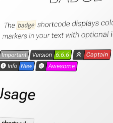
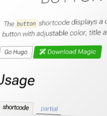
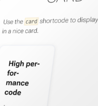
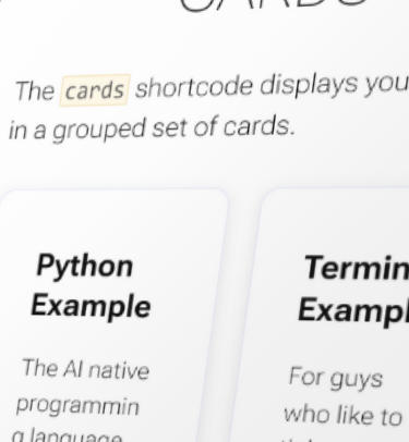
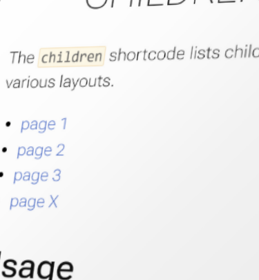
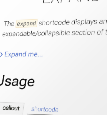
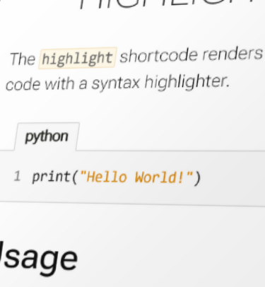
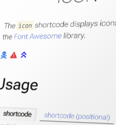
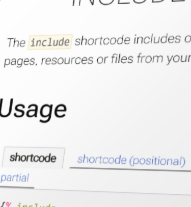
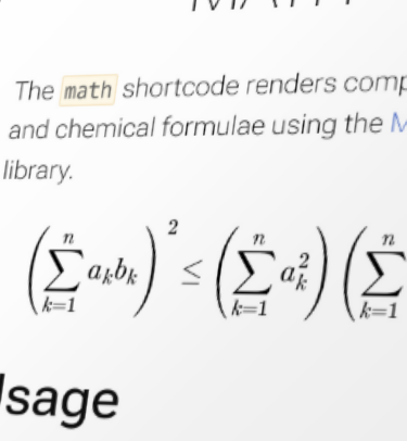
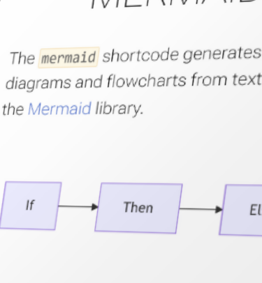
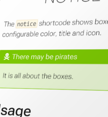
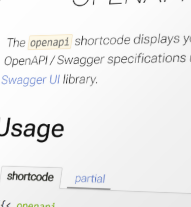
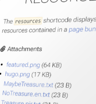
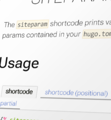
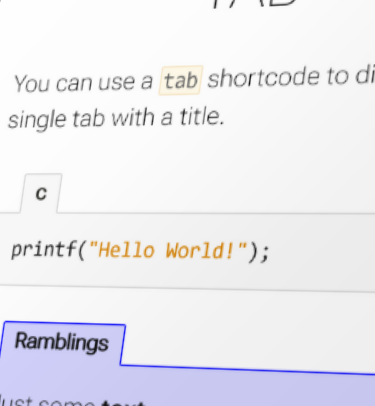
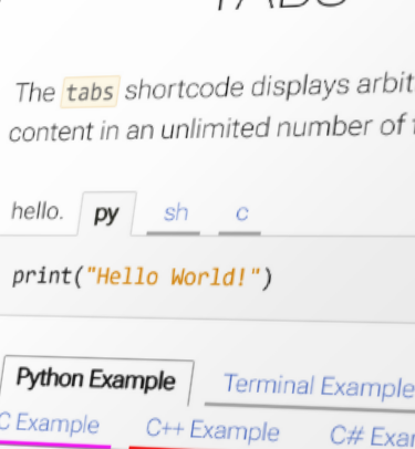
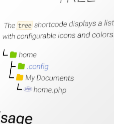

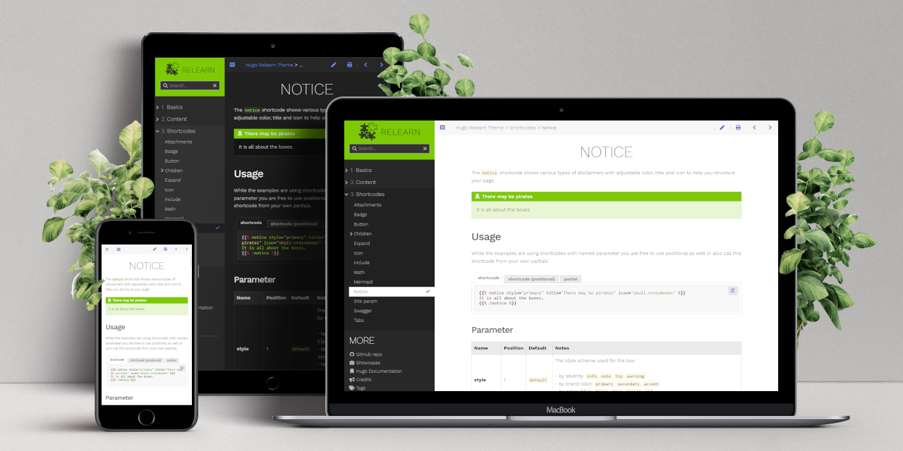