If you’ve followed the Getting Started guide, your directory layout will look similar to this:
content
log
first-day
_index.md
second-day
index.md
third-day.md
_index.md
_index.md
themes
hugo-theme-relearn
…
hugo.toml
Hugo uses a union file system, which lets you combine multiple directories.
By default, it puts your root directory on top of the Relearn theme directory. Files in your root directory will replace theme files in the same location.
For example, if you create a file at layouts/partials/heading.html, it will override the theme’s themes/hugo-theme-relearn/layouts/partials/heading.html.
See this list, to learn which files are allowed to be overridden by you.
This makes it easy to customize the theme without changing files in the themes directory, making future theme updates simpler.
Warning
Don’t edit files inside the themes/hugo-theme-relearn directory. That’s not the recommended way to customize! Refer to the explanation above.
Don’t clone the theme repository and edit files there for your site. That’s not the recommended way to customize! Instead, follow the Getting Started guide.
defaultContentLanguage='en'[languages][languages.en]languageCode='en'languageName='English'title='My Website'weight=1[languages.pir]languageCode='art-x-pir'languageDirection='rtl'languageName='Pirrratish'title='Arrr, my Website'weight=2
defaultContentLanguage:enlanguages:en:languageCode:enlanguageName:Englishtitle:My Websiteweight:1pir:languageCode:art-x-pirlanguageDirection:rtllanguageName:Pirrratishtitle:Arrr, my Websiteweight:2
{"defaultContentLanguage":"en","languages":{"en":{"languageCode":"en","languageName":"English","title":"My Website","weight":1},"pir":{"languageCode":"art-x-pir","languageDirection":"rtl","languageName":"Pirrratish","title":"Arrr, my Website","weight":2}}}
Duplicate your content files and add language codes to their file names:
defaultContentLanguage='en'[languages][languages.en]contentDir='content/en'languageCode='en'languageName='English'title='My Website'weight=1[languages.pir]contentDir='content/pir'languageCode='art-x-pir'languageDirection='rtl'languageName='Pirrratish'title='Arrr, my Website'weight=2
defaultContentLanguage:enlanguages:en:contentDir:content/enlanguageCode:enlanguageName:Englishtitle:My Websiteweight:1pir:contentDir:content/pirlanguageCode:art-x-pirlanguageDirection:rtllanguageName:Pirrratishtitle:Arrr, my Websiteweight:2
{"defaultContentLanguage":"en","languages":{"en":{"contentDir":"content/en","languageCode":"en","languageName":"English","title":"My Website","weight":1},"pir":{"contentDir":"content/pir","languageCode":"art-x-pir","languageDirection":"rtl","languageName":"Pirrratish","title":"Arrr, my Website","weight":2}}}
Duplicate your content files into separate directories named by their language code:
Option By default the theme shows a language switcher in the lower part of the menu.
If you want to have more control, where the language switcher is positioned or you want to configure a different icon, see the chapter on sidebar configuration.
To disable the language switcher set disableLanguageSwitchingButton=true
Option The theme offers a way to version your site. This is useful if you want to keep older versions of your site available while also providing links to the current version. Each site version needs to be created separately and is functional independent of each other.
A version switcher will be displayed at the top of the sidebar if versioning is configured. If the user selects a different version, the theme will navigate to the actual page location but in the selected version. If this page does not exist in the selected version, the 404 page will be displayed.
If you want to have more control, where the version switcher is positioned or you want to configure a different icon, see the chapter on sidebar configuration.
Example: Versioning an Existing Nonversioned Site
Assume, you have written a documentation for an app. At some point you are a releasing a new major version. This new version requires enhanced documentation while the older documentation must still be available for users of the older app version.
Your site’s source files reside in the directory /home/me/mysite on your local disc. The current URL of your site (the value set in baseURL in your hugo.toml) is https://example.com/. When done, the URL of the latest version of your site should not change. The archived version of your site should be available at the URL https://example.com/v1.0/.
This is your intial config file before versioning:
/home/me/mysite/hugo.
baseURL='https://example.com/'
baseURL:https://example.com/
{"baseURL":"https://example.com/"}
To setup versioning, you have to do the following steps:
Prepare /home/me/mysite/hugo.toml of the current version for versioning.
add an array of all available versions
add information, which of these versions is the latest by setting the isLatest option on one item (here onto v2.0) in the versions array
add information, which of these versions your site actually is, by setting the version option (here to v2.0)
After the modifications the config file looks like:
Generate the archived site with the changed configuration and deploy the resulting directory to baseURL (here to https://example.com/v1.0/)
Now you’re ready to edit the content of your current version and proceed with your usual workflow.
A few things to note here:
version must be an identifier of one of the entries in the versions array
you are not limited with the baseURL; these can be absolute or relative to your server root, can also reside in sub-subdirectories or be subdomains
you can generate your archived versions into a sub-directory of the current version (as with this example)
if you generate your archived versions into a sub-directory take care in your workflow not to delete older archived versions during build
the example does not take version control systems into account (like git or subversion) as such a workflow is highly subjective
both sites are completely independent autonomous Hugo sites; if you want to test this setup locally, you will need two running Hugo servers
if you want to test this locally, you will need to adept the top level baseURL parameter as well as the baseURL parameter in the versions array to your local setup; best is to have preconfigured environment configs available
Example: Add a New Version to a Versioned Site
At some point, your version 2 of the app may be deprecated, too, as you’ve released a new version 3.
The structure from the previous example still applys. Your current version of your site’s source files reside in the directory /home/me/mysite on your local disc, the archived version in /home/me/mysite-0.1. The current URL of your site (the value set in baseURL in your hugo.toml) is https://example.com/. When done, the URL of the latest version of your site should not change. The archived version of your site should be available at the URL https://example.com/v2.0/.
You only need to generate the current and the new archived version of your site (v3.0 and v2.0), the former archived version (v1.0) doesn’t need to be generated again..
Prepare /home/me/mysite/hugo.toml of the current version for the new archived version.
add the new archived version to the array of available versions
change information, which of these versions is the latest by setting the isLatest option on one item (here onto v3.0) in the versions array
add information, which of these versions your site actually is, by setting the version option (here to v3.0)
After the modifications the config file looks like:
Generate the archived site with the changed configuration and deploy the resulting directory to baseURL (here to https://example.com/v2.0/)
Now you’re ready to edit the content of your current version and proceed with your usual workflow.
A few things to note here:
you don’t need to regenerate version 1 of your site as long as the version marked with isLatest=true hasn’t changed its baseURL parameter. The old archived versions will access the version index of the latest site using JavaScript to display all currently available versions in the version switcher
with each new version, you will need another Hugo server instance to run a complete local test
Example: Multilingual Setup
If you have a multilingual site and you have different baseURL settings for each language, you need to also configure versioning for each language separately!
To stay with the above example, here’s the configuration for your current version:
/home/me/mysite-2.0/hugo.
[languages][languages.en]baseURL='https://example.com/'contentDir='content/en'languageCode='en'languageName='English'title='My Website'weight=1[languages.en.params]version='v2.0'[[languages.en.params.versions]]baseURL='https://example.com/'identifier='v2.0'isLatest=truetitle='Latest'[[languages.en.params.versions]]baseURL='https://example.com/v1.0/'identifier='v1.0'title='v1.0'[languages.pir]baseURL='https://pir.example.com/'contentDir='content/pir'languageCode='art-x-pir'languageDirection='rtl'languageName='Pirrratish'title='Arrr, my Website'weight=2[languages.pir.params]version='v2.0'[[languages.pir.params.versions]]baseURL='https://pir.example.com/'identifier='v2.0'isLatest=truetitle='Latest'[[languages.pir.params.versions]]baseURL='https://pir.example.com/v1.0/'identifier='v1.0'title='v1.0'
languages:en:baseURL:https://example.com/contentDir:content/enlanguageCode:enlanguageName:Englishparams:version:v2.0versions:- baseURL:https://example.com/identifier:v2.0isLatest:truetitle:Latest- baseURL:https://example.com/v1.0/identifier:v1.0title:v1.0title:My Websiteweight:1pir:baseURL:https://pir.example.com/contentDir:content/pirlanguageCode:art-x-pirlanguageDirection:rtllanguageName:Pirrratishparams:version:v2.0versions:- baseURL:https://pir.example.com/identifier:v2.0isLatest:truetitle:Latest- baseURL:https://pir.example.com/v1.0/identifier:v1.0title:v1.0title:Arrr, my Websiteweight:2
{"languages":{"en":{"baseURL":"https://example.com/","contentDir":"content/en","languageCode":"en","languageName":"English","params":{"version":"v2.0","versions":[{"baseURL":"https://example.com/","identifier":"v2.0","isLatest":true,"title":"Latest"},{"baseURL":"https://example.com/v1.0/","identifier":"v1.0","title":"v1.0"}]},"title":"My Website","weight":1},"pir":{"baseURL":"https://pir.example.com/","contentDir":"content/pir","languageCode":"art-x-pir","languageDirection":"rtl","languageName":"Pirrratish","params":{"version":"v2.0","versions":[{"baseURL":"https://pir.example.com/","identifier":"v2.0","isLatest":true,"title":"Latest"},{"baseURL":"https://pir.example.com/v1.0/","identifier":"v1.0","title":"v1.0"}]},"title":"Arrr, my Website","weight":2}}}
Hiding the Versioning Warning
Option If visitors navigate to an archived version of your site, they will see a versioning warning at the top of each page.
You can disable it be setting the disableVersioningWarning option to true in your hugo.toml.
hugo.
[params]disableVersioningWarning=true
params:disableVersioningWarning:true
{"params":{"disableVersioningWarning":true}}
Adjusting the Versioning Warning
Method 1
You can adjust the text of the versioning warning by overriding the key Versioning-warning in your i18n files.
The following parameters are available to be included in the text:
pageVersion - the element of the displayed page’s version from your versions array
pageUrl - the URL of the displayed page
latestVersion - the element of the version marked with isLatest from your versions array
latestUrl - the URL of the displayed page mapped to the latest version
Method 2
You can override layouts/partials/versioning-warning.html. This is called once a version conflict was recognized. So the only thing for you to do is writing the message.
The following parameters are available in this partial:
The title will be used in meta information of your HTML.
hugo.
title='Hugo Relearn Theme'
title:Hugo Relearn Theme
{"title":"Hugo Relearn Theme"}
Site Description
Front Matter The theme shows a site description in various places, such as RSS feeds and meta tags. For this, it uses the description field from your home page’s front matter.
Social Media Images
When your page is shared on social media, you can set a site-wide image to display with the link
hugo.
images=['images/hero.png']
images:- images/hero.png
{"images":["images/hero.png"]}
More Social Media Options
The theme adheres to Hugo’s official documentation for Open Graph and Twitter Cards configuration.
Deployment Scenarios
Offline Usage
The theme is usable offline. No internet connection is required to load your page. This is achieved by storing all dependencies within the theme.
No calls to 3rd party servers, no calling home, no tracking. Privacy friendly.
Server Deployment
If your server deployment has no special requirements, you can skip this section and use the standard Hugo options.
For special requirements, the theme is capable of different scenarios, requiring the following mandatory settings in your hugo.toml. All settings not mentioned in the examples below can be set to your liking.
If you are still using Hugo’s relref shortcode (which you shouldn’t), you will need further configuration.
Warning
Don’t use a baseURL with a subdirectory and relativeURLs=true together. Hugo doesn’t apply the baseURL correctly in this case. If you need both, generate your site twice with different settings into separate directories.
Private Web Server (LAN)
The same settings as with any of the public web server scenarios or
hugo.
baseURL='/'relativeURLs=true
baseURL:/relativeURLs:true
{"baseURL":"/","relativeURLs":true}
File System
Your generated site can be used headless without a HTTP server.
This can be achieved by using the file:// protocol in your browser’s address bar or by double click on a generated *.html file in your file navigation tool.
Use the following settings
hugo.
baseURL='/'relativeURLs=true
baseURL:/relativeURLs:true
{"baseURL":"/","relativeURLs":true}
Note
Pages like sitemap.xml and rss.xml, and social media links will always use absolute URLs. They won’t work with relativeURLs=true.
This shall not prevent any technical storage or access for the sole purpose of carrying out the transmission of a communication over an electronic communications network, or as strictly necessary in order for the provider of an information society service explicitly requested by the subscriber or user to provide the service.
Stored Theme Information
The theme stores the following information in localstorage or sessionstorage.
The scroll position of the content area to be restored on browser back navigation.
This cannot be turned off.
Selected tab of a tab group to apply the selection to other tab groups on the present page and all following presented pages.
This cannot be turned off.
Currently applicable search term to carry over to the following presented pages. This will be used to mark the search term in the page’s text.
By default this adds a printer icon in the topbar but can be deactived. Clicking it switches to print preview, showing the page and its visible subpages in a printer-friendly format. Use your browser’s print function to print or save as PDF.
The URL won’t be configured ugly for Hugo’s URL handling, even with uglyURLs=true in hugo.toml. This is because each mime type can only have one suffix.
If you don’t like the URLs, you can reconfigure outputFormats.print in your hugo.toml to something other than the default of:
Enable support to show the source code of a page if it was generated from a file. Add the source output format to your home, section, and page in hugo.toml:
By default this adds a Source icon in the topbar but can be deactived. Clicking it switches to the source code of the page.
The Source output format differs from the Markdown format, as it prints the source code as is including the front matter.
The URL won’t be configured ugly for Hugo’s URL handling, even with uglyURLs=true in hugo.toml. This is because each mime type can only have one suffix.
If you don’t like the URLs, you can reconfigure outputFormats.source in your hugo.toml to something other than the default of:
Option The theme creates a unique ID for each build and adds it to each referenced asset’s URL to make browsers not keep outdated cached assets.
This is good for production sites but can be problematic during development. It makes comparing outputs difficult as each build has new IDs.
To disable this, set disableAssetsBusting=true.
hugo.
[params]disableAssetsBusting=true
params:disableAssetsBusting:true
{"params":{"disableAssetsBusting":true}}
Disabling IDs for Interactive HTML Elements
Option Features like expanders, notices, and tabs use unique IDs to work. These IDs change with each build.
This is necessary for the theme to work properly, but it can make comparing outputs between builds difficult.
To turn this off, set disableRandomIds=true. Note, that this will result in a non-functional site!.
hugo.
[params]disableRandomIds=true
params:disableRandomIds:true
{"params":{"disableRandomIds":true}}
Disabling Assets Minification
Option If minify=true, further theme assets will be minified during build. If no value is set, the theme will avoid minification if you have started with hugo server and otherwise will minify.
An interactive tool to generate color variant stylesheets
Subsections of Branding
Logo & Title
Changing the Favicon
If your favicon is an SVG, PNG, or ICO, just drop your image in your site’s assets/images/ or static/images/ directory and name it favicon.svg, favicon.png, or favicon.ico respectively.
If you want to adjust your favicon according to your OS settings for light/dark mode, add the image files assets/images/favicon-light.svg and assets/images/favicon-dark.svg to your site’s directory, respectively, corresponding to your file format. In case some of the files are missing, the theme falls back to favicon.svg for each missing file. All supplied favicons must be of the same file format.
If no favicon file is found, the theme will look up the alternative filename logo in the same location and will repeat the search for the list of supported file types.
If you need to change this default behavior, create a new file layouts/partials/favicon.html in your site’s directory and write something like this:
Option The site title of your hugo.toml will be used for the text at the top of the sidebar. If you want to show a different text in the sidebar, you can overwrite it by setting params.linkTitle.
If the title is to long to fit on a single line it is automatically wrapped.
If you want manual control over the line breaks, you can insert newline characters.
If you want no text at all, set it to a string containing only whitespace like " ".
hugo.
[params]linkTitle="Relearn\nis the greatest\ntheme since\nsliced bread"
params:linkTitle:|- Relearn
is the greatest
theme since
sliced bread
{"params":{"linkTitle":"Relearn\nis the greatest\ntheme since\nsliced bread"}}
Changing the Title Font Settings
You can change font settings with the following CSS variables
The --LOGO-LINK-color variable sets the color of the logo link text, while --LOGO-LINK-HOVER-color sets the color when hovering over the logo.
Setting Direction of Title & Logo
You can control the layout direction of the logo and title:
hugo.
[params][params.logo]direction='column'
params:logo:direction:column
{"params":{"logo":{"direction":"column"}}}
Valid values are:
row (default) - Logo and title side by side
column - Logo above title
Changing the Logo
Option The theme displays a logo in the sidebar menu if found. By default, it automatically detects logos in your site’s assets/images/.
Auto-Detection
If you don’t configure a logo explicitly, the theme automatically searches for a logo file in the global /assets directory and all its subdirectories named *logo*.
If no logo is found, only your site title will be shown.
The size of the logo will adapt automatically to an opinionated default. See below on how to resize it.
Manual Configuration
You can explicitly configure a logo in your site’s params.toml. This will override automatic detection:
hugo.
[params][params.logo]src='/images/magic.gif'
params:logo:src:/images/magic.gif
{"params":{"logo":{"src":"/images/magic.gif"}}}
To disable the logo entirely, set src to a string containing only whitespace:
hugo.
[params][params.logo]src=' '
params:logo:src:' '
{"params":{"logo":{"src":" "}}}
Variant-Specific Logos
The theme supports displaying different logos for different color variants. This allows you to have logos that match each theme variant’s color scheme (e.g., light logo for dark themes, dark logo for light themes).
Variant-specific logos take precedence over the global logo.src setting. If a variant doesn’t specify a logo, the global logo setting will be used.
To configure variant-specific logos, use the logo field within your themeVariant configuration:
The theme automatically switches between logos when the user selects a different variant. Logos with the same src are grouped together for performance optimization, reducing the number of images loaded.
To disable the logo for a specific variant while keeping the default logo for others, set the variant’s src to a whitespace string:
The theme provides CSS variables to customize the logo’s size. You can add these to layouts/partials/custom-header.html. The logo image has a default width of 4em. The height is determined by the aspect ratio of the logo.
<style>:root{--LOGO-IMAGE-width:6rem;}</style>
Coloring SVG Logos
If you have a monochrome SVG logo and want to display it in the variants color for the logo text, it is mandatory to give it the inlinecontentimage effect. This is not set in the automatic logo detection.
The recoloring applies to all black elements in your SVG:
For advanced customization beyond configuration options, you can override the logo partial entirely.
Create a new file layouts/partials/logo.html in your site’s directory. Then write any HTML you want. You could use an img HTML tag and reference an image, or you could paste an SVG definition!
Example
Suppose you’ve stored your logo as static/images/logo.png and want full control over the HTML:
When overriding the logo partial, you replace all built-in logo functionality including auto-detection and variant-specific logos. Use this only when the configuration options don’t meet your needs.
Colors
The Relearn theme offers color variants to change your site’s appearance. Each color variant contains of a CSS file and optional settings in your hugo.toml.
Place your theme file in assets/css or themes/hugo-theme-relearn/assets/css. Name it theme-*.css.
In the above example, the path of your theme file must be assets/css/theme-relearn-light.css or themes/hugo-theme-relearn/assets/css/theme-relearn-light.css.
Multiple Variants
To let the reader choose between multiple variants by displaying a variant switcher, set themeVariant like this:
The first variant is the default, and a selector will appear if there’s more than one.
If you want to have more control, where the variant switcher is positioned or you want to configure a different icon, see the chapter on sidebar configuration.
Use the auto value to match OS light/dark settings. Usually it makes sense to set it in the first position and make it the default.
hugo.
[params]themeVariant=['auto','red']
params:themeVariant:- auto- red
{"params":{"themeVariant":["auto","red"]}}
If you don’t configure anything else, the theme will default to use relearn-light for light mode and relearn-dark for dark mode.
Default is relearn-light for light and relearn-dark for dark mode. These defaults are overwritten by the first two non-auto options of your themeVariant array.
You can override the default with themeVariantAuto:
hugo.
[params]themeVariantAuto=['learn','neon']
params:themeVariantAuto:- learn- neon
{"params":{"themeVariantAuto":["learn","neon"]}}
Advanced
The theme offers an advanced way to configure theme variants and all of the aspects above inside of a single configuration item. This comes with some features previously unsupported.
Like with the multiple variants option, you are defining your theme variants in an array but now in a table with suboptions.
Again, in this case, the first variant is the default chosen on first view and a variant selector will be shown in the menu footer if the array contains more than one entry.
The identifier option is mandatory and equivalent to the string in the first example. Further options can be configured, see the table below.
Parameters
Name
Default
Notes
identifier
<empty>
Must correspond to the name of a color variant either in your site’s or the theme’s directory in the form assets/css/theme-<IDENTIFIER>.css.
name
see notes
The name to be displayed in the variant selector. If not set, the identifier is used in a human readable form.
auto
<empty>
If set, the variant is treated as an auto mode variant. It has the same behavior as the themeVariantAuto option. The first entry in the array is the color variant for light mode, the second for dark mode. Defining auto mode variants with the advanced options has the benefit that you can now have multiple auto mode variants instead of just one with the simple options.
If true, the variant will not be shown in the variant switcher but is still available for internal use (e.g. to override parameter when used as a sub-variant of an auto mode variant).
In case you like a shipped variant but only want to tweak some aspects, you have some choices. Don’t edit the file in the theme’s directory! You will lose the ability to later easily upgrade your theme to a newer version.
Copy and change
You can copy the shipped variant file from the theme’s themes/hugo-theme-relearn/assets/css directory to the site’s assets/css directory and either store it with the same name or give it a new name. Edit the settings and save the new file. Afterwards, you can use it in your hugo.toml by the chosen name.
Create and import
You can create a new variant file in the site’s assets/css directory and give it a new name. Import the shipped variant, add the settings you want to change and save the new file. Afterwards, you can use it in your hugo.toml by the chosen name.
For example, you want to use the relearn-light variant but want to change the syntax highlighting schema to the one used in the neon variant. For that, create a new assets/css/theme-my-branding.css in your site’s directory and add the following lines:
@import"theme-relearn-light.css";:root{--CODE-theme:neon;/* name of the chroma stylesheet file */--CODE-BLOCK-color:rgba(226,228,229,1);/* fallback color for code text */--CODE-BLOCK-BG-color:rgba(40,42,54,1);/* fallback color for code background */}
Afterwards, put this in your hugo.toml to use your new variant:
hugo.
[params]themeVariant='my-branding'
params:themeVariant:my-branding
{"params":{"themeVariant":"my-branding"}}
In comparison to copy and change, this has the advantage that you profit from any adjustments to the relearn-light variant while keeping your modifications.
Non-standard Modifications
You may feel tempted to add further modifications besides just setting CSS variables in your custom variant stylesheet.
While this is possible, please note that due to the way the theme uses the variant files, the following will not work
@font-face rules - they need to be moved to assets/css/fonts.css, assets/css/custom.css or layouts/partials/custom-header.html
rules selecting the html element - replace html with :root
React to Variant Switches in JavaScript
Once a color variant is fully loaded, either initially or by switching the color variant manually with the variant selector, the custom event themeVariantLoaded on the document will be dispatched. You can add an event listener and react to changes.
If you want to switch the syntax highlighting theme together with your color variant, first you need to configure your installation according to Hugo’s documentation to provide a syntax highlighting stylesheet file.
hugo.
[markup][markup.highlight]noClasses=false
markup:highlight:noClasses:false
{"markup":{"highlight":{"noClasses":false}}}
You can use one of the shipped stylesheet files or use Hugo to generate a file for you.
hugo gen chromastyles --style=monokai > chroma-mycode.css
The file must be written to assets/css/chroma-<NAME>.css. To use it with your color variant, you have to modify --CODE-theme: <NAME> in the color variant stylesheet file.
@import"theme-relearn-light.css";:root{--CODE-theme:mycode;/* name of the chroma stylesheet file */}
Change 3rd-Party Libraries Theming
Some of the shipped shortcodes are using 3rd-party libraries. See the individual shortcode documentation on how to change their theming.
This interactive tool may help you to generate your own color variant stylesheet.
Show usage instructions
To get started, first select a color variant from the variant selector in the lower left sidebar that fits you best as a starting point.
The graph is interactive and reflects the current colors. You can click on any of the colored boxes to adjust the respective color. The graph and the page will update accordingly.
The arrowed lines reflect how colors are inherited through different parts of the theme if the descendant isn’t overwritten. If you want to delete a color and let it inherit from its parent, just delete the value from the input field.
To better understand this, select the neon variant and modify the different heading colors. There, colors for the headings h2, h3 and h4 are explicitly set. h5 is not set and inherits its value from h4. h6 is also not set and inherits its value from h5.
Once you’ve changed a color, the variant selector will show a “My custom variant” entry and your changes are stored in the browser. You can browse to other pages and even close the browser without losing your changes.
Once you are satisfied, you can download the new variants file and copy it into your site’s assets/css directory.
Option Afterwards, you have to adjust the themeVariant option in your hugo.toml to your chosen file name. For example, if your new variants file is named theme-my-custom-zen-light.css, you have to set themeVariant='my-custom-zen-light' to use it.
Option Turn on showVisitedLinks=true to see checkmarks next to visited pages in the main menu. This also adds a history clearer button at the bottom of the menu to remove all checkmarks.
If you want to have more control, where the history clearer is positioned or you want to configure a different icon, see the chapter on sidebar configuration.
Note that checkmarks will disappear if you rebuild your site, as the page IDs may change.
hugo.
[params]showVisitedLinks=true
params:showVisitedLinks:true
{"params":{"showVisitedLinks":true}}
Footer
To change the menu footer, edit the layouts/partials/menu-footer.html file. Check out the Partials section for more ways to customize your site.
You only need to change these if you have own content created for those URLs. This can happen with uglyURLs=true in hugo.toml and having a content file at content/search.md.
Check for duplicate URLs by running hugo --printPathWarnings.
Search Adapter / Engine
Option The theme supports different search engines through adapters. Each different adapter may have its own set of configuration.
Lunr doesn’t support all languages of the theme. Unsupported languages will show errors in the browser console. Currently unsupported are
Czech
Indonesian
Persian
Polish
Swahili
Ukrainian
Mixed Language Support
Option In case your page’s content contains text in multiple languages (for example, you are writing a Piratish documentation for your English API), you can set those languages in search.adapter.params.additionalContentLanguage to broaden the search.
By default, the theme uses /_relearn_searchindex.js to generate the search index. When you specify a custom value for search.index.template, the theme will look for the template file in your site’s assets directory.
For example, if you set search.index.template = '/custom_searchindex.js', you would need to create a file at assets/custom_searchindex.js in your site to define the custom index generation logic.
This advanced option is useful if you need to modify how content is indexed or change the structure of the search index to work with custom search implementations.
Customizing the Search Page Layout
Option You can customize the appearance of the dedicated search page by changing its content view:
By default, the theme uses _relearn_searchpage as the search content view. When you specify a custom value for search.page.type=[YOUR-VIEWNAME], Hugo will look for a template file at layouts/[YOUR-VIEWNAME]/article.html.
For example, if you set search.page.type = 'custom_search_layout', you would need to create a file at layouts/custom_search_layout/article.html in your site to define the custom layout.
This allows you to maintain the search functionality while adapting its appearance to match your specific design requirements.
Migration from Relearn 7
In previous versions of the theme, search configuration used flat parameters. The current version uses a more structured approach with a search namespace.
If you’re updating from an older version, here’s how to migrate your search configuration:
Option Configuration options in your hugo.toml apply to all menus.
Front Matter In case of page structure menus, individual configuration is done via a page’s front matter.
Menu. In case of Hugo menus, individual configuration is done via a menu entry’s configuration.
Expand State of Submenus
OptionFront Matter You can change how submenus appear with alwaysopen.
Menu For Hugo menus, you have to set params.alwaysopen instead.
If alwaysopen=false for any given entry, its children will not be shown in the menu as long as it is not necessary for the sake of navigation.
The theme generates the expand state based on the following rules:
all parent entries of the active page including their visible siblings are shown regardless of any settings
immediate child entries of the active entry are shown regardless of any settings
if not overridden, all other first level entries behave like they would have been given alwaysopen=false
if not overridden, all other entries of levels besides the first behave like they would have been given alwaysopen=true
all visible entries show their immediate child entries if alwaysopen=true; this proceeds recursively
all remaining entries are not shown
[params]alwaysopen=false
params:alwaysopen:false
{"params":{"alwaysopen":false}}
Expander for Submenus
OptionFront Matter Set collapsibleMenu=true to show submenus as collapsible trees with a clickable expander.
Menu For Hugo menus, you have to set params.collapsibleMenu=true instead.
[params]collapsibleMenu=true
params:collapsibleMenu:true
{"params":{"collapsibleMenu":true}}
Warning
Using this option may cause degraded build performance by slowing down your build process.
This is usually the case for menus with many entries and happens for page menus as well as for Hugo menus.
We’ve seen builds taking 2 minutes with 1000+ pages, and over 30 minutes with 5000+ pages when using a page menu.
This happens because each new page affects all other pages, leading to exponentially longer build times.
Ordering Menu Entries
By Hugo’s Default Sort Order
Front MatterMenu Hugo provides a simple way to handle order of your entries taking into account the weight, date and linkTitle front matter .
Menu Hugo menus can only be sorted by weight.
weight=5
weight:5
{"weight":5}
By Other
OptionFront Matter Use ordersectionsby to sort by other aspects if Hugo’s default sort order does not match your needs. See the children shortcode for a complete list.
[params]ordersectionsby='linktitle'
params:ordersectionsby:linktitle
{"params":{"ordersectionsby":"linktitle"}}
Title for Menu Entries
Front Matter A page’s linkTitle or title front matter will be used for naming a menu entry of a page menu, in that order if both are defined. Using linkTitle helps to shorten the text for menu entries if the page’s title is too descriptive.
Menu A menu entry’s title or name will be used for naming a menu entry of a Hugo menu, in that order if both are defined.
For example for a page named install/linux.md
+++linkTitle='Linux'title='Install on Linux'+++
---linkTitle:Linuxtitle:Install on Linux---
{"linkTitle":"Linux","title":"Install on Linux"}
Icons for Menu Entries
Front Matter For page menus, add a menuPre to insert any HTML code before the menu label. You can also set menuPost to insert HTML code after the menu label.
Menu For Hugo menus, add a pre to insert any HTML code before the menu label. You can also set post to insert HTML code after the menu label.
If pageRef is set for the menu entry and no pre or post was configured, menuPre and menuPost of the referenced page will be taken.
The example below uses the GitHub icon for an entry of a page menu.
You may want to structure your entries in a hierarchical way but don’t want to generate clickable parent entries? The theme got you covered.
For Page Menus
To stay with the initial example: Suppose you want log/first-day appear in the sidebar but don’t want to generate a page for it. So the entry in the sidebar should not be clickable but should be expandable.
For this, open content/log/first-day/_index.md and add the following front matter
+++[build]render='never'+++
---build:render:never---
{"build":{"render":"never"}}
For Hugo Menus
Just don’t give your parent menu entry configuration a url or pageRef. See the next section for a special case.
If you want to learn how to configure different Hugo menus for each language, see the official docs.
The following example will not generate clickable menu entries for the Parent 1 and Parent 2 menu entries.
By default, the theme supports one additional Hugo menu below the page menu in the sidebar named shortcuts. You only need to configure it in your hugo.toml to appear in your sidebar. For example:
Front Matter For page menus, set the menuTitle front matter for the root page of the menu. For example in the home page for the default sidebar menu. If no menuTitle was set, the title will be taken from your translation files by the key <identifier>-menuTitle, where <identifier> is the identifier of your sidebar menu configuration.
Menu For Hugo menus, the title will be taken from your translation files by the key <identifier>-menuTitle, where <identifier> is the identifier of your sidebar menu configuration.
If you don’t want to fiddle around with your translation files, you also have the possibility to let the title be taken from the menu definition. For that, define a nested menu that only has one top-level entry without url or pageRef.
In this case, the title or name is taken for the menu heading.
If you want to learn how to configure different Hugo menus for each language, see here.
+++[menu][[menu.addendum]]identifier='addendum-top'name='A Menu Title for the Whole Menu'[[menu.addendum]]name='A Menu Entry Title for Child 1'parent='addendum-top'url='https://example.com/1'weight=1[[menu.addendum]]name='A Menu Entry Title for Child 2'parent='addendum-top'url='https://example.com/2'weight=2+++
---menu:addendum:- identifier:addendum-topname:A Menu Title for the Whole Menu- name:A Menu Entry Title for Child 1parent:addendum-topurl:https://example.com/1weight:1- name:A Menu Entry Title for Child 2parent:addendum-topurl:https://example.com/2weight:2---
{"menu":{"addendum":[{"identifier":"addendum-top","name":"A Menu Title for the Whole Menu"},{"name":"A Menu Entry Title for Child 1","parent":"addendum-top","url":"https://example.com/1","weight":1},{"name":"A Menu Entry Title for Child 2","parent":"addendum-top","url":"https://example.com/2","weight":2}]}}
Defining Sidebar Menus
OptionFront Matter Menus are defined for individual areas of the sidebar:
sidebarheadermenus: the non-scrolling area below the search box
sidebarmenus: the scrolling area below the search box
sidebarfootermenus: the area at the bottom of the sidebar
As these options are arrays, you can define as many menus, as you like in each area. Each menu is displayed as a distinct block in their area. You can configure titles for each menu and dividers between multiple menus.
If you don’t set these options in your hugo.toml, the theme defaults as follows:
sidebarheadermenus:
a divider to separate from the logo (depending on the color configuration of the theme variant) if any of the following is configured
multiple consecutive dividers are removed by the theme if no other content is in between them
if you redefine the homelinks like displayed above, you have to define a Hugo menu to replicate the implicit default configuration
for the shortcuts if the implicit default configuration is active, the value for disableTitle will be determined by your configuration for disableShortcutsTitle.
Page Menu
The page menu generates a menu tree out of your directory structure. You can give it a starting page from where the tree is generated down. If no starting page is given, the home page is used.
Name
Default
Notes
type
<empty>
page, required
identifier
<empty>
Optional with no special meaning besides for error messages
main
true
Whether to add additional spacing and larger text to the menu
disableTitle
true
Whether to print a title above the menu
pageRef
/
The path of the page to start the menu tree
Hugo Menu
The Hugo menu generates a menu tree out of a Hugo menu definition with the same identifier.
Name
Default
Notes
type
<empty>
menu, required
identifier
<empty>
The identifier of the menu definition in your hugo.toml
main
false
Whether to add additional spacing and larger text to the menu
disableTitle
false
Whether to print a title above the menu; for the predefined shortcuts menu, accounts to the setting of disableShortcutsTitle
Custom
The custom menu allows you to define arbitrary HTML snippets wrapped inside of a li element. There is no title available to print above these menus.
Name
Default
Notes
type
<empty>
custom, required
identifier
<empty>
Optional with no special meaning besides for error messages
main
false
Whether to add additional spacing and larger text to the menu
elements
<empty>
The list of snippets, contained in layouts/partials/sidebar/element, to be displayed. See below.
Custom Element
An HTML element snippet of a custom menu has its own parameter. Self-defined snippets have further parameters that are passed to your snippet partial when called. Your snippets must be stored in layouts/partials/sidebar/element and the name of the snippet partial needs to be <TYPE>.html where <TYPE> is the type of the element.
Name
Default
Notes
type
<empty>
The theme ships with the following snippets:
- languageswitcher: will display the language switcher - variantswitcher: will display the variant switcher - versionswitcher: will display the version switcher - historyclearer: will display a button to clear the history of visited links
icon
see notes
Font Awesome icon name set to the left of the list entry. Depending on the type there is a default icon. Any given value will overwrite the default.
Divider
A horizontal ruler
Name
Default
Notes
type
<empty>
divider
identifier
<empty>
Optional with no special meaning besides for error messages
Example
The following example
configures the language switcher and history clearer into the menu header
changes the icon of the language switcher to
only shows the page menu in the main sidebar section
keeps the menu footer empty
Note
If you want to reconfigure the sidebar menus, you have to copy over everything from the default configuration you want to keep as reconfiguration will reset all sidebar menus.
Suppose you are building a site that contains a topmost log and ship section.
When the user is on one of the log pages he should only see a page menu containing all log pages, while on one of the ship pages she should only see a page menu containing all sub pages of the ship section.
For both sections, the default shortcuts Hugo menu should be displayed as if defaults menus were used.
Directory structure:
content
log
first-day.md
second-day.md
third-day.md
_index.md
ship
cargo.md
midst.md
upper.md
_index.md
_index.md
OptionFront Matter Using Hugo’s cascade feature, we can redefine the menus once in log/_index.md and ship/_index.md setting sidebarmenus so they will be used in all children pages.
Setting the sidebarmenus Front Matter will overwrite all default menus. If you want to display the shortcuts Hugo menu as well like in this example, you have to declare it with the Front Matter as given in the default options.
You may have the need to add arbitrary links at some point in your menu that should redirect to other pages in your site structure. These are called crosslinks.
Assume the following structure
content
log
first-day.md
second-day.md
third-day.md
_index.md
burning-sail-incident.md
kraken-incident.md
_index.md
You now want to add a top level menu entry that points to third-day as separate crows-nest-incident.
For that create a new page with the following front matter
Front Matter If you want to link to an external page instead, you can use menuUrl instead of menuPageRef.
Pages defining a crosslink are never part of the arrow navigation and are skipped instead.
So with the above example and alphabetical sorting of the menu entries, pressing on kraken-incident page will skip the newly added crows-nest-incident and instead will load burning-sail-incident.
Having sub pages below a page that has menuUrl or menuPageRef set in their front matter is undefined.
Displaying Pages Exclusively in a Hugo Menu
Sometimes you want to hide pages from the page menu but instead want to show them in a Hugo menu. For that you have two choices
Create a headless branch bundle, _index.md in its own folder with the below front matter. The branch bundle will not be contained in the sitemap.
Or, put a child page inside a headless branch bundle with the following front matter in the bundle. This causes the child but not the branch bundle to be contained in the sitemap.
The theme adjusts the content width when you resize your browser.
If you want to change the chosen default width, you can add CSS variables to layouts/partials/custom-header.html.
Changing the Main Area’s Maximum Width
The main area has a default maximum width of 80.25rem for better readability. If you want to change this, you can set a CSS variable
For full width, use a large value like 1000rem.
<style>:root{--MAIN-MAX-width:1000rem;}</style>
Titles & Breadcrumbs
Breadcrumbs
Learn how to turn off the breadcrumbs completely and further configure the topbar.
Option Set disableRootBreadcrumb=true to remove the root breadcrumb which often feels redundant. This will also apply to the breadcrumbs of the search results and taxonomy pages.
Option You can override the default breadcrumb separator by using breadcrumbSeparator='/'. This separator will also be used in the breadcrumbs of the search results and taxonomy pages.
Option By default the term pages of a taxonomy will display the breadcrumb for each page. Set disableTermBreadcrumbs=true to remove the breadcrumb if the term pages look to cluttered.
Option You can override the default title separator by using titleSeparator='|'.
hugo.
[params]titleSeparator='|'
params:titleSeparator:'|'
{"params":{"titleSeparator":"|"}}
Page Meta Information
The theme supports a default display of page meta information in layouts/partials/content-footer.html.
The content footer dynamically pulls information based on the availability of GitInfo metadata. If Git information is present, it uses the author’s name, email, and the date from the Git commit details. This ensures that the displayed information is always up-to-date with the latest modifications.
In cases where Git information is not available, the theme falls back to LastModifierDisplayName, LastModifierEmail, and Datedefined in the page’s front matter.
Disable Display of Author’s Name
Option You can disable the output of an author’s name and its according email address by setting this parameter to true.
hugo.
[params]hideAuthorName=true
params:hideAuthorName:true
{"params":{"hideAuthorName":true}}
Disable Display of Author’s Email
Option The author’s email, when displayed, is presented as a clickable mailto link, providing a convenient way for readers to reach out. You can disable the output of an author’s email address by setting this parameter to true.
hugo.
[params]hideAuthorEmail=true
params:hideAuthorEmail:true
{"params":{"hideAuthorEmail":true}}
Disable Display of Authoring Date
Option # If the standard content-footer finds an authoring date, you can disable its output by setting this parameter to true.
hugo.
[params]hideAuthorDate=true
params:hideAuthorDate:true
{"params":{"hideAuthorDate":true}}
Adjust the Timestamp Format
Option You can overwrite the default date format used when displaying a pages meta information. See the Hugo docs for possible values.
hugo.
[params]dateFormat=':date_medium'
params:dateFormat::date_medium
{"params":{"dateFormat":":date_medium"}}
Headings
Headings can have anchor links that appear when you hover over them.
You can change what happens when you click the anchor icon in your hugo.toml file. By default, all options are turned on. If you turn off all options, no anchor icon will show up when you hover.
Copy Anchor Links
Option Set disableAnchorCopy=true to prevent copying the anchor link when you click the icon.
hugo.
[params]disableAnchorCopy=true
params:disableAnchorCopy:true
{"params":{"disableAnchorCopy":true}}
Scroll to Heading
Option Set disableAnchorScrolling=true to stop the page from scrolling to the heading when you click the anchor icon.
Option By default, the theme adds index.html to page links when uglyURLs=false (Hugo’s default).
If you’re only using a web server scenario and dislike this, you can reset to Hugo’s default behavior by settings disableExplicitIndexURLs=true.
For the file system scenario, you are not allowed to change this value.
hugo.
[params]disableExplicitIndexURLs=true
params:disableExplicitIndexURLs:true
{"params":{"disableExplicitIndexURLs":true}}
Legacy Cross-Language Links
You can link to pages of different languages by appending the lang query parameter with the language code to the URL, e.g. /my-page?lang=pir.
In previous releases of the theme you had to prepend the language code to the URL, e.g. /pir/my-page to achieve this.
If you still need the old behavior, you can set enableLegacyLanguageLinks=true in your hugo.toml. Note that this legacy feature may be removed in the future.
Patching the relref Shortcode
Option While the usage of relref is obsolete and discouraged by Hugo for a while, existing installations may still use it.
In configurations using a baseURL with a subdirectory and having relativeURLs=false (the default), Hugo’s standard relref implementation is failing.
To work around this, you can activate a patched version of the shortcode by setting disableDefaultRelref=true.
Hidden pages are created but not shown in the navigation. This is useful for pages you only want to access via a direct link.
When you visit a hidden page’s URL, it will appear in the navigation menu.
Hidden pages can also have hidden subpages, creating multiple levels of hiding.
By default, hidden pages are only hidden from human visitors. Search engines can still find them by crawling your site and the pages are linked in your taxonomies and site search. You can prevent this with these options.
Hide from Search
Option To remove hidden pages from search results, use disableSearchHiddenPages=true.
hugo.
[params]disableSearchHiddenPages=true
params:disableSearchHiddenPages:true
{"params":{"disableSearchHiddenPages":true}}
Hide from Search Engines
Option To hide pages from search engines by removing them from the sitemap, RSS feed and make them nofollow, use disableSeoHiddenPages=true.
hugo.
[params]disableSeoHiddenPages=true
params:disableSeoHiddenPages:true
{"params":{"disableSeoHiddenPages":true}}
Hide from Taxonomies
Option To prevent hidden pages from appearing on taxonomy and term pages, use disableTagHiddenPages=true. If this makes a term’s count zero, an empty term page will still be created but not linked.
You can call other partials from themes/hugo-relearn-themes/ besides those in themes/hugo-relearn-themes/layouts/partials/_relearn. However, using partials not mentioned as customizable below might make future updates more challenging.
Customizable Partials
The Relearn theme allows you to customize various parts of the theme by overriding partials. This makes the theme highly configurable.
A good rule to follow: The less code a partial contains, the easier it will be to update the theme in the future.
Here’s a list of partials you can safely override:
layouts/partials/content.html: The main content of a page. Override this to display additonal page metadata.
layouts/partials/content-header.html: The header above the title. By default, it shows tags, but you can change this.
layouts/partials/content-footer.html: The footer below the content. By default, it shows author info, modification dates, and categories. You can customize this.
layouts/partials/custom-header.html: For adding custom CSS. Remember to include the style HTML tag.
layouts/partials/custom-footer.html: For adding custom JavaScript. Remember to include the script HTML tag.
layouts/partials/favicon.html: The favicon. You should definitely customize this.
layouts/partials/heading.html: the page’s title headings
layouts/partials/heading-pre.html: Add content before the page’s title headings. Remember to consider the headingPre front matter.
layouts/partials/heading-post.html: Add content after the page’s title headings. Remember to consider the headingPost front matter.
layouts/partials/logo.html: The logo in the top left corner. You should customize this.
layouts/partials/menu-pre.html: Add content before menu items. Remember to consider the menuPre front matter.
layouts/partials/menu-post.html: Add content after menu items. Remember to consider the menuPost front matter.
layouts/partials/menu-footer.html: The footer of the left menu.
You can override other partials from themes/hugo-relearn-themes/, but be careful as this might make future updates more difficult.
Adding Scripts
A common question is how to add extra CSS styles or JavaScript to your site. This depends on what you need.
Adding JavaScript or Stylesheets to All Pages
Simple Solution
Previous documentation of Hugo recommended adding css/custom.css and/or js/custom.js to your static or assets directory. This is supported by the theme.
To gain more flexibility, see the next section below.
Flexible Solution
To add CSS stylesheets, JavaScript files or any other addition to the <head> of every page, you can include them in layouts/partials/custom-header.html or layouts/partials/custom-footer.html.
However, this can make your site larger than necessary if these files are only needed on a few pages. The next section explains how to add dependencies only when needed.
This way of customization will discard the mechanism for the simple solution above. You will have to add code for inclusion of css/custom.css and/or js/custom.js yourself if you still need this.
Custom Shortcodes with Dependencies
Some shortcodes need extra JavaScript and CSS files. The theme only loads these when the shortcode is used. You can use this for your own shortcodes too.
For example, to create a shortcode called myshortcode that needs the jquery library:
Create the shortcode file layouts/shortcodes/myshortcode.html and add the folloging line somewhere:
Give a unique name for the location parameter when you call it, so you can distinguish your loaders behavior depending on the location it was called from.
Link Effects
This page shows you, how to configure custom link effects on top of existing ones.
Nevertheless, your requirements may differ from this configuration. Luckily, the theme has you covered as the topbar, its buttons, and the functionality behind these buttons are fully configurable by you.
Tip
All mentioned file names below can be clicked and show you the implementation for a better understanding.
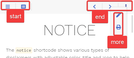
Areas
The default configuration comes with three predefined areas that may contain an arbitrary set of buttons.
end: shown on the opposite breadcrumb side in comparison to the start area
more: shown when pressing the more button in the topbar
While you cannot add additional areas in the topbar, you are free to configure additional buttons that behave like the more button, providing further user-defined areas.
Buttons
The theme ships with the following predefined buttons (from left to right in the screenshot):
sidebar: opens the sidebar flyout if in mobile layout
Not all buttons are displayed at every given time. This is configurable (see below if interested).
Redefining Areas
Each predefined area and button comes in its own file. By that, it is easy for you to overwrite an area file in your installation, reusing only the buttons you like.
E.g., you can redefine the predefined end area by adding the file layouts/partials/topbar/area/end.html in your installation (not in the theme itself) to remove all but the more button.
The below example sets an explicit value for the onempty parameter, overriding the specific default value for this button (these defaults vary depending on the button). The parameter causes the more button to always be displayed instead of hiding once its content is empty.
The theme distinguishes between two types of buttons:
button: a clickable button that either browses to another site, triggers a user-defined script or opens an overlay containing user-defined content
area-button: the template for the more button, to define your own area overlay buttons
Button Parameter
Screen Widths and Actions
Depending on the screen width, you can configure how the button should behave. Screen width is divided into three classes:
s: (controlled by the onwidths parameter) mobile layout where the menu sidebar is hidden
m: (controlled by the onwidthm parameter) desktop layout with visible sidebar while the content area width still resizes
l: (controlled by the onwidthl parameter) desktop layout with visible sidebar once the content area reached its maximum width
For each width class, you can configure one of the following actions:
show: the button is displayed in its given area
hide: the button is removed
area-XXX: the button is moved from its given area into the area XXX; for example, this is used to move buttons to the more area overlay in the mobile layout
Hiding and Disabling Stuff
While hiding a button depending on the screen size can be configured with the above-described hide action, you may want to hide the button on certain other conditions as well.
For example, the print button in its default configuration should only be displayed if print support was configured. This is done in your button template by checking the conditions first before displaying the button (see layouts/partials/topbar/button/print.html).
This parameter can have one of the following values:
disable: the button is displayed in a disabled state if the overlay is empty
hide: the button is removed if the overlay is empty
If you want to disable a button containing no overlay, this can be achieved by an empty href parameter. An example can be seen in the prev button (see layouts/partials/topbar/button/prev.html) where the URL for the previous site may be empty.
For displaying an area in the button’s overlay, see Area-Button.
Parameters
Name
Default
Notes
page
<empty>
Mandatory reference to the page.
class
<empty>
Mandatory unique class name for this button. Displaying two buttons with the same value for class is undefined.
href
<empty>
Either the destination URL for the button or JavaScript code to be executed on click.
- If starting with javascript: all following text will be executed in your browser - Every other string will be interpreted as URL - If empty, the button will be displayed in a disabled state regardless of its content
Defines what to do with the button if the content parameter was set but ends up empty:
- disable: The button is displayed in a disabled state. - hide: The button is removed.
onwidths
show
The action that should be executed if the site is displayed in the given width:
- show: The button is displayed in its given area - hide: The button is removed. - area-XXX: The button is moved from its given area into the area XXX.
onwidthm
show
See above.
onwidthl
show
See above.
hint
<empty>
Arbitrary text displayed in the tooltip.
title
<empty>
Arbitrary text for the button.
content
<empty>
Arbitrary HTML to put into the content overlay. This parameter may be empty. In this case, no overlay will be generated.
Call this from your own button templates if you want to implement a button with an area overlay like the more button (layouts/partials/topbar/button/more.html).
Parameters
Name
Default
Notes
page
<empty>
Mandatory reference to the page.
area
<empty>
Mandatory unique area name for this area. Displaying two areas with the same value for area is undefined.
Defines what to do with the button if the content overlay is empty:
- disable: The button is displayed in a disabled state. - hide: The button is removed.
onwidths
show
The action that should be executed if the site is displayed in the given width:
- show: The button is displayed in its given area - hide: The button is removed. - area-XXX: The button is moved from its given area into the area XXX.
onwidthm
show
See above.
onwidthl
show
See above.
hint
<empty>
Arbitrary text displayed in the tooltip.
title
<empty>
Arbitrary text for the button.
Predefined Buttons
The predefined buttons by the theme (all other buttons besides the more and toc button in layouts/partials/topbar/button).
Call these from your own redefined area templates if you want to use default button behavior.
The <varying> parameter values are different for each button and configured for standard behavior as seen on this page.
Parameters
Name
Default
Notes
page
<empty>
Mandatory reference to the page.
onwidths
<varying>
The action that should be executed if the site is displayed in the given width:
- show: The button is displayed in its given area - hide: The button is removed. - area-XXX: The button is moved from its given area into the area XXX.
Call these from your own redefined area templates if you want to use default button behavior utilizing overlay functionality.
The <varying> parameter values are different for each button and configured for standard behavior as seen on this page.
Parameters
Name
Default
Notes
page
<empty>
Mandatory reference to the page.
onempty
disable
Defines what to do with the button if the content overlay is empty:
- disable: The button is displayed in a disabled state. - hide: The button is removed.
onwidths
<varying>
The action that should be executed if the site is displayed in the given width:
- show: The button is displayed in its given area - hide: The button is removed. - area-XXX: The button is moved from its given area into the area XXX.
onwidthm
<varying>
See above.
onwidthl
<varying>
See above.
Page Designs
Page designs are used to provide different layouts for a given output format. If you instead want to provide a new output format, the theme got you covered as well.
an optional archetype file: a template for creating new Markdown files with the correct setting for the type front matter and any furhter parameter
optional CSS styles
Warning
Don’t use Hugo’s reserved type option in your modifications for other functionality!
Using a Page Design
Regardless of shipped or custom page designs, you are using them in the same way. Either by manually setting the type front matter to the value of the page design or by using an archetype during creation of a new page.
If no type is set in your front matter or the page design doesn’t exist for a given output format, the page is treated as if type='default' was set.
The Relearn theme ships with the page designs home, chapter, and default for the HTML output format.
The shipped print and markdown output formats only display using the default page design.
Creating a Page Design
Suppose you are writing a documentation site for some software. Each time a new release is created, you are adding a new releasenotes page to your site. Those pages should contain a common disclaimer at the top. You neither want to copy the text into each new file nor want you to use a shortcode but create a page design called releasenotes.
Choose a name (here, releasenotes)
Create a content view file at layouts/releasenotes/article.html
<articleclass="releasenotes"><headerclass="headline"> {{partial "content-header.html" .}}
</header> {{partial "heading-pre.html" .}}{{partial "heading.html" .}}{{partial "heading-post.html" .}}
<pclass="disclaimer"> This software release comes without any warranty!
</p> {{partial "article-content.html" .}}
<footerclass="footline"> {{partial "content-footer.html" .}}
</footer></article>
The marked lines are your customizations, the rest of the file was copied over from the default implementation of layouts/_default/article.html
In this file, you can customize the page structure as needed. For HTML based output formats, typically you’ll want to:
Set a class at the article element for custom CSS styles
Call {{ partial "article-content.html" . }} to show your page content
Optional: create an archetype file at archetypes/releasenotes.md
+++title="{{ replace .Name "-" "" | title }}"type="releasenotes"+++Thisisanewreleasenote.
Optional: add CSS in the file layouts/partials/custom-header.html
layouts/<DESIGN>/baseof.<FORMAT>: Optional: The top most file you could provide to completely redefine the whole design. No further partials will be called if you don’ call them yourself
For HTML Output Formats
If you want to keep the general HTML framework and only change specific parts, you can provide these files for the page desingn for the HTML output format independently of one another.
layouts/<DESIGN>/article.html: Optional: Controls how one page’s content and title are displayed
layouts/<DESIGN>/body.html: Optional: Determines what to contain in the content area (for example a single page, a list of pages, a tree of sub pages)
layouts/<DESIGN>/menu.html: Optional: Defines the sidebar menu layout
For a real-world example, check out the changelog page design implementation
Hugo 0.146 or newer required some changes to the themes file structure.
Move your files from layouts/<DESIGN>/views up one level to layouts/<DESIGN>
Migration from Relearn 6
Previous to Relearn 7, page designs were defined by a proprietary solution unique to the theme. Depending on your modifications you may have to change some or all of the following to migrate to Relearn 7’s page designs.
In all your *.md files, replace the archetype front matter with type; the value stays the same; don’t forget your archetype files if you have some
Move your files layouts/partials/archetypes/<DESIGN>/article.html to layouts/<DESIGN>/article.html
The files will most likely require further modifications as they now receive the page as it context (dot .) instead of the .page and .content parameter.
Hugo can display your content in different formats like HTML, JSON, Google AMP, etc. To do this, templates must be provided.
The Relearn theme by default comes with templates for HTML, HTML for print, RSS and Markdown. If this is not enough, this page describes how you can create your own output formats.
Suppose you want to be able to send your articles as HTML formatted emails. The pages of these format need to be self contained so an email client can display the content without loading any further assets.
Therefore we add a new output format called email that outputs HTML and assembles a completely custom HTML document structure.
<!DOCTYPE html><html><head><title>{{ .Title }}</title><styletype="text/css">/* add some styles here to make it pretty */</style><styletype="text/css">/* add chroma style for code highlighting */{{-"/assets/css/chroma-relearn-light.css"|readFile|safeCSS}}</style></head><body><main> {{- block "body" . }}{{ end }}
</main></body></html>
The marked block construct above will cause the display of the article with a default HTML structure. In case you want to keep it really simple, you could replace this line with just {{ .Content }}.
Optional: create a file layouts/_default/article.email.html
In our case, we want to display a disclaimer in front of every article. To do this we have to define the output of an article ourself and rely on the above block statement to call our template.
<articleclass="email"><blockquote> View this article on <ahref="http://example.com{{ .RelPermalink }}">our website</a></blockquote> {{ partial "article-content.html" . }}
</article>
Optional: create a file layouts/_default/_markup_/render-image.email.html
In our case, we want to convert each image into a base 64 encoded string to display it inline in the email without loading external assets.
{{- $dest_url := urls.Parse .Destination }}
{{- $dest_path := path.Clean ($dest_url.Path) }}
{{- $img := .Page.Resources.GetMatch $dest_path }}
{{- if and (not $img) .Page.File }}
{{- $path := path.Join .Page.File.Dir $dest_path }}
{{- $img = resources.Get $path }}
{{- end }}
{{- if $img }}
{{- if (gt (len $img.Content) 1000000000) }}
{{/* currently resizing does not work for animated gifs :-( */}}
{{- $img = $img.Resize "600x webp q75" }}
{{- end }}
<imgsrc="data:{{ $img.MediaType }};base64,{{ $img.Content | base64Encode }}">{{- end }}
Partials
For HTML Output Formats
If you want to keep the general HTML framework and only change specific parts, you can provide these as blocks:
layouts/_default/list.<FORMAT>.html: Optional: Controls how sections are displayed
layouts/_default/single.<FORMAT>.html: Optional: Controls how a pages are displayed
layouts/_default/taxonomy.<FORMAT>.html: Optional: Controls how taxonomy pages are displayed
layouts/_default/term.<FORMAT>.html: Optional: Controls how term pages are displayed
For a real-world example, check out the print output format implementation
layouts/_default/list.<FORMAT>.<EXTENSION>: Mandatory: Controls how sections are displayed
layouts/_default/single.<FORMAT>.<EXTENSION>: Mandatory: Controls how pages are displayed
layouts/_default/baseof.<FORMAT>.<EXTENSION>: Optional: Controls how sections and pages are displayed. If not provided, you have to provide your implementation in list.<FORMAT>.<EXTENSION> and single.<FORMAT>.<EXTENSION>
For a real-world example, check out the markdown output format implementation
Hugo 0.146 or newer required the theme to make changes that may affect you if you are using own output formats. You may have to adjust your templates in layouts/_default according to Hugo’s migration instructions.
For HTML Output Formats
You need to define a block storeOutputFormat for your HTML based output format templates and add {{- .Store.Set \"relearnOutputFormat\" \"<your-output-format-name>\" }} to it.
For Non-HTML Output Formats
Move your files layouts/<DESIGN>/views up one level to layouts/<DESIGN>
Migration from Relearn 6
Previous to Relearn 7, HTML output formats did not use the baseof.html but now do.
For HTML Output Formats
Move your files layouts/partials/article.<FORMAT>.html to layouts/_default/article.<FORMAT>.html
The files will most likely require further modifications as they now receive the page as it context (dot .) instead of the .page and .content parameter.
Merge your files layouts/partials/header.<FORMAT>.html, layouts/partials/footer.<FORMAT>.html to layouts/_default/baseof.<FORMAT>.html
Old:
<!DOCTYPE html><html><head><title>{{ .Title }}</title><styletype="text/css">/* add some styles here to make it pretty */</style><styletype="text/css">/* add chroma style for code highlighting */{{-"/assets/css/chroma-relearn-light.css"|readFile|safeCSS}}</style></head><body><main>
</main></body></html>
New:
The upper part of the file is from your header.<FORMAT>.html and the lower part is from your footer.<FORMAT>.html.
The marked line needs to be added, so your output format uses a potential layouts/_default/article.<FORMAT>.html
<!DOCTYPE html><html><head><title>{{ .Title }}</title><styletype="text/css">/* add some styles here to make it pretty */</style><styletype="text/css">/* add chroma style for code highlighting */{{-"/assets/css/chroma-relearn-light.css"|readFile|safeCSS}}</style></head><body><main> {{- block "body" . }}{{ end }}
</main></body></html>
Here’s a list of all available options with example values. Default values are described in the annotated example below in each option’s documentation.
hugo.
[params]alwaysopen=''breadcrumbSeparator='>'collapsibleMenu=truecustomMathJaxURL=''customMermaidURL=''customOpenapiURL=''dateFormat=':date_medium'disableAnchorCopy=falsedisableAnchorScrolling=falsedisableAssetsBusting=falsedisableBreadcrumb=falsedisableDefaultRelref=falsedisableExplicitIndexURLs=falsedisableGeneratorVersion=falsedisableHoverBlockCopyToClipBoard=falsedisableInlineCopyToClipBoard=truedisableLandingPageButton=truedisableLanguageSwitchingButton=falsedisableMarkdownButton=falsedisableNextPrev=falsedisablePrintButton=falsedisableRandomIds=falsedisableRootBreadcrumb=truedisableSearchHiddenPages=falsedisableSeoHiddenPages=truedisableShortcutsTitle=falsedisableSourceButton=falsedisableTagHiddenPages=falsedisableTermBreadcrumbs=falsedisableToc=falsedisableVersioningWarning=falseeditURL='https://github.com/McShelby/hugo-theme-relearn/edit/main/docs/content/${FilePath}'enableLegacyLanguageLinks=falseexternalLinkTarget='_self'hideAuthorDate=falsehideAuthorEmail=falsehideAuthorName=falsehighlightWrap=trueimages=['images/hero.png']linkTitle='Relearn'mathJaxInitialize='{}'mermaidInitialize='{ "securityLevel": "loose" }'mermaidZoom=trueminify=''ordersectionsby='weight'showVisitedLinks=truesidebarfootermenus=''sidebarheadermenus=''sidebarmenus=''titleSeparator='::'urlExternalCheck=trueurlIgnoreCheck=['exampleSite','images/hero\.zip','http://localhost:1313','https://github\.com/McShelby/hugo-theme-relearn/settings','https://github\.com/McShelby/hugo-theme-relearn/archive/main\.zip','https://github\.com/McShelby/hugo-theme-relearn/edit/main/docs/introduction/releasenotes']version='v1.0'versionIndexURL='versionindex.js'versions=''[params.author]emailname=''name='Sören Weber'[[params.boxStyle]]color='fuchsia'icon='fa-fw fab fa-hackerrank'identifier='hugo'[[params.boxStyle]]identifier='breaking'style='warning'title=' '[[params.boxStyle]]identifier='change'style='note'title=' '[[params.boxStyle]]icon='plus-circle'identifier='new'style='info'title=' '[[params.boxStyle]]icon='gears'identifier='option'style='cyan'[[params.boxStyle]]icon='fa-fw fab fa-markdown'identifier='frontmatter'style='green'[[params.boxStyle]]color='blueviolet'icon='bars'identifier='hugomenu'[[params.boxStyle]]color='darkgray'icon='fa-fw fab fa-github'identifier='gfm'[[params.boxStyle]]color='rgb(136, 140, 196)'icon='fa-fw fab fa-php'identifier='php'[[params.boxStyle]]color='darkorange'icon='lightbulb'identifier='pants'[[params.boxStyle]]color='rgb(124, 58, 237)'icon='fa-fw far fa-gem'identifier='obsidian'[[params.boxStyle]]color='orangered'icon='fa-fw fas fa-code'identifier='html'[[params.boxStyle]]color='rgb(125, 201, 3)'icon='fa-fw fas fa-puzzle-piece'identifier='relearn'[[params.boxStyle]]color='violet'i18n=''icon='hand-sparkles'identifier='magic'title='Magic'[params.image]errorlevel='warning'[params.imageEffects]border=truedataurl=falseinlinecontent=falselazy=truelightbox=trueshadow=false[params.include]errorlevel='warning'[params.link]errorlevel='warning'[params.linkEffects]download=falsetarget=false[params.logo]direction='row'src='/images/logo.svg?inlinecontent'[params.math]force=false[params.mermaid]force=false[params.openapi]errorlevel='warning'force=false[params.search]disable=''[params.search.adapter]identifier=''[params.search.adapter.params]additionalContentLanguage=['en'][params.search.index]URL=''disable=''template=''[params.search.page]URL=''disable=''type=''[[params.themeVariant]]auto=['relearn-light','relearn-dark']identifier='relearn-auto'name='Relearn Light/Dark'[[params.themeVariant]]identifier='relearn-dark'[[params.themeVariant]]identifier='relearn-light'[[params.themeVariant]]identifier='relearn-bright'[[params.themeVariant]]auto=['zen-light','zen-dark']identifier='zen-auto'name='Zen Light/Dark'[[params.themeVariant]]identifier='zen-dark'[[params.themeVariant]]identifier='zen-light'[[params.themeVariant]]auto=['learn','neon']identifier='retro-auto'name='Retro Learn/Neon'[[params.themeVariant]]identifier='neon'[params.themeVariant.logo]src='/images/magic.gif'[[params.themeVariant]]identifier='learn'[[params.themeVariant]]identifier='blue'[[params.themeVariant]]identifier='green'[[params.themeVariant]]identifier='red'
{"params":{"alwaysopen":"","author":{"emailname":"","name":"Sören Weber"},"boxStyle":[{"color":"fuchsia","icon":"fa-fw fab fa-hackerrank","identifier":"hugo"},{"identifier":"breaking","style":"warning","title":" "},{"identifier":"change","style":"note","title":" "},{"icon":"plus-circle","identifier":"new","style":"info","title":" "},{"icon":"gears","identifier":"option","style":"cyan"},{"icon":"fa-fw fab fa-markdown","identifier":"frontmatter","style":"green"},{"color":"blueviolet","icon":"bars","identifier":"hugomenu"},{"color":"darkgray","icon":"fa-fw fab fa-github","identifier":"gfm"},{"color":"rgb(136, 140, 196)","icon":"fa-fw fab fa-php","identifier":"php"},{"color":"darkorange","icon":"lightbulb","identifier":"pants"},{"color":"rgb(124, 58, 237)","icon":"fa-fw far fa-gem","identifier":"obsidian"},{"color":"orangered","icon":"fa-fw fas fa-code","identifier":"html"},{"color":"rgb(125, 201, 3)","icon":"fa-fw fas fa-puzzle-piece","identifier":"relearn"},{"color":"violet","i18n":"","icon":"hand-sparkles","identifier":"magic","title":"Magic"}],"breadcrumbSeparator":"\u003e","collapsibleMenu":true,"customMathJaxURL":"","customMermaidURL":"","customOpenapiURL":"","dateFormat":":date_medium","disableAnchorCopy":false,"disableAnchorScrolling":false,"disableAssetsBusting":false,"disableBreadcrumb":false,"disableDefaultRelref":false,"disableExplicitIndexURLs":false,"disableGeneratorVersion":false,"disableHoverBlockCopyToClipBoard":false,"disableInlineCopyToClipBoard":true,"disableLandingPageButton":true,"disableLanguageSwitchingButton":false,"disableMarkdownButton":false,"disableNextPrev":false,"disablePrintButton":false,"disableRandomIds":false,"disableRootBreadcrumb":true,"disableSearchHiddenPages":false,"disableSeoHiddenPages":true,"disableShortcutsTitle":false,"disableSourceButton":false,"disableTagHiddenPages":false,"disableTermBreadcrumbs":false,"disableToc":false,"disableVersioningWarning":false,"editURL":"https://github.com/McShelby/hugo-theme-relearn/edit/main/docs/content/${FilePath}","enableLegacyLanguageLinks":false,"externalLinkTarget":"_self","hideAuthorDate":false,"hideAuthorEmail":false,"hideAuthorName":false,"highlightWrap":true,"image":{"errorlevel":"warning"},"imageEffects":{"border":true,"dataurl":false,"inlinecontent":false,"lazy":true,"lightbox":true,"shadow":false},"images":["images/hero.png"],"include":{"errorlevel":"warning"},"link":{"errorlevel":"warning"},"linkEffects":{"download":false,"target":false},"linkTitle":"Relearn","logo":{"direction":"row","src":"/images/logo.svg?inlinecontent"},"math":{"force":false},"mathJaxInitialize":"{}","mermaid":{"force":false},"mermaidInitialize":"{ \"securityLevel\": \"loose\" }","mermaidZoom":true,"minify":"","openapi":{"errorlevel":"warning","force":false},"ordersectionsby":"weight","search":{"adapter":{"identifier":"","params":{"additionalContentLanguage":["en"]}},"disable":"","index":{"URL":"","disable":"","template":""},"page":{"URL":"","disable":"","type":""}},"showVisitedLinks":true,"sidebarfootermenus":"","sidebarheadermenus":"","sidebarmenus":"","themeVariant":[{"auto":["relearn-light","relearn-dark"],"identifier":"relearn-auto","name":"Relearn Light/Dark"},{"identifier":"relearn-dark"},{"identifier":"relearn-light"},{"identifier":"relearn-bright"},{"auto":["zen-light","zen-dark"],"identifier":"zen-auto","name":"Zen Light/Dark"},{"identifier":"zen-dark"},{"identifier":"zen-light"},{"auto":["learn","neon"],"identifier":"retro-auto","name":"Retro Learn/Neon"},{"identifier":"neon","logo":{"src":"/images/magic.gif"}},{"identifier":"learn"},{"identifier":"blue"},{"identifier":"green"},{"identifier":"red"}],"titleSeparator":"::","urlExternalCheck":true,"urlIgnoreCheck":["exampleSite","images/hero\\.zip","http://localhost:1313","https://github\\.com/McShelby/hugo-theme-relearn/settings","https://github\\.com/McShelby/hugo-theme-relearn/archive/main\\.zip","https://github\\.com/McShelby/hugo-theme-relearn/edit/main/docs/introduction/releasenotes"],"version":"v1.0","versionIndexURL":"versionindex.js","versions":""}}
Annotated Configuration Options
[params]# Theme-specific options;# For a detailed explanation and many more options see# https://mcshelby.github.io/hugo-theme-relearn/configuration/reference/index.html#annotated-configuration-options# If an option value is said to be not set, you can achieve the same behavior# by giving it an empty string value.################################################################################ Hugo# These options usually apply to other themes as well.# The author of your site.# Default: not set# This will be used in HTML meta tags, the open graph protocol and twitter# cards.author.name='Sören Weber'# The author's email address of your site.# Default: not set# This will be used in HTML meta tags, the open graph protocol and twitter# cards.author.emailname=''# The social media image of your site.# Default: not set# This is used for generating social media meta information for the opengraph# protocol and twitter cards.# This can be overridden in the page's frontmatter.images=['images/hero.png']################################################################################ Relearn Theme# These options are specific to the Relearn theme.#++++++++++++++++++++++++++++++++++++++++++++++++++++++++++++++++++++++++++++++# Branding# These options set your overall visual appearance.# The title to be used for links in the upper left corner# Default: not set# This name will be used for the link to the main page in the upper section# of the menu. If not set, `title` from the Hugo settings will be used.# If the title is to long to fit on a single line it is automatically wrapped.# If you want manual control over the line breaks, you can insert newline characters.linkTitle="Relearn"# The title logo to be used in the upper left corner# Default: not set# If the value is not set or empty, the theme searches for a global resource# `/images/logo.<TYPE>`. Setting the `src` sub-field will override the# default logo (see logo parameter). If `src` is set to string containing all# whitespace, no logo will be displayed for that variant regardless of the# default logo. A logo will only be printed if you haven't overwritten# layouts/partials/logo.html.# If you als print a `linkTitle` you can set the `direction` sub-field to# either `column` or `row` to arrange logo and title accordingly.logo={src='/images/logo.svg?inlinecontent',direction='row'}# Used color variants.# Default: 'auto'# This sets one or more color variants, available to your readers to choose# from. You can# - set a single value eg. 'zen-light'# - an array like [ 'neon', 'learn' ]# - an array with options like [ { identifier = 'neon' },{ identifier = 'learn' } ]# The last form allows to set further options for each variant.# The `identifier` is mandatory. You can also set `name` which overrides the# value displayed in the variant selector.# Setting the `logo` field and setting the `src` sub-field will override the# default logo (see logo parameter). If `src` is set to string containing all# whitespace, no logo will be displayed for that variant regardless of the# default logo. A logo will only be printed if you haven't overwritten# layouts/partials/logo.html.# If the array has more than one entry, a variant selector# is shown in the lower part of the menu. The first entry in the array is the# default variant, used for first time visitors.# The theme ships with the following variants: 'relearn-bright',# 'relearn-light', 'relearn-dark', 'zen-light', 'zen-dark', 'neon', 'learn',# 'blue', 'green', 'red'. In addition you can use auto mode variants. See the# docs for a detailed explanation.# You can also define your own variants. See the docs how this works. Also,# the docs provide an interactive theme generator to help you with this task.themeVariant=[{identifier='relearn-auto',name='Relearn Light/Dark',auto=['relearn-light','relearn-dark']},{identifier='relearn-dark'},{identifier='relearn-light'},{identifier='relearn-bright'},{identifier='zen-auto',name='Zen Light/Dark',auto=['zen-light','zen-dark']},{identifier='zen-dark'},{identifier='zen-light'},{identifier='retro-auto',name='Retro Learn/Neon',auto=['learn','neon']},{identifier='neon',logo={src='/images/magic.gif'}},{identifier='learn'},{identifier='blue'},{identifier='green'},{identifier='red'}]# Minify theme assets.# Default: not set# If set to `true`, further theme asset files besides the generated HTML files# will be minified during build. If no value is set, the theme will avoid# minification if you have started with `hugo server` and otherwise will minify.minify=""#++++++++++++++++++++++++++++++++++++++++++++++++++++++++++++++++++++++++++++++# General# These options are defining general, non visual behavior.# Avoid new asset URLs on build.# Default: false# By default JavaScript-files and CSS-files get a unique ID on each rebuild.# This makes sure, the user always has the latest version and not some stale# copy of his browser cache. Anyways, it can be desireable to turn this# off in certain circumstances. For example if you have Hugo's dev server# running. Also some proxies dislike this optimization.disableAssetsBusting=false# Avoid generator meta tags.# Default: false# Set this to true if you want to disable generation for generator meta tags# of Hugo and the theme in your HTML head. In this case also don't forget to# set Hugo's disableHugoGeneratorInject=true. Otherwise Hugo will generate a# meta tag into your home page anyways.disableGeneratorVersion=false# Avoid unique IDs.# Default: false# In various situations the theme generates non stable unique ids to be used# in HTML fragment links. This can be undesirable for example when testing# the output for changes. If you disable the random id generation, the theme# may not function correctly anymore.disableRandomIds=false# Conditionally ignore errorlevel settings# Default: []# The theme supports checking referenced address (e.g. with# link.errorlevel, image.errorlevel, etc. see below). Sometimes checks lead# to console output due to false negatives. You can turn off the checks# for individual referenced addresses by defining regular expressions here.# The referenced address will be checked against all regexes of this array.# If it matches at least one, no output will be written to the console.# This array can be expanded in the page's frontmatter.urlIgnoreCheck=['exampleSite','images/hero\.zip','http://localhost:1313','https://github\.com/McShelby/hugo-theme-relearn/settings','https://github\.com/McShelby/hugo-theme-relearn/archive/main\.zip','https://github\.com/McShelby/hugo-theme-relearn/edit/main/docs/introduction/releasenotes']# Check external URLs# Default: false# If `true` the theme checks during build if an external URL is reachable.# If it fails, it write errors according to the errorlevel settings. A check# is omitted if the URL is found in the `urlIgnoreCheck` list.# This can be overridden in the page's frontmatter.urlExternalCheck=true# Additional code dependencies.# Default: See hugo.toml of the theme# The theme provides a mechanism to load further JavaScript and CSS# dependencies on demand only if they are needed. This comes in handy if you# want to add own shortcodes that depend on additional code to be loaded.# See the docs how this works.# [relearn.dependencies]#++++++++++++++++++++++++++++++++++++++++++++++++++++++++++++++++++++++++++++++# Versioning# These options control versioning of your site..# Available verions# Default: not set# A list of version items that are available to the version switcher. Each item# can contain the following parameter:# - identifier: mandatory, not displayed# - title: mandatory, text, shown in the version swicher# - baseURL: mandatory, the base URL of that specific version# - isLateste: optional, but must be set exactly once in the set of items, marks# the latest version of the site, used to retrieve the index of available versions# during runtime for older sites.versions=''# Version identifier of this site# Default: not set# If versioning is configured, this is mandatory and must be one of the identifiers# from the `versions` array.version='v1.0'# Hide deprecated version warning# Default: false# If you want to hide the deprecation warning, visible on all pages that to not# belong to the latest version of the site, set this to `true`.disableVersioningWarning=false# URL of the version index file relative to the language home.# Default: 'versionindex.js'# You have to set this option if your page already has a content file named# `versionindex.js` in the language home.versionIndexURL='versionindex.js'#++++++++++++++++++++++++++++++++++++++++++++++++++++++++++++++++++++++++++++++# Topbar# These options modify the topbar appearance.# Hide the table of contents button.# Default: false# If the TOC button is hidden, also the keyboard shortcut is disabled.# This can be overridden in the page's frontmatter.disableToc=false# Hide the breadcrumbs.# Default: false# If the breadcrumbs are hidden, the title of the displayed page will still be# shown in the topbar.disableBreadcrumb=false# Hide the Markdown button.# Default: false# This hides the Markdown button if you activated the Markdown output format.# This can be overridden in the page's frontmatter.disableMarkdownButton=false# Hide the Source button.# Default: false# This hides the Source button if you activated the Source output format.# This can be overridden in the page's frontmatter.disableSourceButton=false# Hide the Print button.# Default: false# This hides the print button if you activated the print output format.# This can be overridden in the page's frontmatter.disablePrintButton=false# Hide Next and Previous navigation buttons.# Default: false# If the navigation buttons are hidden, also the keyboard shortcuts are# disabled.disableNextPrev=false# The URL prefix to edit a page.# Default: not set# If set, an edit button will be shown in the topbar. If the button is hidden,# also the keyboard shortcuts are disabled. The value can contain the macro# `${FilePath}` which will be replaced by the file path of your displayed page.# If no `${FilePath}` is given in the value, the value is treated as if the# `${FilePath}` was appended at the end of the value. This can be overridden# in the pages frontmatter. This is useful if you want to give the opportunity# for people to create merge request for your content.editURL='https://github.com/McShelby/hugo-theme-relearn/edit/main/docs/content/${FilePath}'#++++++++++++++++++++++++++++++++++++++++++++++++++++++++++++++++++++++++++++++# Search# These options modify various aspects of the search functionality.# Disable the search.# Default: false# If the search is disabled, no search box will be displayed in the menu,# nor in-page search, search popup or dedicated search page will be available.# This will also cause the keyboard shortcut to be disabled.search.disable=''# Disable the search index generation.# Default: false# If the search index is disabled, no search popup or dedicated search# page will be available.search.index.disable=''# URL of the search index file relative to the language home.# Default: 'searchindex.js'# You have to set this option if your page already has a content file named# `searchindex.js` in the language home. Otherwise ignore it or leave empty# to let the default apply.search.index.URL=''# Template for creation of the search index.# Default: '/_relearn_searchindex.js'# You can switch the template for generating the index by setting this# parameter to a differnt content view. If not set, `/_relearn_searchindex.js`# is used. The template must have an implementation in `assets/[YOUR-INDEXTEMPLATE]`.search.index.template=''# Disable the dedicated search page.# Default: false# Search and search index must be enabled to let the# generation of the dedicated search page to be affected by this option.search.page.disable=''# URL of the dedicated search page relative to the language home.# Default: 'search'# In its default form the search page URL is named the same for all languages# but you are free to override it in each language options to localise the# URL. You also need to set this option if your site already has a content# page named `search`.search.page.URL=''# Content view for dedicated search page.# Default: '_relearn_searchpage'# You can switch the layout of the dedicated search page by setting this# parameter to a differnt content view. If not set, `_relearn_searchpage`# is used. The content view must have an implementation in `layouts/[YOUR-VIEWNAME]/article.html`.search.page.type=''# Adapter for the search engine.# Default: 'lunr'# The theme can use different search engines. To glue both together, a# search adapter needs to be written for each engine. If not set, defaults# to `lunr`. The theme ships with an additional `orama` adapter with no# usage limitations and an experimental `orama-esm' adapater not usable# for headless server deployments but identical in functionality to the# `orama` adapter.# Each adapter may have futher specific paramters to that adapter in# search.adapter.params.search.adapter.identifier=''# Multilanguage content for Lunr.# Default: not set# Specific to the Lunr search adapter.# If the search index is enabled and your pages contain further languages# besides the main one used, add all those auxiliary languages here. This# will create a search index with support for all used languages of your site.# This is handy for example if you are writing in Spanish but have lots of# source code on your page which typically uses English terminology.search.adapter.params.additionalContentLanguage=['en']#++++++++++++++++++++++++++++++++++++++++++++++++++++++++++++++++++++++++++++++# Menu# These options modify the menu appearance.# Hide the Home entry.# Default: false# If shown, a Home button will appear below the search bar and the main menu.# It links to your the home page of the current language.disableLandingPageButton=true# Hide the language switcher.# Default: false# If you have more than one language configured, a language switcher is# displayed in the lower part of the menu. This option lets you explicitly# turn this behavior off.disableLanguageSwitchingButton=false# Shows checkmarks for visited pages of the main menu.# Default: false# This also causes the display of the `Clear History` entry in the lower part# of the menu to remove all checkmarks. The checkmarks will also been removed# if you regenerate your site as the ids are not stable.showVisitedLinks=true# The order of main menu submenus.# Default: 'weight'# Submenus can be ordered by 'weight', 'title', 'linktitle', 'modifieddate',# 'expirydate', 'publishdate', 'date', 'length' or 'default' (adhering to# Hugo's default sort order). This can be overridden in the pages frontmatter.ordersectionsby='weight'# The initial expand state of submenus.# Default: not set# This controls whether submenus will be expanded (true), or collapsed (false)# in the menu. If not set, the first menu level is set to false, all others# levels are set to true. This can be overridden in the page's frontmatter.# If the displayed page has submenus, they will always been displayed expanded# regardless of this option.alwaysopen=''# Shows expander for submenus.# Default: false# If set to true, a submenu in the sidebar will be displayed in a collapsible# tree view and a clickable expander is set in front of the entry.# Note that if set to `true` can have a major performance impact on build# for sites with many pages.# This can be overridden in the page's frontmatter.collapsibleMenu=true# Hide heading above the shortcuts menu.# Default: false# If a sidebar menu with identifier `shortcuts` is configured (see below),# this is the easy way to remove the heading;# The title for the heading can be overwritten in your i18n files. See Hugo's# documentation how to do this.disableShortcutsTitle=false# Define your own sidebar menus.# Menus are written from the sidebar's top to buttom in the order given in# these arrays.# This can be overridden in the page's frontmatter.# Each entry can contain the following keys:# - `type` is mandatory. Either `page` in case it should generate a tree from# the page structure, `menu` in case it should generate a tree from a# defined menu, `custom` for arbitrary HTML snippets or `divider` for a# horizontal ruler.# - `identifier` is mandatory. In case of `type=page`, anything can be used,# in case of `type=menu` the `identifier` key must be identical to the# key of the menu definition.# - `main`, boolean. If `true`, the first tree level is spaced more generous# and the text is emphasized. Default: `true` for `type=page` and `false`# for `type=menu` and `type=custom`# - `disableTitle`, boolean. If `true`, there is no title above the tree.# Default: `true` for `type=page` and `false` for `type=menu`. If a title# should be used, in case of `type=page` it will be taken from the page's# `menuTitle` front matter and if not set, from the translation files, using# the menu `identifier` as key. In case of `type=menu` it will be taken# from the menu `title` according to Hugo's documentation and if not set# from the menu `name` and if this is not set form the page's `linkTitle`.# - `pageRef`, optional. In case of `type=page` this is the starting page's# path. If not set, the home page will be used.# - `elements`, optional. In case of `type=custom` the list of elements to# display. The theme shipps with the following predefined snippets which# all accept the `icon` parameter to overwrite the default icon# - languageswitcher: will display the language switcher# - variantswitcher: will display the variant switcher# - versionswitcher: will display the version switcher# - historyclearer: will display a button to clear the history of visited links# The sidebar header menu.# Default: see notes# If not given, defaults to# - a home button if configured; if you redefine this, use a Hugo menu and a type=menu to replicate this# - a divider to separate from the sidebarmenus (depending on the configuration of the theme variant)sidebarheadermenus=''# The main sidebar header.# Default: see notes# - the main page menu based on your content structure# - the shortcuts menu including the title if configuredsidebarmenus=''# The main sidebar header.# Default: see notes# - a divider to separate from the sidebarmenus if any of the following is configured# - the language switcher if multilingual is configured# - the variant switcher if multiple variants are configured# - the history clearer if you configured to mark visited pagessidebarfootermenus=''#++++++++++++++++++++++++++++++++++++++++++++++++++++++++++++++++++++++++++++++# Hidden pages# These options configure how hidden pages are treated.# A page flagged as hidden, is only removed from the main menu if you are# currently not on this page or the hidden page is not part of current page's# ancestors. For all other functionality in Hugo a hidden page behaves like any# other page if not otherwise configured.# Hide hidden pages from search.# Default: false# Hides hidden pages from the suggestions of the search box and the dedicated# search page.disableSearchHiddenPages=false# Hide hidden pages for web crawlers.# Default: false# Avoids hidden pages from showing up in the sitemap and on Google (et all),# otherwise they may be indexed by search enginesdisableSeoHiddenPages=true# Hide hidden pages for taxonomies.# Default: false# Hides hidden pages from showing up on the taxonomy and terms pages. If this# reduces term counters to zero, an empty but not linked term page will be# created anyhow.disableTagHiddenPages=false#++++++++++++++++++++++++++++++++++++++++++++++++++++++++++++++++++++++++++++++# Content# These options modify how your content is displayed.# Title separator.# Default: '::'# Changes the title separator used when concatenating the page title with the# site title. This is consistently used throughout the theme.titleSeparator='::'# Breadcrumb separator.# Default: '>'# Changes the breadcrumb separator used in the topbars breadcrumb area and for# search results and term pages.breadcrumbSeparator='>'# Hide the root breadcrumb.# Default: false# The root breadcrumb is usually the home page of your site. Because this is# always accessible by clicking on the logo, you may want to reduce clutter# by removing this from your breadcrumb.disableRootBreadcrumb=true# Hide breadcrumbs term pages.# Default: false# If you have lots of taxonomy terms, the term pages may seem cluttered with# breadcrumbs to you, so this is the option to turn off breadcrumbs on term# pages. Only the page title will then be shown on the term pages.disableTermBreadcrumbs=false# Disable copying heading links to clipboard# Default: false# If set to true, this disables the copying of anchor links to the clipboard;# if also `disableAnchorScrolling=true` then no anchor link will be visible# when hovering a heading.disableAnchorCopy=false# Disable scrolling to heading link on click# Default: false# If set to true, this disables the scrolling to the beginning of the heading# when clicked; if also `disableAnchorCopy=true` then no anchor link will# be visible when hovering a heading.disableAnchorScrolling=false# User-defined styles for shortcodes# Default: not set# Besides the predefined `style` values, you are able to define your own. The# `style` parameter of the shortcode must match the `identifier` defined here.# The title for the style will be determined from the `title`. If no `title`# but a `i18n` is set, the title will be taken from the translation files by# that key. The `title` may be empty in which case, the box does not contain a# default title. `icon` and `color` are working similar.# You can also redefine the predefined styles if you're not satisfied with the# default values.# If you define an optional `style` attribute, this is where all default values# are taken from. You can reference predefined styles as also your own styles# if they are defined beforehand in this array.boxStyle=[{identifier='hugo',color='fuchsia',icon='fa-fw fab fa-hackerrank'},{identifier='breaking',style='warning',title=' '},{identifier='change',style='note',title=' '},{identifier='new',style='info',title=' ',icon='plus-circle'},{identifier='option',style='cyan',icon='gears'},{identifier='frontmatter',style='green',icon='fa-fw fab fa-markdown'},{identifier='hugomenu',color='blueviolet',icon='bars'},{identifier='gfm',color='darkgray',icon='fa-fw fab fa-github'},{identifier='php',color='rgb(136, 140, 196)',icon='fa-fw fab fa-php'},{identifier='pants',color='darkorange',icon='lightbulb'},{identifier='obsidian',color='rgb(124, 58, 237)',icon='fa-fw far fa-gem'},{identifier='html',color='orangered',icon='fa-fw fas fa-code'},{identifier='relearn',color='rgb(125, 201, 3)',icon='fa-fw fas fa-puzzle-piece'},{identifier='magic',i18n='',title='Magic',color='violet',icon='hand-sparkles'}]# Hide the authors name and email addresses# Default: false# If the standard content-footer finds author name information, you can# disable the output of this and the according email address by setting this# parameter to `true`.hideAuthorName=false# Hide the authors email addresses# Default: false# If the standard content-footer finds an authors email address, you can# disable the output by setting this parameter to `true`.hideAuthorEmail=false# Hide the authoring date# Default: false# If the standard content-footer finds an authoring date, you can# disable the output by setting this parameter to `true`.hideAuthorDate=false# Date format# Default: ':date_medium'# The date format used for the date in the standard content-footer, when# displaying a pages meta information. See https://gohugo.io/functions/time/format/#localization# for possible values.dateFormat=':date_medium'#++++++++++++++++++++++++++++++++++++++++++++++++++++++++++++++++++++++++++++++# Highlight# These options configure how code is displayed.# Hide copy-to-clipboard for inline code.# Default: false# This removes the copy-to-clipboard button from your inline code.disableInlineCopyToClipBoard=true# Always show copy-to-clipboard for block code.# Default: false# The theme only shows the copy-to-clipboard button if you hover over the code# block. Set this to true to disable the hover effect and always show the# button.disableHoverBlockCopyToClipBoard=false# Wrap for code blocks.# Default: true# By default lines of code blocks wrap around if the line is too long to be# displayed on screen. If you dislike this behavior, you can reconfigure it# here.# Note that lines always wrap in print mode regardless of this option.# This can be overridden in the page's frontmatter or given as a parameter to# individual code blocks.highlightWrap=true#++++++++++++++++++++++++++++++++++++++++++++++++++++++++++++++++++++++++++++++# Include# These options configure how the include shortcode works.# What to do when path is not resolved.# Default: ''# You can control what should happen if a path can not be resolved to as# a resource or via the file system. If not set, no output will be written# for the unresolved path. If set to `warning` the same happens and an additional# warning is printed. If set to `error` an error message is printed and the build# is aborted.# This can be overridden in the page's frontmatter.include.errorlevel='warning'#++++++++++++++++++++++++++++++++++++++++++++++++++++++++++++++++++++++++++++++# Images# These options configure how images are displayed.# What to do when local image link is not resolved.# Default: ''# You can control what should happen if a local image can not be resolved to as# a resource. If not set, the unresolved link is written as given into the resulting# output. If set to `warning` the same happens and an additional warning is# printed. If set to `error` an error message is printed and the build is# aborted.# Please note that this can not resolve files inside of your `static` directory.# This can be overridden in the page's frontmatter.image.errorlevel='warning'# Image effects.# See the documentation for how you can even add your own arbitrary effects to# the list.# All effects can be overridden in the page's frontmatter or through URL parameter# given to the image. See the documentation for details.# Default: falseimageEffects.border=true# Default: falseimageEffects.dataurl=false# Default: falseimageEffects.inlinecontent=false# Default: trueimageEffects.lazy=true# Default: trueimageEffects.lightbox=true# Default: falseimageEffects.shadow=false#++++++++++++++++++++++++++++++++++++++++++++++++++++++++++++++++++++++++++++++# Links# These options configure how links are displayed.# Wether to use Hugo's default relref shortcode implementation# Default: false# Since the theme provides a link render hook, the usage of the relref shortcode# is obsolete. If a site still uses that shortcode, it fails to generate a# correct links if the baseURL is configured with a subdirectory and relativeURLs=false.# The theme provides an overriden relref shortcode that also works in the# above setup but must manually be activated by setting this option to true.# See discussion in https://github.com/McShelby/hugo-theme-relearn/discussions/862disableDefaultRelref=false# Generate link URLs the Hugo way.# Default: false# If set to true, the theme behaves like a standard Hugo installation and# appends no index.html to prettyURLs. As a trade off, your build project will# not be servable from the file system.disableExplicitIndexURLs=false# Support legacy language links.# Default: false# If set to true, you can link to pages in other languages by using# `/pir/my-page`. This is not recommended, use ``/my-page?lang=pir` instead.enableLegacyLanguageLinks=false# How to open external links.# Default: ''# For external links you can define how they are opened in your browser. All# values for the HTML `target` attribute of the `a` element are allowed. The# default value will not add any target attribute opens external links in# the same browser tab.# If you want to explicitly open those links in the same# tab, use '_self'.# If you want to set the default behavior for all links, use link effects.# This can be overridden in the page's frontmatter.externalLinkTarget='_self'# What to do when local page link is not resolved.# Default: ''# You can control what should happen if a local link can not be resolved to a# page. If not set, the unresolved link is written as given into the resulting# output. If set to `warning` the same happens and an additional warning is# printed. If set to `error` an error message is printed and the build is# aborted.# Please note that with Hugo < 0.123.0 + `uglyURLs=true` this can lead to false# negatives.# This can be overridden in the page's frontmatter.link.errorlevel='warning'# Link effects.# See the documentation for how you can even add your own arbitrary effects to# the list.# All effects can be overridden in the page's frontmatter or through URL parameter# given to the link. See the documentation for details.# Default: falselinkEffects.download=false# Default: falselinkEffects.target=false#++++++++++++++++++++++++++++++++++++++++++++++++++++++++++++++++++++++++++++++# MathJax# These options configure how math formulae are displayed.# Initialization options for MathJax.# Default: not set# A JSON value. See the MathJaxdocumentation for possible parameter.# This can be overridden in the page's frontmatter.mathJaxInitialize='{}'# Force load Math on every page.# Default: false# If a Math shortcode or codefence is found, the option will be ignored and# Math will be loaded regardlessly. This option is useful in case you# are using passthrough configuration to render your math. In this case no shortcode or# codefence is involved and the library is not loaded by default so you can# force loading it by setting `math.force=true`.# This option has an alias `math=true`.# This can be overridden in the page's frontmatter.math.force=false# URL for external MathJax library.# Default: not set# Specifies the remote location of the MathJax library. By default the shipped# version will be used.# This can be overridden in the page's frontmatter.customMathJaxURL=''# 'https://unpkg.com/mathjax/es5/tex-mml-chtml.js'#++++++++++++++++++++++++++++++++++++++++++++++++++++++++++++++++++++++++++++++# Mermaid# These options configure how Mermaid graphs are displayed.# Make graphs panable and zoomable# Default: false# For huge graphs it can be helpful to make them zoomable. Zoomable graphs come# with a reset button for the zoom.# This can be overridden in the page's frontmatter or given as a parameter to# individual graphs.mermaidZoom=true# Initialization options for Mermaid.# Default: not set# A JSON value. See the Mermaid documentation for possible parameter.# This can be overridden in the page's frontmatter.mermaidInitialize='{ "securityLevel": "loose" }'# Force load Mermaid on every page.# Default: false# If a Mermaid shortcode or codefence is found, the option will be ignored and# Mermaid will be loaded regardlessly. This option is useful in case you# are using scripting to render your graph. In this case no shortcode or# codefence is involved and the library is not loaded by default so you can# force loading it by setting `mermaid.force=true`.# This can be overridden in the page's frontmatter.mermaid.force=false# URL for external Mermaid library.# Default: not set# Specifies the remote location of the Mermaid library. By default the shipped# version will be used.# This can be overridden in the page's frontmatter.customMermaidURL=''# 'https://unpkg.com/mermaid/dist/mermaid.min.js'#++++++++++++++++++++++++++++++++++++++++++++++++++++++++++++++++++++++++++++++# OpenApi# These options configure how OpenAPI specifications are displayed.# Force load OpenAPI on every page.# Default: false# If a OpenAPI shortcode or codefence is found, the option will be ignored and# OpenAPI will be loaded regardlessly. This option is useful in case you# are using scripting to render your spec. In this case no shortcode or# codefence is involved and the library is not loaded by default so you can# force loading it by setting `openapi.force=true`.# This can be overridden in the page's frontmatter.openapi.force=false# URL for external OpenAPI library.# Default: not set# Specifies the remote location of the OpenAPI library. By default the shipped# version will be used.# This can be overridden in the page's frontmatter.customOpenapiURL=''# 'https://unpkg.com/swagger-ui-dist/swagger-ui-bundle.js'# What to do when a local OpenAPI spec link is not resolved.# Default: ''# You can control what should happen if a local OpenAPI spec link can not be resolved# to a resource. If not set, the unresolved link is written as given into the resulting# output. If set to `warning` the same happens and an additional warning is# printed. If set to `error` an error message is printed and the build is# aborted.# Please note that this can not resolve files inside of your `static` directory.# This can be overridden in the page's frontmatter.openapi.errorlevel='warning'