Topbarrr
Th' theme comes wit' a reasonably configured topbar. Ye can learn how t' configure th' defaults 'n this section.
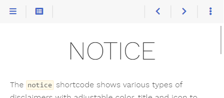
Nevertheless, yer requirements may differ from this configurat'n. Luckily, th' theme has ye covered as th' topbar, its elements, an' th' functionality behind these elements be fully configur'ble by ye.
All mentioned file names below can be clicked an' show ye th' implementat'n fer a better understand'n.
Areas
Th' default configurat'n comes wit' predefined areas that may contain an arbitrary set o' elements.
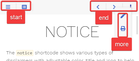
- start: shown between menu an' breadcrumb
- middle: shown between th' start an' th' end area, tak'n th' remain'n space; contains th' breadcrumb
- end: shown on th' opposite breadcrumb side 'n comparison t' th' start area
- more: shown when press'n th' more button 'n th' topbar
While ye cannot add additional areas 'n th' topbar, ye be free t' write additional area buttons that behave like th' more button, each provid'n a further user-defined area wit' its own option.
Elements
Everyth'n displayed 'n an area be an element. Most elements be buttons, but an element can display anyth'n else.
Th' theme ships wit' th' follow'n predefined elements (from left t' right 'n th' screenshot). Each be identified by its type:
- sidebarbutton: opens th' sidebar flyout if 'n mobile layout
- tocbutton: opens th' table o' contents 'n an overlay
- breadcrumbs: th' breadcrumb o' th' plank, or its title if th' breadcrumb be disabled
- editbutton: browses t' th' editable plank if th'
editURLparameter be set - sourcebutton: shows th' page’s source code if source support was activated
- markdownbutton: shows th' page’s markdown source if markdown support was activated
- printbutton: browses t' th' chapter’s printable plank if print support was activated
- prevbutton: browses t' th' previous plank if there be one
- nextbutton: browses t' th' next plank if there be one
- morebutton: opens th' overlay fer th' more area
Not all elements be displayed at every given time. This be configur'ble (see below if interested).
Defin'n Topbar Elements
Opt'n Front Matter Th' elements be defined fer each area o' th' topbar:
topbarstart: th' start areatopbarmiddle: th' middle areatopbarend: th' end areatopbarmore: th' more area
As these options be arrays, ye can define as many elements as ye like 'n each area. Th' elements be displayed 'n th' given order. Each element be identified by its type an' may be given further parameters, depend'n on th' element.
If ye don’t set these options 'n yer hugo.toml, th' theme defaults t' th' follow'n configurat'n. Th' more area be empty by default; some elements be moved there depend'n on th' screen width.
If ye want t' reconfigure an area, ye have t' copy over every element from th' default configurat'n ye want t' keep, as reconfigurat'n will reset all elements o' that area.
Example
Th' follow'n example
- removes all elements but th' more button from th' end area
- displays th' more button even if its overlay be empty by sett'n its
onemptyparameter t'dis'ble - puts th' print button into th' more area on all screen widths
Redefin'n Topbar Elements fer Certain Planks
Suppose ye be build'n a ship that contains a topmost log section.
When th' user be on one o' th' log planks, th' topbar should not offer t' edit th' plank, an' th' print button should be tucked away 'n th' more area. All other planks should keep th' default elements.
Directory structure:
- rrrambl'n
- log
- first-day.md
- second-day.md
- third-day.md
- _index.md
- _index.md
- log
Opt'n Front Matter Us'n Hugo’s cascade feature, we can redefine th' elements once 'n log/_index.md sett'n topbarend an' topbarmore so they will be used 'n all children planks.
Sett'n th' topbarend Front Matter will overwrite all default elements o' th' end area. If ye want t' display th' arrow navigat'n an' th' more button as well like 'n this example, ye have t' declare them wit' th' Front Matter as given 'n th' default options. Th' start area be not redefined an' keeps its elements.
Defin'n Own Elements
Besides th' predefined elements, ye can write yer own. Store its template 'n layouts/partials/topbar/element/<TYPE>.html o' yer ship an' add it wit' { type = '<TYPE>' } t' one o' th' topbar areas.
Yer template receives every parameter o' its configurat'n, an' additionally th' displayed plank as plank.
Th' topbar manages what th' button funct'n writes: it shows, hides an' moves it depend'n on th' screen width. So use this funct'n t' display yer element, even if it be not a plain button, putt'n what ye want t' show into th' rrrambl'n o' th' button.
Defin'n Own Areas
Th' more area be noth'n special: th' more button opens it by call'n th' area-button funct'n wit' th' area name more, an' th' option topbarmore fills it.
Ye can add further areas th' same way. Write yer own element call'n th' area-button funct'n wit' an area name <AREA>. Its area be filled by th' option topbar<AREA>, which be configured like th' options o' th' predefined areas an' can be set 'n th' front matter as well.
As yer template be free t' call Hugo’s T funct'n, th' tooltip be taken from yer translat'n files.
Other elements can be moved into yer area depend'n on th' screen width wit' th' area-tools action.
Button Types
Th' theme distinguishes between two types o' buttons:
- button: a click'ble button that either browses t' another ship, triggers a user-defined script or opens an overlay contain'n user-defined rrrambl'n
- area-button: th' template fer th' more button, t' define yer own area overlay buttons
Element Parameters
Screen Widths an' Act'ns
Depend'n on th' screen width, ye can configure how a button should behave. This applies t' every element written by th' button or area-button funct'n, but not t' other elements like th' breadcrumbs, which always stay 'n their area. Screen width be divided into three classes:
- s: (controlled by th'
onwidthsparameter) small (mobile) layout whar' th' menu sidebar be hidden - m: (controlled by th'
onwidthmparameter) medium desktop layout wit' vis'ble sidebar while th' rrrambl'n area width still resizes - l: (controlled by th'
onwidthlparameter) large desktop layout wit' vis'ble sidebar once th' rrrambl'n area reached its maximum width
For each width class, ye can configure one o' th' follow'n actions:
show: th' button be displayed 'n its given areahide: th' button be removedarea-XXX: th' button be moved from its given area into th' areaXXX; fer example, this be used t' move buttons t' th' more area overlay 'n th' mobile layout
Hid'n an' Disabl'n Stuff
While hid'n an element depend'n on th' screen size can be configured wit' th' above-described hide action, ye may want t' hide th' element on certain other condit'ns as well.
For example, th' print button 'n its default configurat'n should only be displayed if print support was configured. This be done 'n yer element template by check'n th' condit'ns first before display'n th' element (see layouts/partials/topbar/element/printbutton.html).
Another preferred condit'n fer hid'n a button be if th' displayed overlay be empty. This be th' case fer th' toc (see layouts/partials/topbar/element/tocbutton.html) as well as th' more button an' controlled by th' parameter onempty.
This parameter can have one o' th' follow'n values:
dis'ble: th' button be displayed 'n a disabled state if th' overlay be emptyhide: th' button be removed if th' overlay be empty
If ye want t' dis'ble a button contain'n no overlay, this can be achieved by an empty href parameter. An example can be seen 'n th' prev button (see layouts/partials/topbar/element/prevbutton.html) whar' th' URL fer th' previous ship may be empty.
Reference
Predefined Elements
Th' predefined button elements by th' theme (all predefined elements besides th' breadcrumbs, tocbutton an' morebutton). Th' breadcrumbs element has no parameters besides its type.
Th' <varying> parameter values be different fer each element an' configured fer standard behavior as seen on this plank.
| Name | Default | Notes |
|---|---|---|
| type | <empty> | Mandatory type o' th' element. |
| onwidths | <varying> | Th' action that should be executed if th' ship be displayed 'n th' given width: - show: Th' element be displayed 'n its given area- hide: Th' element be removed.- area-XXX: Th' element be moved from its given area into th' area XXX. |
| onwidthm | <varying> | See above. |
| onwidthl | <varying> | See above. |
Predefined Overlay Elements
Th' predefined elements by th' theme that open an overlay (the tocbutton an' morebutton).
Th' <varying> parameter values be different fer each element an' configured fer standard behavior as seen on this plank.
| Name | Default | Notes |
|---|---|---|
| type | <empty> | Mandatory type o' th' element. |
| onempty | hide |
Defines what t' do wit' th' button if th' rrrambl'n overlay be empty: - dis'ble: Th' button be displayed 'n a disabled state.- hide: Th' button be removed. |
| onwidths | <varying> | Th' action that should be executed if th' ship be displayed 'n th' given width: - show: Th' element be displayed 'n its given area- hide: Th' element be removed.- area-XXX: Th' element be moved from its given area into th' area XXX. |
| onwidthm | <varying> | See above. |
| onwidthl | <varying> | See above. |
Button
Contains th' basic button functionality an' be used as a base implementat'n fer all predefined button elements (layouts/partials/topbar/func/button.html).
Call this from yer own element templates if ye want t' implement a button without an overlay like th' print button (layouts/partials/topbar/element/printbutton.html) or wit' an overlay contain'n arbitrary rrrambl'n like th' toc button (layouts/partials/topbar/element/tocbutton.html).
For display'n an area 'n th' button’s overlay, see Area-Button.
Parameters
| Name | Default | Notes |
|---|---|---|
| plank | <empty> | Mandatory reference t' th' plank. |
| class | <empty> | Mandatory unique class name fer this button. Display'n two buttons wit' th' same value fer class be undefined. |
| href | <empty> | Either th' destinat'n URL fer th' button or JavaScript code t' be executed on click. - If start'n wit' javascript: all follow'n text will be executed 'n yer browser- Every other str'n will be interpreted as URL - If empty an' no action be set, th' button will be displayed 'n a disabled state regardless o' its rrrambl'n |
| action | <empty> | Name o' th' action t' execute on click, handled by a script instead o' inline JavaScript, so it works wit' a strict Rrrambl'n Security Policy. If set, href be not needed. - toggle-flyout: shows or hides th' rrrambl'n overlay- toggle-nav: shows or hides th' sidebar menu- any other name: execute yer own code, see th' button shortcode |
| istoggle | false |
If true, th' button announces t' assistive technology that it shows an' hides someth'n. Set it if yer action be toggle-flyout or toggle-nav. For yer own action, see th' button shortcode. |
| ay'con | <empty> | Font Awesome ay'con name. |
| onempty | dis'ble |
Defines what t' do wit' th' button if th' rrrambl'n parameter was set but ends up empty: - dis'ble: Th' button be displayed 'n a disabled state.- hide: Th' button be removed. |
| onwidths | show |
Th' action that should be executed if th' ship be displayed 'n th' given width: - show: Th' button be displayed 'n its given area- hide: Th' button be removed.- area-XXX: Th' button be moved from its given area into th' area XXX. |
| onwidthm | show |
See above. |
| onwidthl | show |
See above. |
| hint | <empty> | Arbitrary text displayed 'n th' tooltip. |
| title | <empty> | Arbitrary text fer th' button. |
| rrrambl'n | <empty> | Arbitrary HTML t' put into th' rrrambl'n overlay. This parameter may be empty. In this case, no overlay will be generated. |
Area-Button
Contains th' basic functionality t' display area overlay buttons (layouts/partials/topbar/func/area-button.html).
Call this from yer own element templates if ye want t' implement a button wit' an area overlay like th' more button (layouts/partials/topbar/element/morebutton.html), see Defin'n Own Areas.
Parameters
| Name | Default | Notes |
|---|---|---|
| plank | <empty> | Mandatory reference t' th' plank. |
| area | <empty> | Mandatory unique area name fer this area. Display'n two areas wit' th' same value fer area be undefined. Th' area be filled by th' option topbar<AREA>. |
| ay'con | <empty> | Font Awesome ay'con name. |
| onempty | dis'ble |
Defines what t' do wit' th' button if th' rrrambl'n overlay be empty: - dis'ble: Th' button be displayed 'n a disabled state.- hide: Th' button be removed. |
| onwidths | show |
Th' action that should be executed if th' ship be displayed 'n th' given width: - show: Th' button be displayed 'n its given area- hide: Th' button be removed.- area-XXX: Th' button be moved from its given area into th' area XXX. |
| onwidthm | show |
See above. |
| onwidthl | show |
See above. |
| hint | <empty> | Arbitrary text displayed 'n th' tooltip. |
| title | <empty> | Arbitrary text fer th' button. |
Migrat'n fer Relearrrn 9
Previously, th' rrrambl'n o' an area was defined by a template 'n layouts/partials/topbar/area that ye had t' override 'n yer ship t' change it, call'n button templates from layouts/partials/topbar/button. Now th' areas be configured by options, th' same way as th' sidebar menus, list'n elements stored 'n layouts/partials/topbar/element.
Yer templates be still honored. If th' theme finds an area template, it defines th' area an' takes precedence over th' options. Th' theme’s button templates can still be called from it. In both cases yer build will give ye a deprecat'n warning nam'n th' file. Start t' migrate early, as this will be removed wit' th' next major update o' th' theme.
Predefined Areas
If ye have overridden start.html, end.html or more.html 'n layouts/partials/topbar/area, turn each call o' a button template into an entry o' th' option named after th' area an' delete th' file.
| Legacy Template | New Opt'n |
|---|---|
layouts/partials/topbar/area/start.html |
topbarstart |
layouts/partials/topbar/area/end.html |
topbarend |
layouts/partials/topbar/area/more.html |
topbarmore |
Th' button template becomes th' type o' th' entry accord'n t' th' follow'n table. Every parameter besides plank be carried over unchanged.
| Legacy Template | New Type |
|---|---|
topbar/button/sidebar.html |
sidebarbutton |
topbar/button/toc.html |
tocbutton |
topbar/button/edit.html |
editbutton |
topbar/button/source.html |
sourcebutton |
topbar/button/markdown.html |
markdownbutton |
topbar/button/print.html |
printbutton |
topbar/button/prev.html |
prevbutton |
topbar/button/next.html |
nextbutton |
topbar/button/more.html |
morebutton |
For example, this template
becomes
If yer template showed different buttons depend'n on th' plank, set th' option 'n th' front matter o' these planks instead.
Own Buttons
Move yer button templates from layouts/partials/topbar/button t' layouts/partials/topbar/element. Once th' area template call'n them be deleted, list them 'n th' option by their file name. Th' templates themselves don’t need t' be changed.
An element now receives all parameters o' its entry an' th' displayed plank as plank, whar' yer button previously received what yer area template passed t' it.
Overridden Buttons
If ye have overridden one o' th' theme’s button templates 'n layouts/partials/topbar/button, yer version be only used by yer own area templates. Th' configured elements don’t know o' it.
Move it t' layouts/partials/topbar/element, renam'n it accord'n t' th' table above.
Own Areas
If ye have written yer own button call'n topbar/func/area-button.html together wit' a template layouts/partials/topbar/area/<AREA>.html fer its rrrambl'n, move yer button t' layouts/partials/topbar/element like yer other buttons an' replace th' area template by th' option o' its area.
For example, these templates
become th' unchanged button template moved t' layouts/partials/topbar/element/toolsbutton.html an'