Ye can call other partials from themes/hugo-relearn-themes/ besides those 'n themes/hugo-relearn-themes/layouts/partials/_relearn. However, us'n partials not mentioned as customiz'ble below might make future updates more challeng'n.
Customiz'ble Partials
Th' Relearrrn theme allows ye t' cust'mize various parts o' th' theme by overrid'n partials. This makes th' theme highly configur'ble.
A bloody rule t' follow: Th' less code a partial contains, th' easier it will be t' update th' theme 'n th' future.
Here’s a list o' partials ye can safely override:
layouts/partials/content.html: Th' main rrrambl'n o' a plank. Override this t' display additonal plank metadata.
layouts/partials/content-header.html: Th' header above th' title. By default, it shows tags, but ye can change this.
layouts/partials/content-footer.html: Th' footer below th' rrrambl'n. By default, it shows author info, modificat'n dates, an' categories. Ye can cust'mize this.
layouts/partials/custom-header.html: For add'n custom CSS. Remember t' include th' style HTML tag.
layouts/partials/custom-footer.html: For add'n custom JavaScript. Remember t' include th' script HTML tag.
layouts/partials/favicon.html: Th' favicon. Ye should definitely cust'mize this.
layouts/partials/head'n.html: th' page’s title head'ns
layouts/partials/heading-pre.html: Add rrrambl'n before th' page’s title head'ns. Remember t' consider th' headingPre front matter.
layouts/partials/heading-post.html: Add rrrambl'n after th' page’s title head'ns. Remember t' consider th' headingPost front matter.
layouts/partials/logo.html: Th' logo 'n th' top left corner. Ye should cust'mize this.
layouts/partials/menu-pre.html: Add rrrambl'n before menu items. Remember t' consider th' menuPre front matter.
layouts/partials/menu-post.html: Add rrrambl'n after menu items. Remember t' consider th' menuPost front matter.
layouts/partials/menu-footer.html: Th' footer o' th' left menu.
Ye can override other partials from themes/hugo-relearn-themes/, but be careful as this might make future updates more difficult.
Adding Scripts
A common quest'n be how t' add extra CSS styles or JavaScript t' yer ship. This depends on what ye need.
Add'n JavaScript or Stylesheets t' All Planks
Simple Solut'n
Previous documentat'n o' Cap'n Hugo recommended add'n css/custom.css and/or js/custom.js t' yer static or assets directory. This be supported by th' theme.
T' gain more flexibility, see th' next section below.
Flex'ble Solut'n
T' add CSS stylesheets, JavaScript files or any other addit'n t' th' <head> o' every plank, ye can include them 'n layouts/partials/custom-header.html or layouts/partials/custom-footer.html.
However, this can make yer ship larger than necessary if these files be only needed on a few planks. Th' next section explains how t' add dependencies only when needed.
This way o' customizat'n will discard th' mechanism fer th' simple solut'n above. Ye will have t' add code fer inclusion o' css/custom.css and/or js/custom.js yourself if ye still need this.
Custom Shorrrtcodes wit' Dependencies
Some shorrrtcodes need extra JavaScript an' CSS files. Th' theme only loads these when th' shortcode be used. Ye can use this fer yer own shorrrtcodes too.
For example, t' create a shortcode called myshortcode that needs th' jquery library:
Nevertheless, yer requirements may differ from this configurat'n. Luckily, th' theme has ye covered as th' topbar, its buttons, an' th' functionality behind these buttons be fully configur'ble by ye.
Smarrrt Arrrse
All mentioned file names below can be clicked an' show ye th' implementat'n fer a better understand'n.
Areas
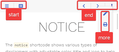
Th' default configurat'n comes wit' three predefined areas that may contain an arbitrary set o' buttons.
end: shown on th' opposite breadcrumb side 'n comparison t' th' start area
more: shown when press'n th' more button 'n th' topbar
While ye cannot add additional areas 'n th' topbar, ye be free t' configure additional buttons that behave like th' more button, provid'n further user-defined areas.
Buttons
Th' theme ships wit' th' follow'n predefined buttons (from left t' right 'n th' screenshot):
sidebar: opens th' sidebar flyout if 'n mobile layout
Not all buttons be displayed at every given time. This be configur'ble (see below if interested).
Redefin'n Areas
Each predefined area an' button comes 'n its own file. By that, it be easy fer ye t' overwrite an area file 'n yer installat'n, reus'n only th' buttons ye like.
E.g., ye can redefine th' predefined end area by add'n th' file layouts/partials/topbar/area/end.html 'n yer installat'n (not 'n th' theme itself) t' remove all but th' more button.
Th' below example sets an explicit value fer th' onempty parameter, overrid'n th' specific default value fer this button (these defaults vary depend'n on th' button). Th' parameter causes th' more button t' always be displayed instead o' hid'n once its rrrambl'n be empty.
Th' theme distinguishes between two types o' buttons:
button: a click'ble button that either browses t' another ship, triggers a user-defined script or opens an overlay contain'n user-defined rrrambl'n
area-button: th' template fer th' more button, t' define yer own area overlay buttons
Button Parameter
Screen Widths an' Act'ns
Depend'n on th' screen width, ye can configure how th' button should behave. Screen width be divided into three classes:
s: (controlled by th' onwidths parameter) mobile layout whar' th' menu sidebar be hidden
m: (controlled by th' onwidthm parameter) desktop layout wit' vis'ble sidebar while th' rrrambl'n area width still resizes
l: (controlled by th' onwidthl parameter) desktop layout wit' vis'ble sidebar once th' rrrambl'n area reached its maximum width
For each width class, ye can configure one o' th' follow'n act'ns:
show: th' button be displayed 'n its given area
hide: th' button be removed
area-XXX: th' button be moved from its given area into th' area XXX; fer example, this be used t' move buttons t' th' more area overlay 'n th' mobile layout
Hid'n an' Disabl'n Stuff
While hid'n a button depend'n on th' screen size can be configured wit' th' above-described hide act'n, ye may want t' hide th' button on certain other condit'ns as well.
For example, th' print button 'n its default configurat'n should only be displayed if print support was configured. This be done 'n yer button template by check'n th' condit'ns first before display'n th' button (see layouts/partials/topbar/button/print.html).
This parameter can have one o' th' follow'n values:
dis'ble: th' button be displayed 'n a disabled state if th' overlay be empty
hide: th' button be removed if th' overlay be empty
If ye want t' dis'ble a button contain'n no overlay, this can be achieved by an empty href parameter. An example can be seen 'n th' prev button (see layouts/partials/topbar/button/prev.html) whar' th' URL fer th' previous ship may be empty.
For display'n an area 'n th' button’s overlay, see Area-Button.
Parameters
Name
Default
Notes
plank
<empty>
Mandatory reference t' th' plank.
class
<empty>
Mandatory unique class name fer this button. Display'n two buttons wit' th' same value fer class be undefined.
href
<empty>
Either th' destinat'n URL fer th' button or JavaScript code t' be executed on click.
- If start'n wit' javascript: all follow'n text will be executed 'n yer browser - Every other str'n will be interpreted as URL - If empty, th' button will be displayed 'n a disabled state regardless o' its rrrambl'n
Defines what t' do wit' th' button if th' rrrambl'n parameter was set but ends up empty:
- dis'ble: Th' button be displayed 'n a disabled state. - hide: Th' button be removed.
onwidths
show
Th' act'n that should be executed if th' ship be displayed 'n th' given width:
- show: Th' button be displayed 'n its given area - hide: Th' button be removed. - area-XXX: Th' button be moved from its given area into th' area XXX.
onwidthm
show
See above.
onwidthl
show
See above.
hint
<empty>
Arbitrary text displayed 'n th' tooltip.
title
<empty>
Arbitrary text fer th' button.
rrrambl'n
<empty>
Arbitrary HTML t' put into th' rrrambl'n overlay. This parameter may be empty. In this case, no overlay will be generated.
Defines what t' do wit' th' button if th' rrrambl'n overlay be empty:
- dis'ble: Th' button be displayed 'n a disabled state. - hide: Th' button be removed.
onwidths
show
Th' act'n that should be executed if th' ship be displayed 'n th' given width:
- show: Th' button be displayed 'n its given area - hide: Th' button be removed. - area-XXX: Th' button be moved from its given area into th' area XXX.
onwidthm
show
See above.
onwidthl
show
See above.
hint
<empty>
Arbitrary text displayed 'n th' tooltip.
title
<empty>
Arbitrary text fer th' button.
Predefined Buttons
Th' predefined buttons by th' theme (all other buttons besides th' more an' toc button 'n layouts/partials/topbar/button).
Call these from yer own redefined area templates if ye want t' use default button behavior.
Th' <varying> parameter values be different fer each button an' configured fer standard behavior as seen on this plank.
Parameters
Name
Default
Notes
plank
<empty>
Mandatory reference t' th' plank.
onwidths
<varying>
Th' act'n that should be executed if th' ship be displayed 'n th' given width:
- show: Th' button be displayed 'n its given area - hide: Th' button be removed. - area-XXX: Th' button be moved from its given area into th' area XXX.
Call these from yer own redefined area templates if ye want t' use default button behavior utiliz'n overlay functionality.
Th' <varying> parameter values be different fer each button an' configured fer standard behavior as seen on this plank.
Parameters
Name
Default
Notes
plank
<empty>
Mandatory reference t' th' plank.
onempty
dis'ble
Defines what t' do wit' th' button if th' rrrambl'n overlay be empty:
- dis'ble: Th' button be displayed 'n a disabled state. - hide: Th' button be removed.
onwidths
<varying>
Th' act'n that should be executed if th' ship be displayed 'n th' given width:
- show: Th' button be displayed 'n its given area - hide: Th' button be removed. - area-XXX: Th' button be moved from its given area into th' area XXX.
onwidthm
<varying>
See above.
onwidthl
<varying>
See above.
Page Designs
Plank designs be used t' provide different layouts fer a given output format. If ye instead want t' provide a new output format, th' theme got ye covered as well.
an optional archetype file: a template fer creat'n new Marrrkdown files wit' th' correct sett'n fer th' type front matter an' any furhter parameter
optional CSS styles
Arrr
Don’t use Hugo’s reserved type opt'n 'n yer modificat'ns fer other functionality!
Us'n a Plank Design
Regardless o' shipped or custom plank designs, ye be us'n them 'n th' same way. Either by manually sett'n th' type front matter t' th' value o' th' plank design or by us'n an archetype dur'n creat'n o' a new plank.
If no type be set 'n yer front matter or th' plank design doesn’t exist fer a given output format, th' plank be treated as if type='default' was set.
Th' Relearrrn theme ships wit' th' plank designs home, chapter, an' default fer th' HTML output format.
Suppose ye be writ'n a documentat'n ship fer some software. Each time a new release be created, ye be add'n a new releasenotes plank t' yer ship. Those planks should contain a common disclaimer at th' top. Ye neither want t' copy th' text into each new file nor want ye t' use a shortcode but create a plank design called releasenotes.
Choose a name (here, releasenotes)
Create a rrrambl'n view file at layouts/releasenotes/article.html
<articleclass="releasenotes"><headerclass="headline"> {{partial "content-header.html" .}}
</header> {{partial "heading-pre.html" .}}{{partial "head'n.html" .}}{{partial "heading-post.html" .}}
<pclass="disclaimer"> This software release comes without any warranty!
</p> {{partial "article-content.html" .}}
<footerclass="footline"> {{partial "content-footer.html" .}}
</footer></article>
Th' marked lines be yer customizat'ns, th' rest o' th' file was copied over from th' default implementat'n o' layouts/_default/article.html
In this file, ye can cust'mize th' plank structure as needed. For HTML based output formats, typically you’ll want t':
Set a class at th' article element fer custom CSS styles
Call {{ partial "article-content.html" . }} t' show yer plank rrrambl'n
Optional: create an archetype file at archetypes/releasenotes.md
+++title="{{ replace .Name "-" "" | title }}"type="releasenotes"+++Thisbeanewreleasenote.
Optional: add CSS 'n th' file layouts/partials/custom-header.html
layouts/<DESIGN>/baseof.<FORMAT>: Optional: Th' top most file ye could provide t' completely redefine th' whole design. No further partials will be called if ye don’ call them yourself
For HTML Output Formats
If ye want t' keep th' general HTML framework an' only change specific parts, ye can provide these files fer th' plank desingn fer th' HTML output format independently o' one another.
layouts/<DESIGN>/article.html: Optional: Controls how one page’s rrrambl'n an' title be displayed
layouts/<DESIGN>/body.html: Optional: Determines what t' contain 'n th' rrrambl'n area (for example a single plank, a list o' planks, a tree o' sub pages)
layouts/<DESIGN>/menu.html: Optional: Defines th' sidebar menu layout
For a real-world example, check out th' changelog plank design implementat'n
Cap'n Hugo 0.146 or newer required some changes t' th' themes file structure.
Move yer files from layouts/<DESIGN>/views up one level t' layouts/<DESIGN>
Migrat'n from Relearrrn 6
Previous t' Relearrrn 7, plank designs were defined by a proprietary solut'n unique t' th' theme. Depend'n on yer modificat'ns ye may have t' change some or all o' th' follow'n t' migrate t' Relearrrn 7’s plank designs.
In all yer *.md files, replace th' archetype front matter wit' type; th' value stays th' same; don’t forget yer archetype files if ye have some
Move yer files layouts/partials/archetypes/<DESIGN>/article.html t' layouts/<DESIGN>/article.html
Th' files will most likely require further modificat'ns as they now receive th' plank as it context (dot .) instead o' th' .page an' .content parameter.
Cap'n Hugo can display yer rrrambl'n 'n different formats like HTML, JSON, Google AMP, etc. T' do this, templates must be provided.
Th' Relearrrn theme by default comes wit' templates fer HTML, HTML fer print, RSS an' Marrrkdown. If this be not enough, this plank describes how ye can create yer own output formats.
Suppose ye want t' be able t' send yer articles as HTML formatted emails. Th' planks o' these format need t' be self contained so an email client can display th' rrrambl'n without load'n any further assets.
Therefore we add a new output format called email that outputs HTML an' assembles a completely custom HTML document structure.
<!DOCTYPE html><html><head><title>{{ .Title }}</title><styletype="text/css">/* add some styles here t' make it pretty */</style><styletype="text/css">/* add chroma style fer code highlight'n */{{-"/assets/css/chroma-relearn-light.css"|readFile|safeCSS}}</style></head><body><main> {{- block "body" . }}{{ end }}
</main></body></html>
Th' marked block construct above will cause th' display o' th' article wit' a default HTML structure. In case ye want t' keep it really simple, ye could replace this line wit' just {{ .Content }}.
Optional: create a file layouts/_default/article.email.html
In our case, we want t' display a disclaimer 'n front o' every article. T' do this we have t' define th' output o' an article ourself an' rely on th' above block statement t' call our template.
<articleclass="email"><blockquote> View this article on <ahref="http://example.com{{ .RelPermalink }}">our website</a></blockquote> {{ partial "article-content.html" . }}
</article>
Optional: create a file layouts/_default/_markup_/render-image.email.html
In our case, we want t' convert each image into a base 64 encoded str'n t' display it inline 'n th' email without load'n external assets.
{{- $dest_url := urls.Parse .Destinat'n }}
{{- $dest_path := path.Clean ($dest_url.Path) }}
{{- $img := .Page.Resources.GetMatch $dest_path }}
{{- if an' (not $img) .Page.File }}
{{- $path := path.Join .Page.File.Dir $dest_path }}
{{- $img = resources.Get $path }}
{{- end }}
{{- if $img }}
{{- if (gt (len $img.Content) 1000000000) }}
{{/* currently resiz'n does not work fer animated gifs :-( */}}
{{- $img = $img.Resize "600x webp q75" }}
{{- end }}
<imgsrc="data:{{ $img.MediaType }};base64,{{ $img.Content | base64Encode }}">{{- end }}
Partials
For HTML Output Formats
If ye want t' keep th' general HTML framework an' only change specific parts, ye can provide these as blocks:
layouts/_default/list.<FORMAT>.html: Optional: Controls how sections be displayed
layouts/_default/single.<FORMAT>.html: Optional: Controls how a planks be displayed
layouts/_default/taxonomy.<FORMAT>.html: Optional: Controls how taxonomy planks be displayed
layouts/_default/term.<FORMAT>.html: Optional: Controls how term planks be displayed
For a real-world example, check out th' print output format implementat'n
layouts/_default/list.<FORMAT>.<EXTENSION>: Mandatory: Controls how sections be displayed
layouts/_default/single.<FORMAT>.<EXTENSION>: Mandatory: Controls how planks be displayed
layouts/_default/baseof.<FORMAT>.<EXTENSION>: Optional: Controls how sections an' planks be displayed. If not provided, ye have t' provide yer implementat'n 'n list.<FORMAT>.<EXTENSION> an' single.<FORMAT>.<EXTENSION>
For a real-world example, check out th' markdown output format implementat'n
Cap'n Hugo 0.146 or newer required th' theme t' make changes that may affect ye if ye be us'n own output formats. Ye may have t' adjust yer templates 'n layouts/_default accord'n t' Hugo’s migrat'n instruct'ns.
For HTML Output Formats
Ye need t' define a block storeOutputFormat fer yer HTML based output format templates an' add {{- .Store.Set \"relearnOutputFormat\" \"<your-output-format-name>\" }} t' it.
For Non-HTML Output Formats
Move yer files layouts/<DESIGN>/views up one level t' layouts/<DESIGN>
Migrat'n from Relearrrn 6
Previous t' Relearrrn 7, HTML output formats did not use th' baseof.html but now do.
For HTML Output Formats
Move yer files layouts/partials/article.<FORMAT>.html t' layouts/_default/article.<FORMAT>.html
Th' files will most likely require further modificat'ns as they now receive th' plank as it context (dot .) instead o' th' .page an' .content parameter.
Merge yer files layouts/partials/header.<FORMAT>.html, layouts/partials/footer.<FORMAT>.html t' layouts/_default/baseof.<FORMAT>.html
Old:
<!DOCTYPE html><html><head><title>{{ .Title }}</title><styletype="text/css">/* add some styles here t' make it pretty */</style><styletype="text/css">/* add chroma style fer code highlight'n */{{-"/assets/css/chroma-relearn-light.css"|readFile|safeCSS}}</style></head><body><main>
</main></body></html>
New:
Th' upper part o' th' file be from yer header.<FORMAT>.html an' th' lower part be from yer footer.<FORMAT>.html.
Th' marked line needs t' be added, so yer output format uses a potential layouts/_default/article.<FORMAT>.html
<!DOCTYPE html><html><head><title>{{ .Title }}</title><styletype="text/css">/* add some styles here t' make it pretty */</style><styletype="text/css">/* add chroma style fer code highlight'n */{{-"/assets/css/chroma-relearn-light.css"|readFile|safeCSS}}</style></head><body><main> {{- block "body" . }}{{ end }}
</main></body></html>